The importance of space

One of the most commonly overlooked things in typography is, as you may have guessed by the title of this post, spacing.
There are two key terms, kerning and letter spacing that come into play here. The difference is that kerning refers to space between two particular characters, while letter spacing is applied throughout the entire line or paragraph between all pairs of characters. However, there are other types of spacing, such as word spacing, that I will mention below.
Regardless of what we call it, space should always be balanced, since among other things it affects legibility. Below I have some examples of signs that have all sorts of issues with spacing.
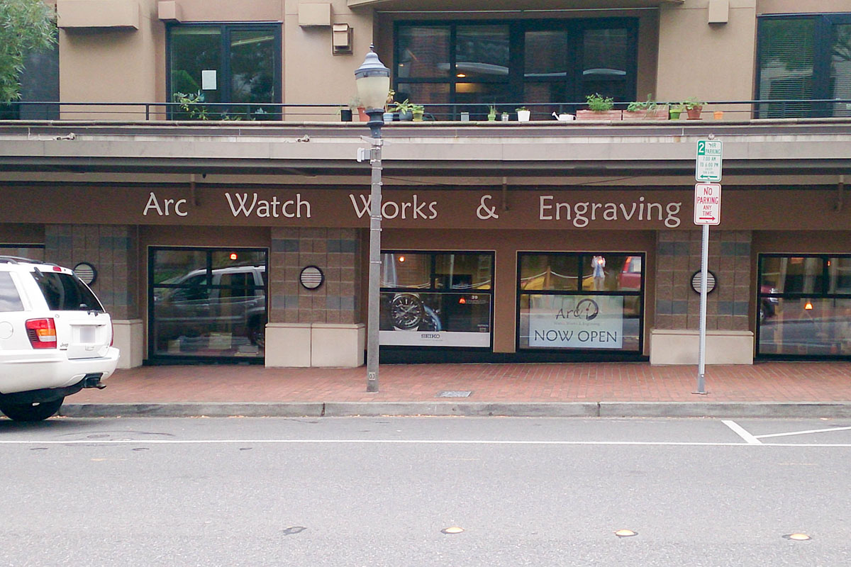
This specimen has a problem with word spacing. Each of the words is so far apart that the sign does not look cohesive any more. In calligraphy, the width of letter i is commonly used for word spacing. Depending on the features of the typeface, a larger space may be required in order to clearly separate words, but is should never be as wide as the one above.

Now, this sign has the opposite problem. The first time I saw it, it took almost a minute to figure out what it said, since I could not parse out individual words in it. The gear instead of an O also makes the sign less legible, but its effect is tiny compared to that of the absent spaces. In case you still have trouble reading in, the name of the store is Seattle Coffee Gear.

This sign has both too much and too little space at the same time. Letter spacing is unnecessarily sparse, but there are no spaces between individual words. Of course, the customers can eventually puzzle out that it says "deli bakery pantry", but it is very likely that on the first attempt they would try to read it as one word, and would end up with "delib", which looks like the beginning of "deliberate", except that it is followed by an A. Therefore, the reader has to go back and try reading the sign differently.
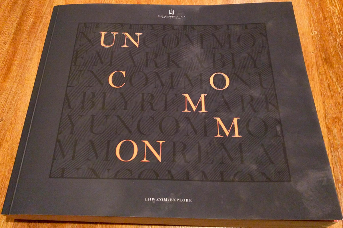
In this book cover, we are dealing not just with spacing between the letters, but with their location with respect to each other. The highlighted letters are not placed in a natural left-to-right and top-to-bottom reading order. If you follow each line, you could argue that they are, but since there is no text that is easy to read in those lines, and thus our eyes do not follow that pattern. Instead, the reader has to puzzle out that the cover says "Uncommon" by jumping all over the page letter by letter.

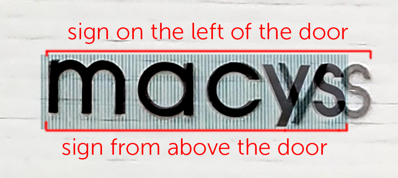
Look carefully at the sign above the door, and then at the one on the left. You will notice that the sign on the left is kerned differently than the one on top: there is too much space between C and Y, which makes it look unbalanced. While I am sure this was not intentional, it is still quite noticeable.
Below is an image with the two signs superimposed to demonstrate the difference.
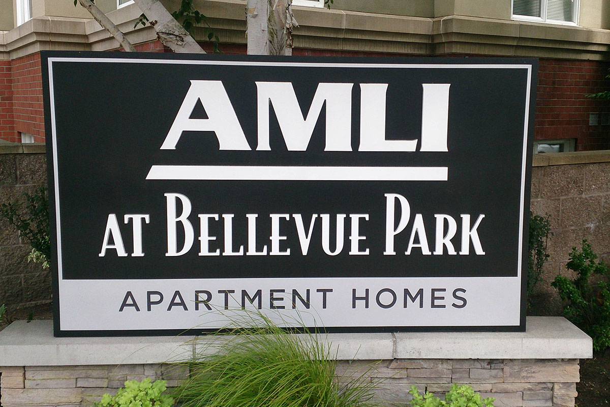
Here is a sign that could benefit from good kerning. Kerning is most often necessary in signs that are set in all caps, since the default spacing values for typefaces are usually designed for creating paragraphs of text, and not for putting capitals next to each other. A good rule of thumb is to keep the curves closest together, and the straight verticals farthest apart, so that the spaces between each pair of letters look equal.
There are no curves in "AMLI", but the A and the L have a lot of space that is part of the letterform. Putting the M and the L so close together makes them look squished, and creates a white spot in the middle of the word.
It is fascinating how space can make so much difference. Use it correctly, and nobody will ever notice, but make a mistake, and suddenly your sign is harder to understand and looks off.
Comments