inkmeblue
  • Home
  • Portfolio
  • Workshop
  • About
  • Contact
Subscribe

spacing

A collection of 2 posts
Cannot unsee
type

Cannot unsee

One of my friends recently linked me to this XKCD comic since I have been complaining about kerning lately. The best part is this is actually pretty close to the truth. Once you learn to see bad kerning, it becomes really hard to ignore it. No matter where you look,
Oct 29, 2015 1 min read
The importance of space
type

The importance of space

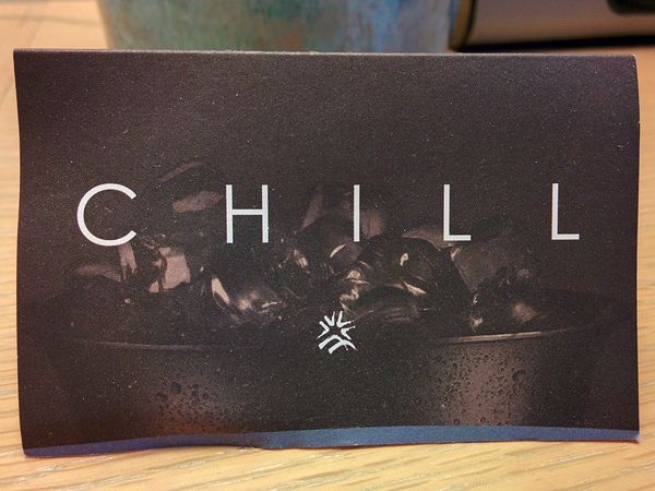
One of the most commonly overlooked things in typography is, as you may have guessed by the title of this post, spacing. There are two key terms, kerning and letter spacing that come into play here. The difference is that kerning refers to space between two particular characters, while letter
Sep 10, 2015 4 min read
inkmeblue © 2023