Cannot unsee

One of my friends recently linked me to this XKCD comic since I have been complaining about kerning lately.
 The best part is this is actually pretty close to the truth. Once you learn to see bad kerning, it becomes really hard to ignore it. No matter where you look, it is bound to crop up.
I was staying at a nice resort and picked up the card that was sitting next to the ice bucket.
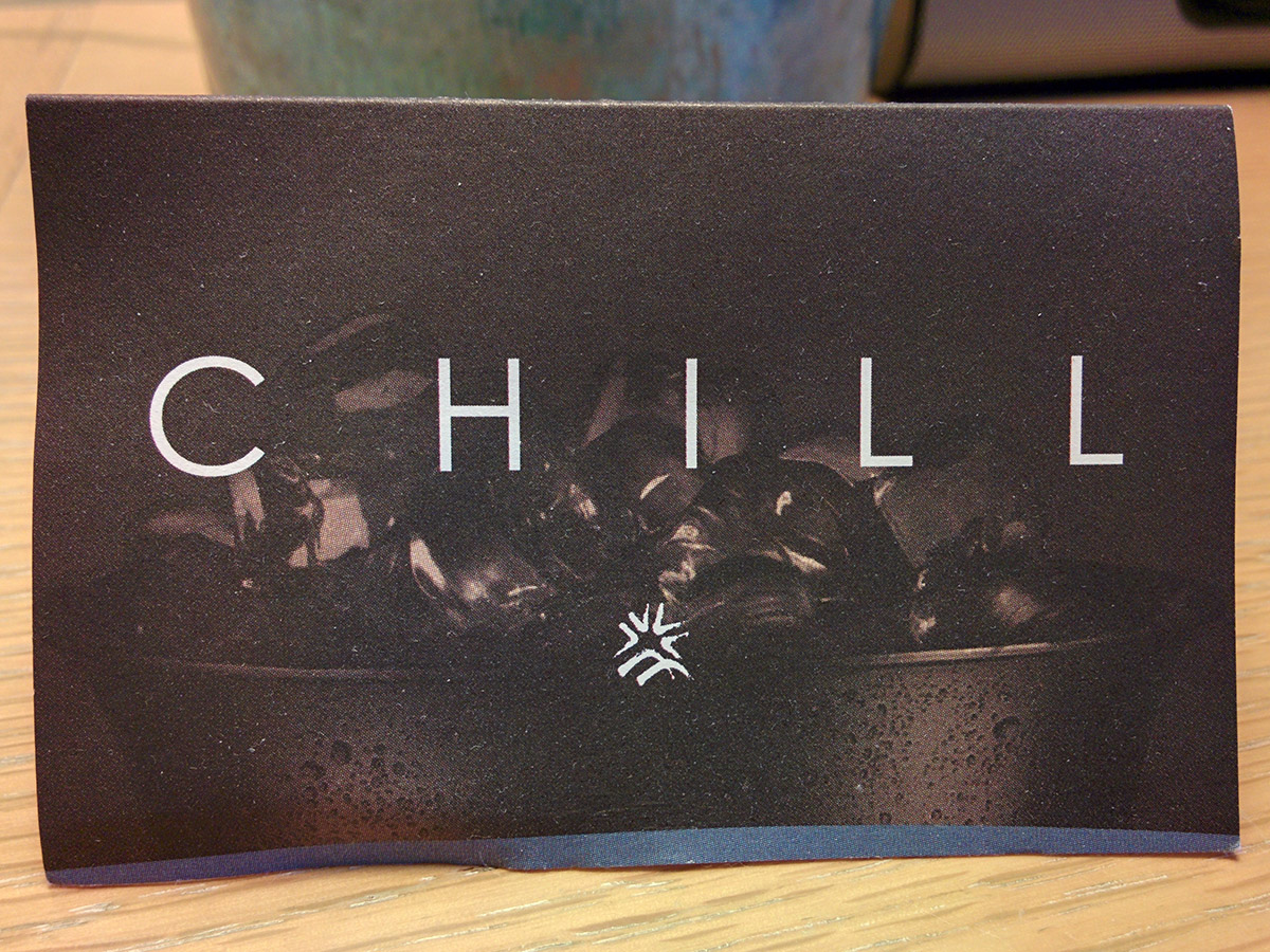
C-HILL. I mean, chill. It's off just enough to be disturbing.
As I was walking around the resort, I kept thinking that they need to hire a kerning expert. I could see it in almost every piece of typography, even in the restaurant sign.
![]()
They probably wanted to make it look fun and whimsical. But why, just why did they glue the O and R together? Sadly, what they ended up with is a really dark spot where the O touches the R. This makes the logo look unbalanced.
Anyway, I'm done complaining about bad kerning for now, but there is always more of it out there!
Image sources:
http://imgs.xkcd.com/comics/kerning.png
http://www.suncadiaresort.com/assets/pdfs/portals-logo-spot-notag.png
Comments