Why Tesla's latest UI update is complete garbage

I've been pretty happy with my Tesla Model S for the past 7 years. The UI on the main screen has never been amazing, but it was acceptable, and I got used to it.
This morning, I saw what the latest update did, and frankly it is a lot worse than before. If it ain't broke, don't fix it.
The Gaping Hole
Okay, my first question: why is there a huge blank space to the right of the volume control? It is simply there, regardless of how many apps I choose to show.
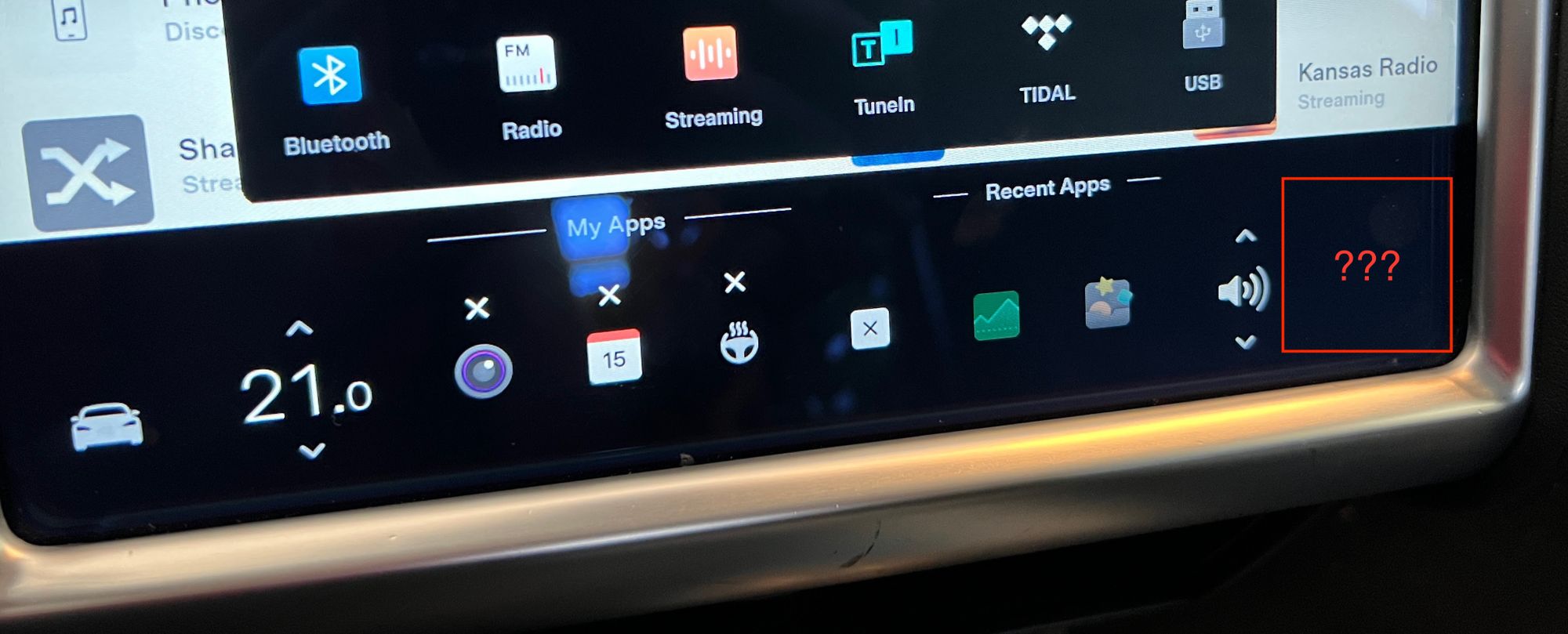
I wonder if the problem is this UI was never tested on an older Model S with a vertical screen, or if the person who tested it just didn't think this was problematic. I would like to hope that the UX designer did not put in there on purpose, just so that it could drive me nuts.
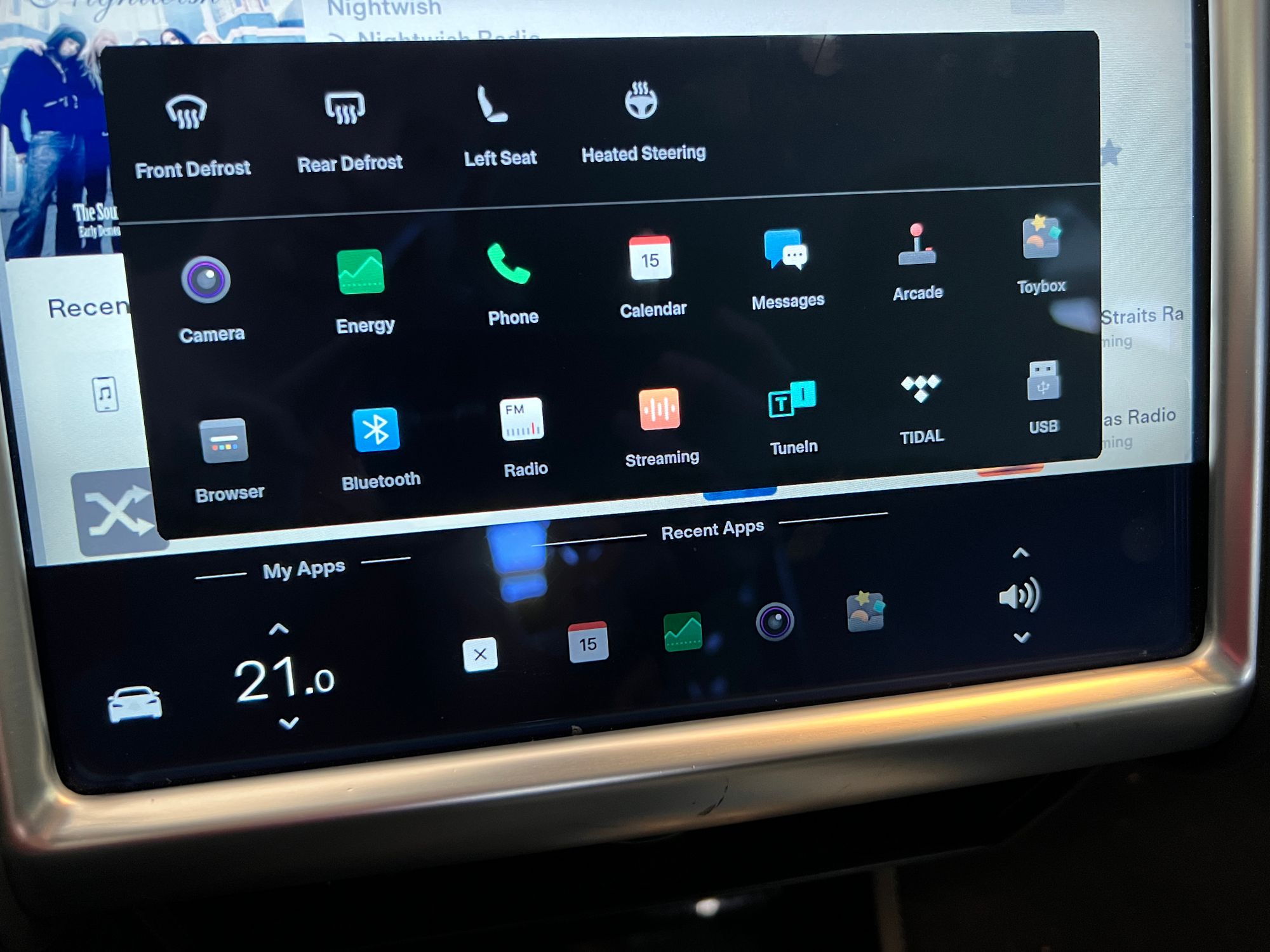
"My" vs "Recent" Apps
The whole distinction between "My Apps" and "Recent Apps" appears to have no useful purpose. Here are some notes on how the interaction works:
- It is possible to not have anything in "My Apps", but "Recent Apps" cannot be removed.
- There should be an option to remove the "Recent" list since it's taking up space. While it is possible that such a list would be useful to a new car owner who is just figuring out which apps they might need, but I certainly don't care for it.
- The fewer "My" apps you have, the more "Recent" ones show up.
- If the goal is to always use the same amount of space, then it works. But does this solve a user need?
- If an item is added to "My Apps", it doesn't show up in "Recent" anymore.
- This at least is the right choice, having two of the same app would be awful.
- However, that means that if you have all you need in "My Apps", you are still going to see some random "Recent" item, probably something you clicked accidentally.
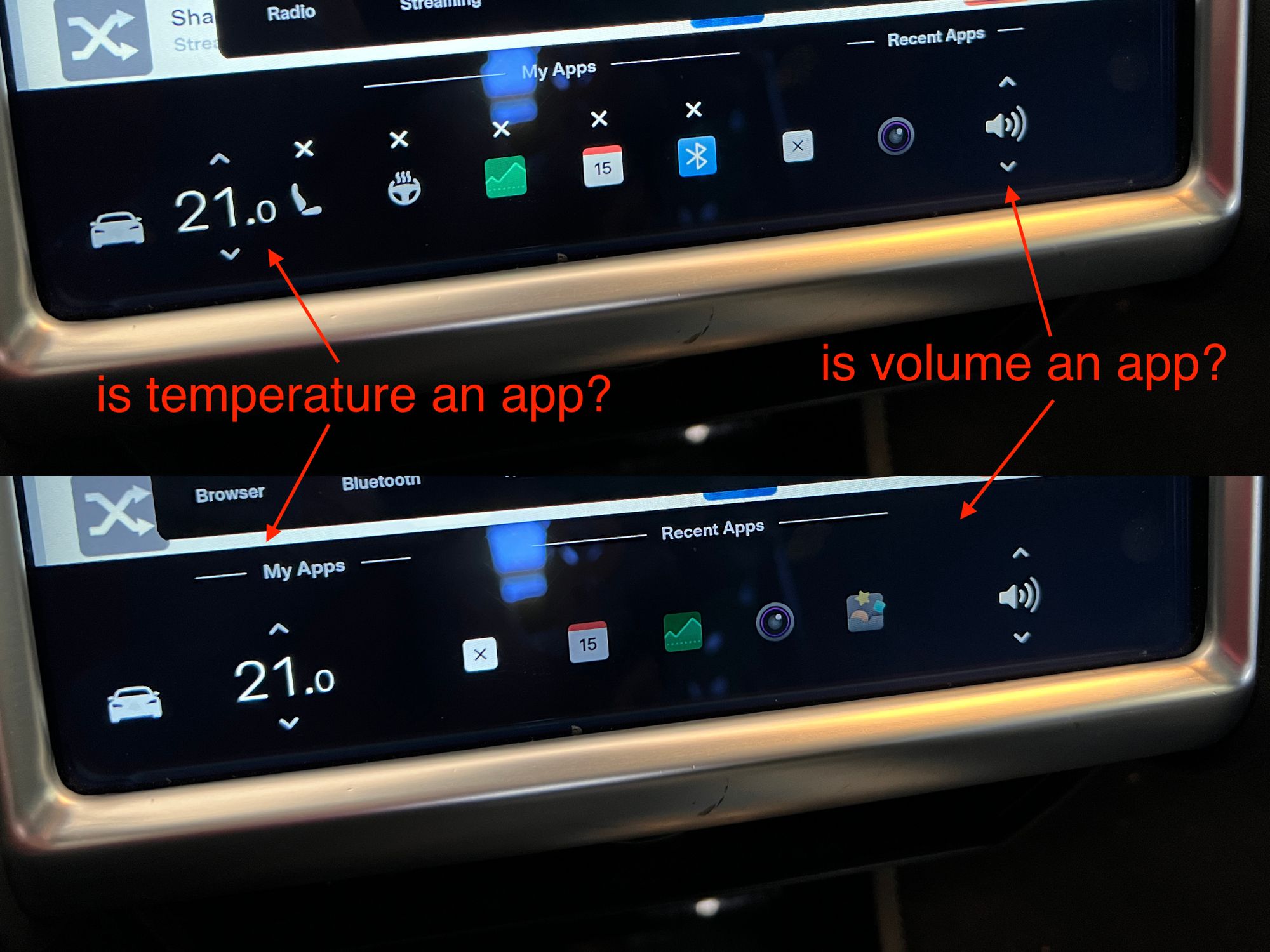
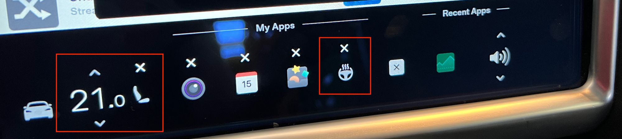
Bonus: Positioning issues
To add insult to injury, those "My Apps" and "Recent Apps" headings are misaligned, and depending on how many items you have, you might see the temperature setting under "My Apps" or the volume setting under "Recent Apps".
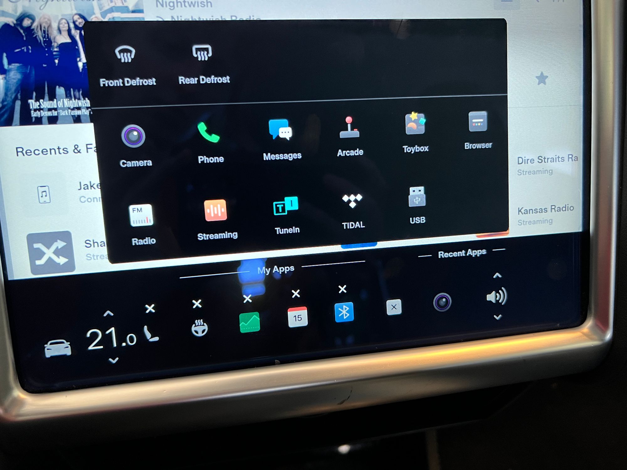
Bonus: Put your steering wheel heat in the Toybox
If you remove an app from "My Apps", but used it recently, it will appear in "Recent Apps". However, if you use the "Heated Steering" app, and then remove it from "My Apps", the "Recent" section shows "Toybox". Not exactly the same thing, right?
Climate Controls
While the issues above are mostly just visual annoyance, the climate control bugs are more profound.
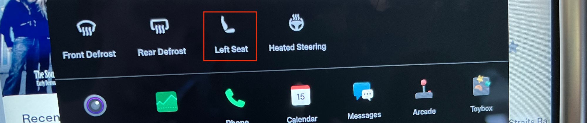
Not all climate controls are created equal
It is completely beyond me why "Left Seat" heating goes next to the temperature control (and that is the only location you can put it), but "Heated Steering" goes with the rest of "My Apps". They should either both go next to the temperature control, or both go in the "My Apps" box.
Also, why is there only "Left Seat"? When I am a passenger, I sure do enjoy being able to easily turn my seat heater on! But alas I can no longer enjoy that simple pleasure...
The 90° rotation
This one could have come straight out of Don Norman's "Design of Everyday Things", which I believe is required reading in every single design school.
In the old UI, the seat map was facing the same way as the car. In the new one, it's rotated by 90°.
This increases the user's cognitive load, as they have to turn the image in their head to figure out which seat to press. Every. Single. Time.

And I can even tell you exactly how this one happened. In the original Model S, the screen is vertical, so it was a no-brainer to put the seats facing the correct way. But in Model 3, and in the Model S refresh, the screen is horizontal. So the team decided it was a good idea to rotate the UI so it fits more naturally on the screen at the expense of usability.
Reduced clarity of "Keep"
In the old version, the more verbose "Keep climate on" was much easier to understand. "Keep" is shorter, but it has lost the clarity.
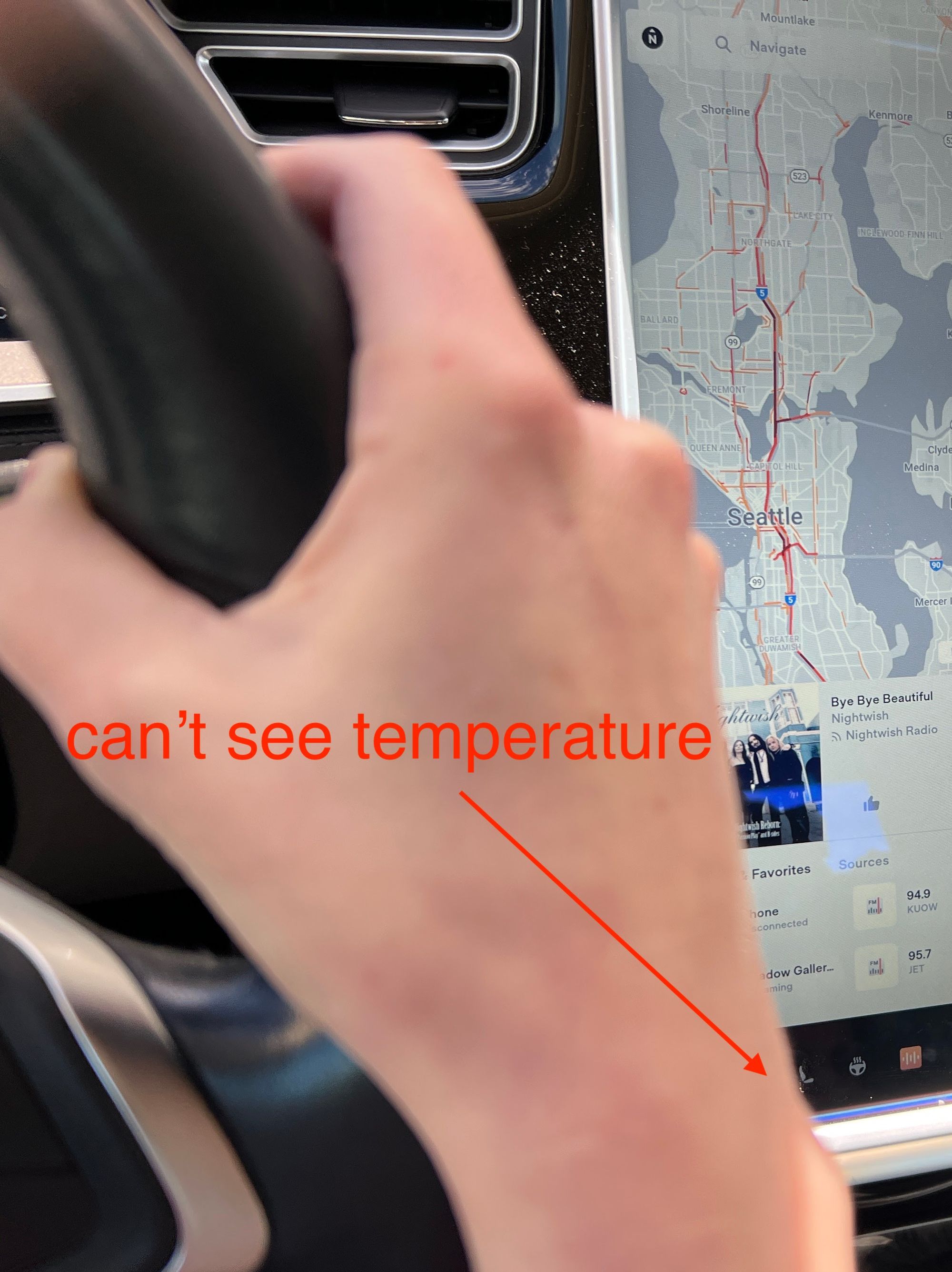
What, our users have arms? Nonsense!
This final one is such a facepalm... Previously, the temperature setting was in the center, but now it's on the left.
Guess what? When I am holding the steering wheel, I actually cannot see it anymore because my right arm covers it up. Pathetic.
Conclusion
I am sure that for newer cars that all have horizontal screens it makes sense to build a single design system instead of making a custom version for each model.
But that system has to be good! Which it is not. Too many things just don't make any sense.
And maybe the older cars should be left alone instead of giving them a half-assed UI update. I would rather have no UI update than this garbage.
Comments