Just make them different

When two different designs or products look too similar, they invariably end up confusing users.
Sometimes, it could be two different brands. Or two devices that have different purposes. Or walls that look too much like whiteboards.
My example today will be of the two boxes of cereal. They are both made by the same manufacturer, and are usually placed on the same shelf right next to each other in the store.
The crucial difference is that I love chocolate, but hate raisins. Now take a look at the packaging:
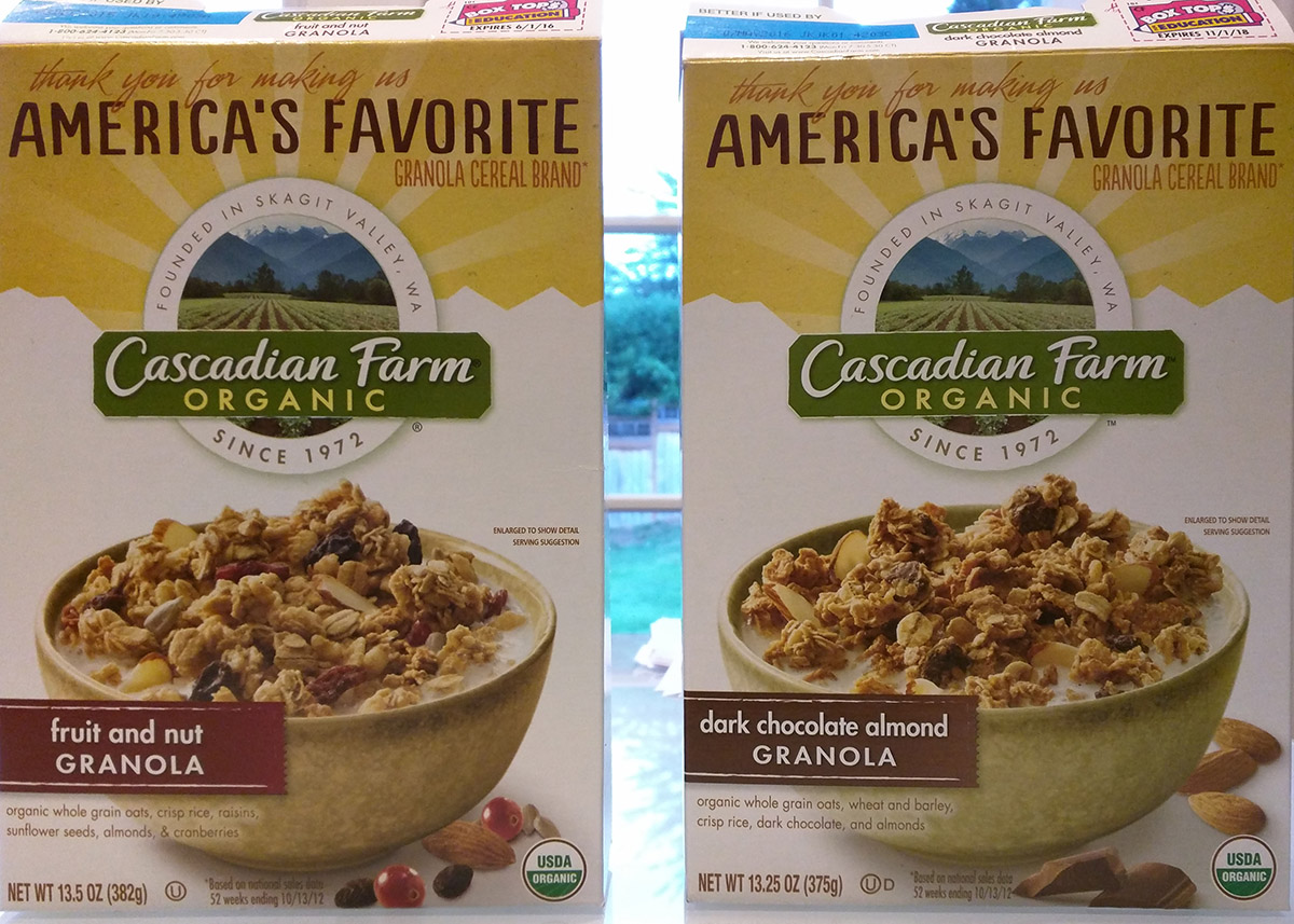
This image reminds me of the "Find 10 differences" game. Let's see how many differences I can find.
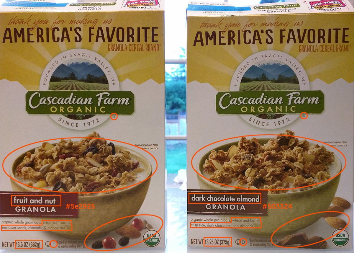
Well, that is not even 10. That is 8, including the slight difference in color of the ribbon on the left, ® vs ™, and the D at the bottom that only appears on one of the boxes.
Are these differences big enough to be noticed by a rushed shopper who already knows what the cereal looks like and just grabs a couple off the shelf? Nope.
I bought three boxes. Two of them were Dark Chocolate Almond. The third one was Raisin Fruit and Nut. So when did I notice that?
It was early morning when I opened the cereal box and poured some of the contents into my bowl. I saw a sunflower seed on top, and thought: "Weird, usually there aren't any. May be it just got in by accident since they use the same facility". I then poured my milk over it and sat down to eat. I took a bite and — eww, I tasted a raisin!
I went back to the counter and grabbed the box. Sure enough, I got the Fruit and Nut box instead of chocolate. When I put the two boxes next to each other, I could see the difference, but I am not surprised I did not notice it at the store.
The two boxes feature identical green bowls with granola in them. The color of those ribbons on which the type of cereal is written is almost indistinguishable. The company logo and the top part of the box are exactly the same.
It is understandable that they want to have a similar style for the entire line of granola cereals, but this excessive similarity actually decreases user satisfaction. It is too easy to grab the wrong box and be disappointed when you notice the difference in your plate.
Even a small change, such as making the ribbon colors more distinct, would help a lot.
EDIT: I got some comments on this post, and it was pointed out to me that I missed some of the differences in the image, so I have updated the image to include those.
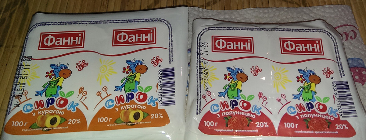
I have also received a similar comparison image for a different product, which is now included below.
Comments