Instagram's new logo

A lot of people have shared their feelings about the new Instagram logo. I'm going to share some thoughts instead.
First, let's consider the 2016 logo for a moment. I would not list it among the best-designed logos of the century, but it's plain and simple. It's pleasant enough to look at, and that's pretty much all it needs to be. It does not rise to the level where people would have feelings about it.
And to be fair, I don't think the designers of the new logo intended to stir the pot with their typographic choices. Working together in their tiny echo-chamber, they probably truly convinced each other this was the best option.
But there is one important part they missed: type has much stricter rules than any other kind of visual design. Knowing your letterforms and their history is essential to creating meaningful and beautiful wordmarks. A lot of people can tell intuitively that something feels wrong about the new logo, but they can't explain why. And I have a suspicion the team behind the design did not have anyone with a strong typography background, or worse, that person was completely ignored and overruled on the basis of being "too rigid" or "too traditional".
For this post, I have two distinct lines of thought: the first one is more around the technical aspects of the logo itself, and the second one is around possible influence of AI.
Part 1: Logo critique
In general, I see nothing wrong with moving the logo towards the sans-serif style. It is a better match for Meta's overall design language, and would probably have to happen sooner or later.
Let's consider what the logo would look like if it were just set in Facebook Sans.
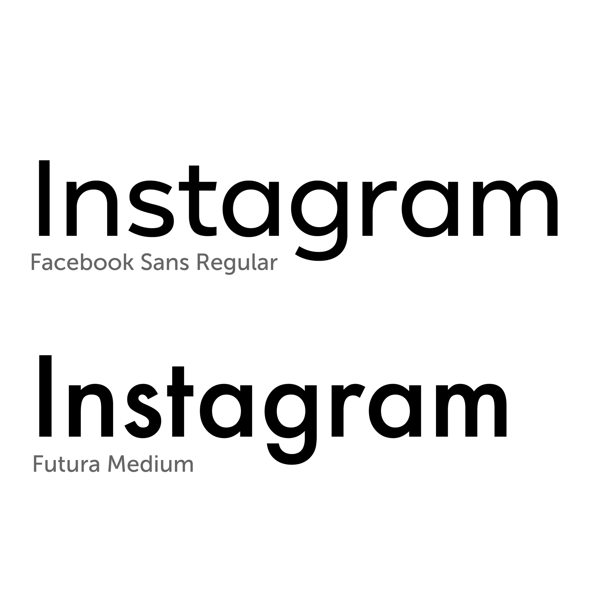
Facebook Sans is a pleasant sans-serif typeface, somewhat reminiscent of Futura, but lighter and more open. But of course such a logo would not be special or memorable, and it only takes 30 seconds to create.
So what did the design team change?
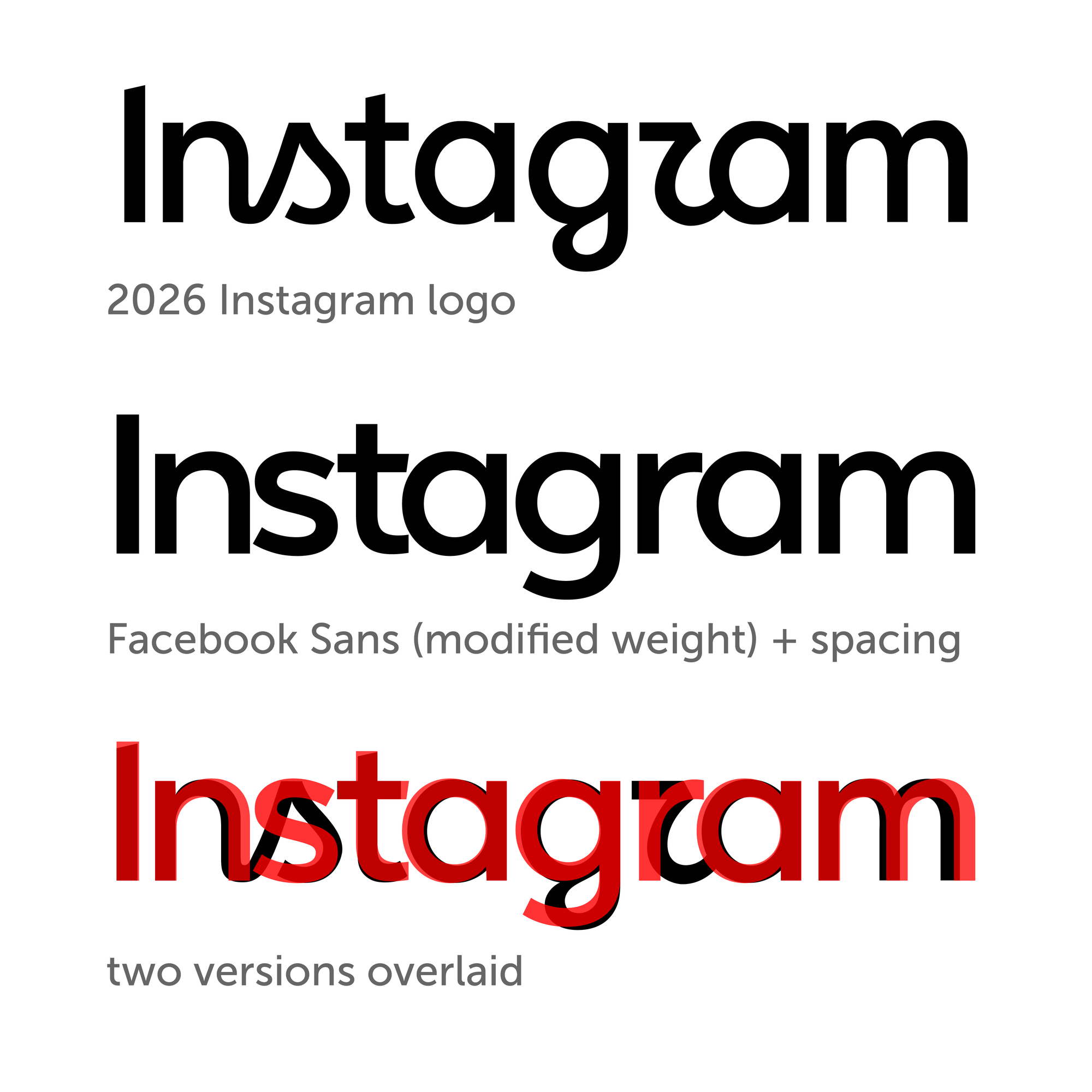
The process described below is how I attempted to reconstruct the new logo. It might not follow the exact steps the designers took, but it achieves a similar result.
I took the Facebook Sans Regular version, increased the weight (there was no weight between Regular and Bold, so I had to extrapolate), and decreased the spacing between the letters.
Then, I overlaid the result with the 2026 logo, and it was a pretty close match. The logo adds a few extra touches, such as slanting the terminals of the "I" and the "t", and making the "n" and the "m" more condensed, all of which are totally fair game.
But, there are also a few things that don't match at all (surprise!), and I am going to go into the details of each one of them below.
Basically, the team took the sans-serif version, and tried to make it look and feel more like the 2016 brush script version. And they way they did it was by introducing some elements that simply don't work with sans-serif type.
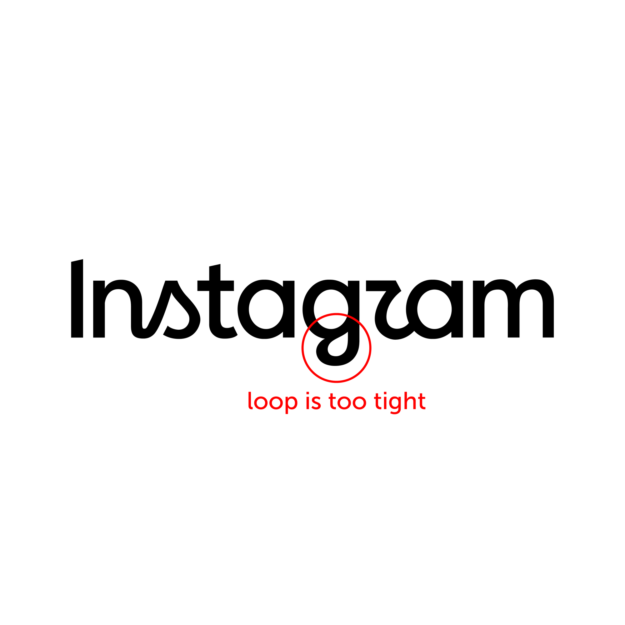
First, let's look at the "g". In the plain sans-serif option, the bottom part is open, which is what you would normally expect from a sans-serif typeface. So they replaced it with a "g" that has a closed loop, just like the one in the 2016 logo. It is out of character, but not something that would rise to the level of a "typographic crime" as an idea. The only problem is they made the loop way to tight, and that tiny closed-off space is the first place your eye is drawn to in the new design. I think they could have pulled this one off, if only they made it bigger.
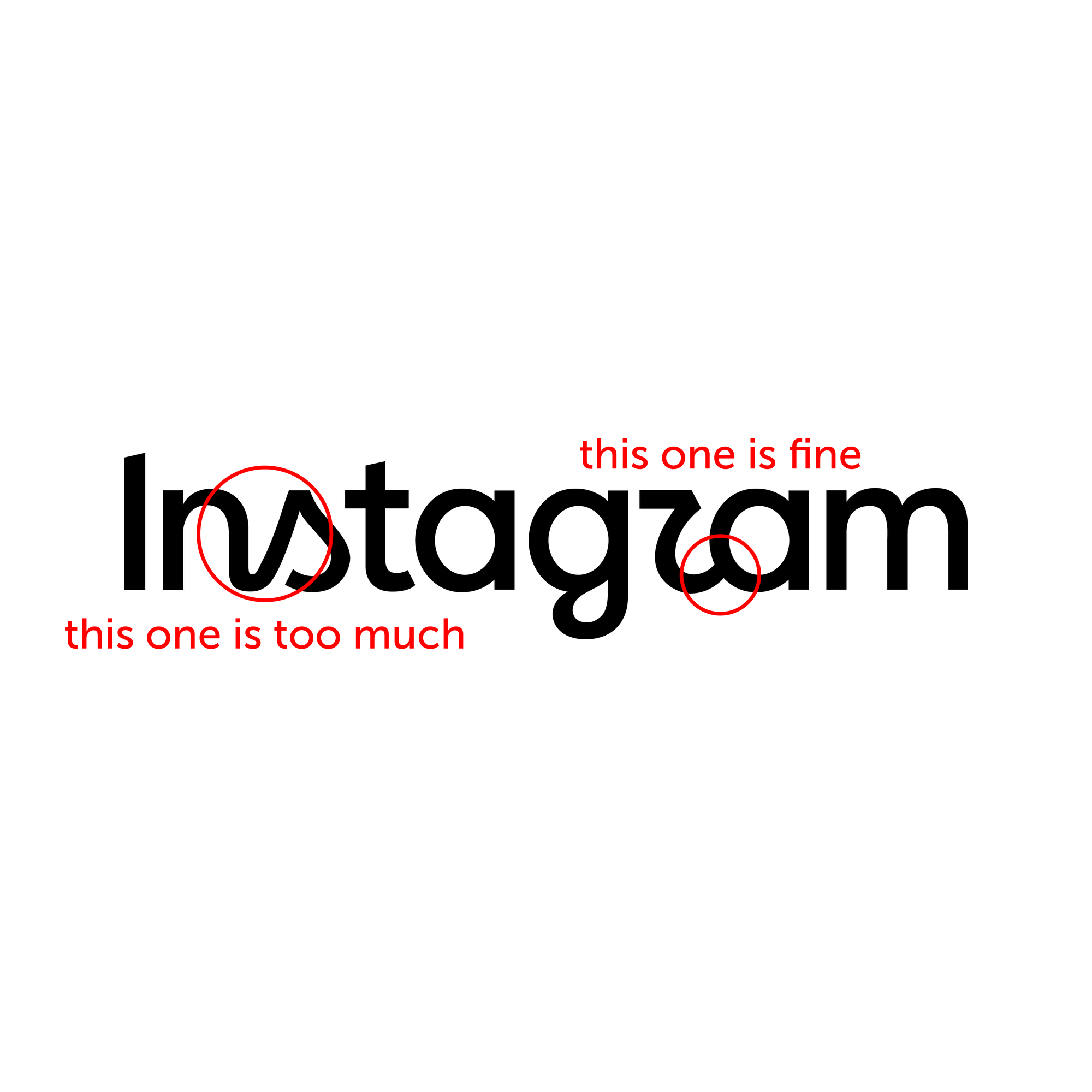
Next, let's consider the way the letters are (or aren't) connected. In the brush script version, all of the letters (except the initial "I") were linked together. This is a defining characteristic of script typefaces (and calligraphic hands).
In sans-serif type, you'd never see such connections between letters. There are plenty of ligatures, some of which can be quirky and creative, but they are only dictated by the uniformity of spacing between the letters. If something like "ff" was not a ligature, there would just be an ugly gap between the two "f"s. This rule goes all the way back to calligraphy. I would argue that the Foundational hand can be considered as the basis for most modern "roman" serif and sans-serif typefaces, and the same ligatures can be traced back to the early manuscripts. The letters might touch or slightly overlap, but they don't have additional strokes connecting adjacent letters.
And so, following that logic, I can see how "r" and "a" may have ended up touching (assuming for the moment there is no concern over the shape of the "r"). There is no connecting stroke between them, just an overlap to create uniform spacing. This is fine.
However, the "n" and the "s" are an entirely different situation. The steep diagonal that connects them has no counterpart anywhere else in the logo (and probably in the hypothetical typeface based on it either). It is completely out of character, and that is the one thing that is a big no-no for calligraphy and typography. Letterforms can be unique and funky, but they always need to have a connection to the rest of the typeface. They need to feel like part of the family. And this "ns" connection, with a sharp kink at the bottom, and an alien diagonal, simply doesn't fit with the sans-serif. I can't find any excuse why it should ever exist. I can only see the "reason", which was to "keep the feel of the old logo". But it's not the right solution for satisfying that requirement.
The "s" was turned into a script form to keep this connection. It also doesn't fit in with the sans-serif, but I could forgive it if not for the diagonal in front of it. There probably was a subtler way to keep it "weird", but acceptable.
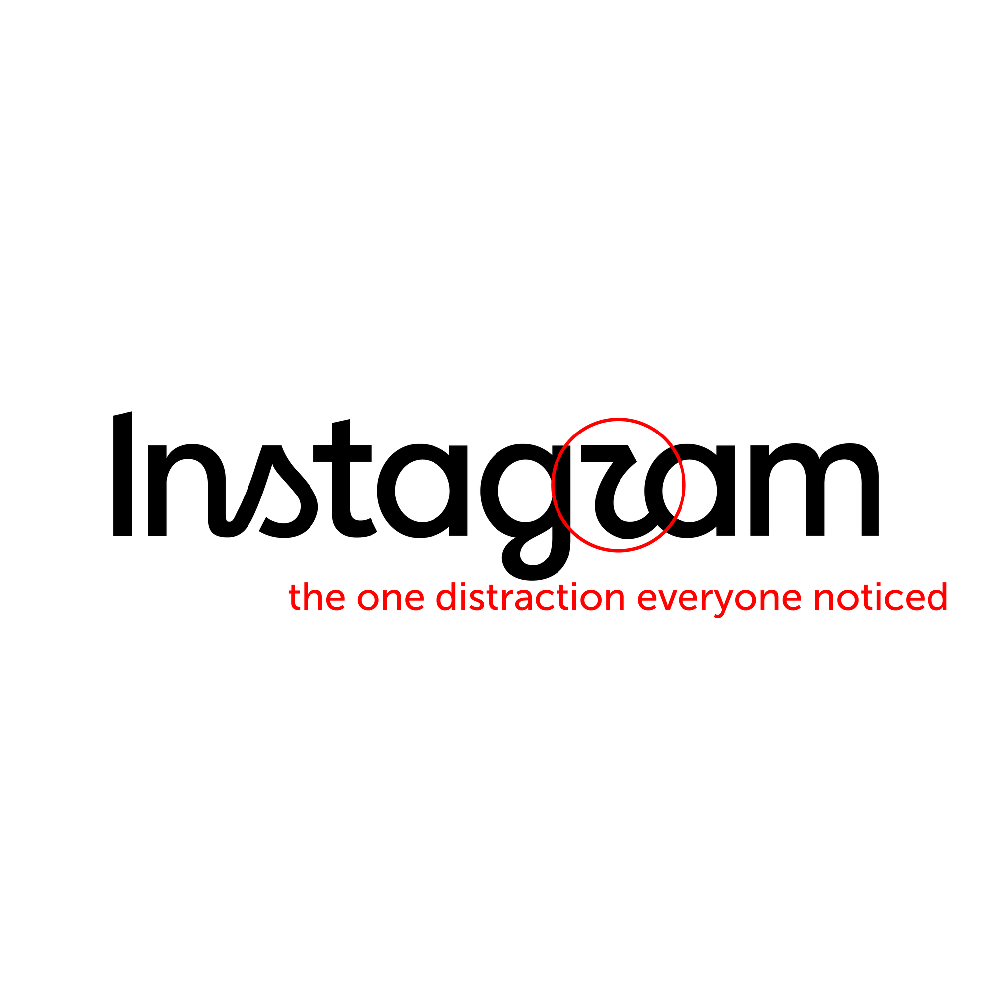
Finally, let's talk about the elephant in the room: the "r". It's got a lot of comments from just about anyone. And this again goes to illustrate the point that if you do something wrong with your typography, people will know it even if they aren't typography experts. The reason for this is because type is structured and predictable. People like patterns. When the patterns are broken too much, it feels upsetting, because the harmony is lost.
This letter is what makes me think there was nobody with typographic background on the team, or that they were silenced. There is absolutely zero precedent for having this shape of the "r" in any non-script calligraphy or typefaces. There is no historical reason for it to look this way.
In fact, the only thing that is even somewhat close to it is the "R rotunda", turned upside down. But then it just looks like a cursive "r" anyway.
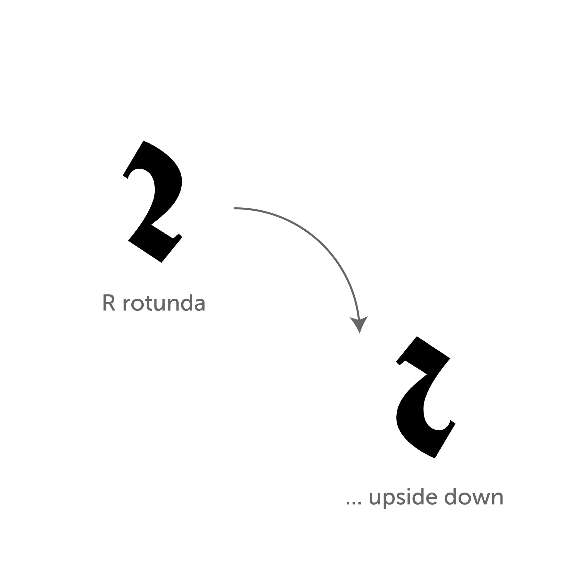
So why is it bad? It's unattractive, and it doesn't fit the rest of the letters. It violates typography's predictability contract, and does not make up for it with a "wow" factor. And so it has no reason to exist beyond the design exploration. Was it worth trying? I think it was, just to see that it wasn't a good fit. But it should not have been kept. If you want my 2 cents, I don't think it reads as a "z", it just reads as a crappy "r".
And one more funny thing. Last night, I was flipping through David Harris' "The Calligrapher's Bible", and I came across a shape that looked almost identical to the new Instagram "r". Check it out!
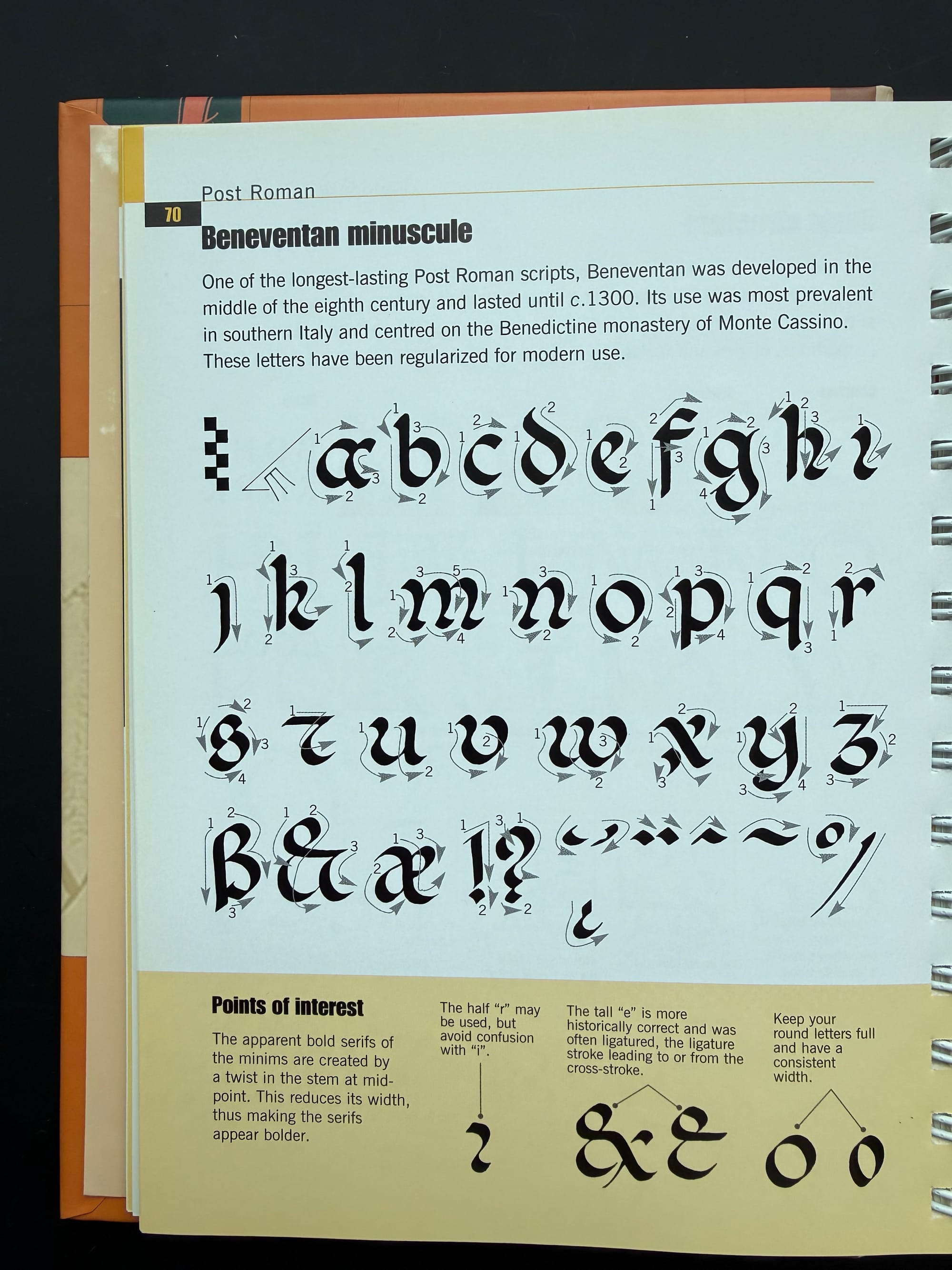
Second letter in the second row from the bottom... Look closely... Oh wait, it's a "t", not an "r"! To be fair, it's also not a historical form, but an adaptation by the author, but it doesn't help the case of the weird "r". It's still bad.
Part 2: What role could AI have played in creating this logo?
Now that I have covered the "what" part, I still have a lot of questions about the "why". And the more I think about it, the more inclined I am to hypothesize that AI was involved in this design, and perhaps trusted more than it should have been.
AI models are notorious for being awful with type inside images. You ask them to generate a picture with some text, and you get back extra letters or words, weird letterforms, and things that generally don't make sense. While it's true they have improved since the early days, I got some exciting glitches from the latest ones that I was playing with for writing this blog, so this is far from a solved problem.
I gave the same prompt to Claude, ChatGPT, Grok, and Gemini (using their respective latest premium models): given the 2016 logo, and the sans-serif version set in Facebook Sans Regular (provided as image uploads), imagine what a new logo might look like, assuming it's based on the sans-serif look, but still evokes the old brush script version.
Some models took more coaxing than others to actually get what I was asking for (Claude flat-out refused; others would frequently output either the original, or the sans-serif image with no modifications whatsoever), but when they did produce results, I found them to be quite telling.
I'll start with what Claude said. Since I wasn't able to get it to output an image (due to Anthropic's policy restrictions), I asked it to explain to me in text what it thinks it would look like if an AI had created a new logo based on those 2 images. Here is an interesting quote:
What I'd deliberately not do: add stroke contrast across the board, italicize the whole word, or reintroduce a swash. Those are the obvious AI-ish moves — they read as "script + sans averaged together" rather than as a designed translation, and averaging is exactly the failure mode worth naming in your project.
So Claude thinks an AI would try to come up with an "average" of the two images. Is it right? Let's see.
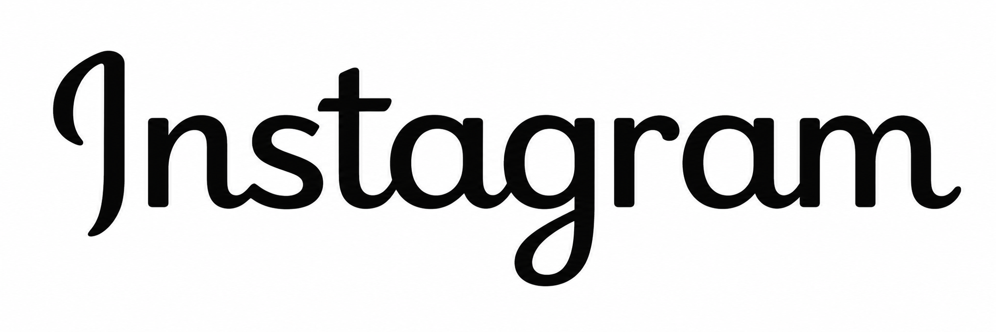
Funny enough, this is exactly along the lines of what ChatGPT did! As you can see in the image above, it kept the connections between most of the letters, created some stroke contrast, and added a swash (aka loop) on the "g". The things I'd like you to keep in mind about this version as we go through these:
- Look at the connection between the "ns".
- Look at the loop in the "g".
- Look at the angled top terminal of the "t".
And, as a side comment, this is actually not bad, coming from an AI. It's not amazing, but I don't feel the compulsion to throw it out either. I think it could be taken as a starting point for a good design exploration.
To do one more iteration, I pushed ChatGPT to make it "more sans-serif", and the result is below.
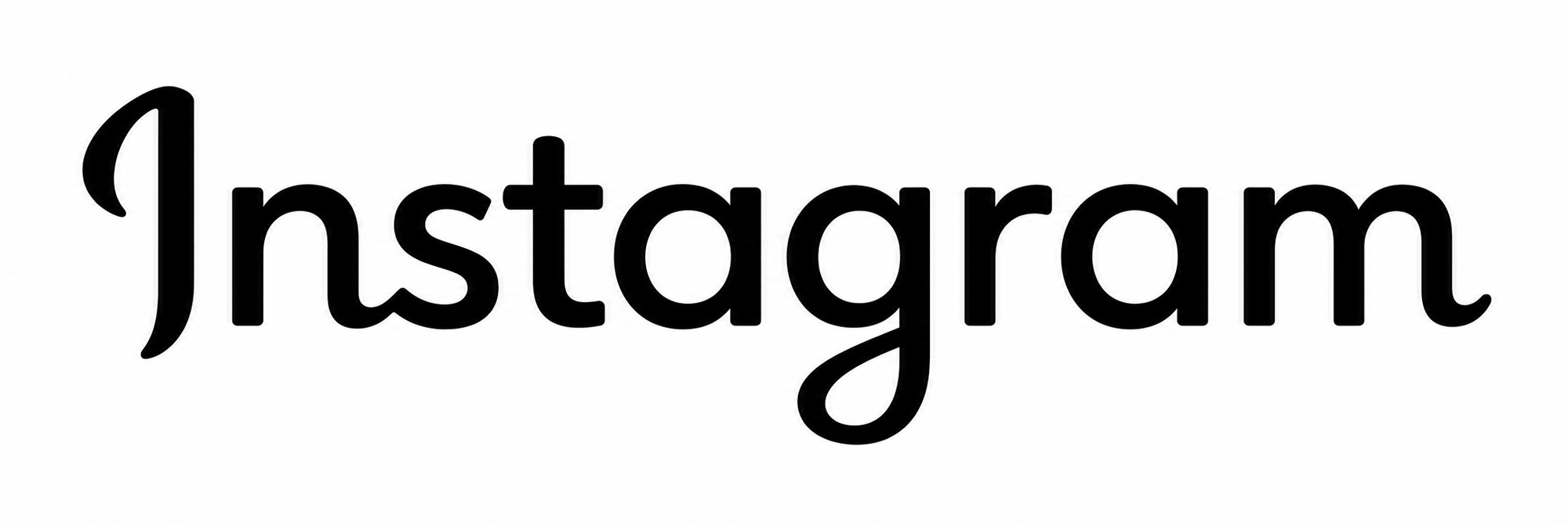
It looks less attractive than the first version, but there are some interesting things that it retains:
- The "ns" still has a connection (now the only connection in the wordmark).
- The "g" still has a loop.
Next in my lineup is Grok. It didn't do an amazing job, but I still think the result is valuable. Check it out, just like Claude had predicted, it italicized the whole word!
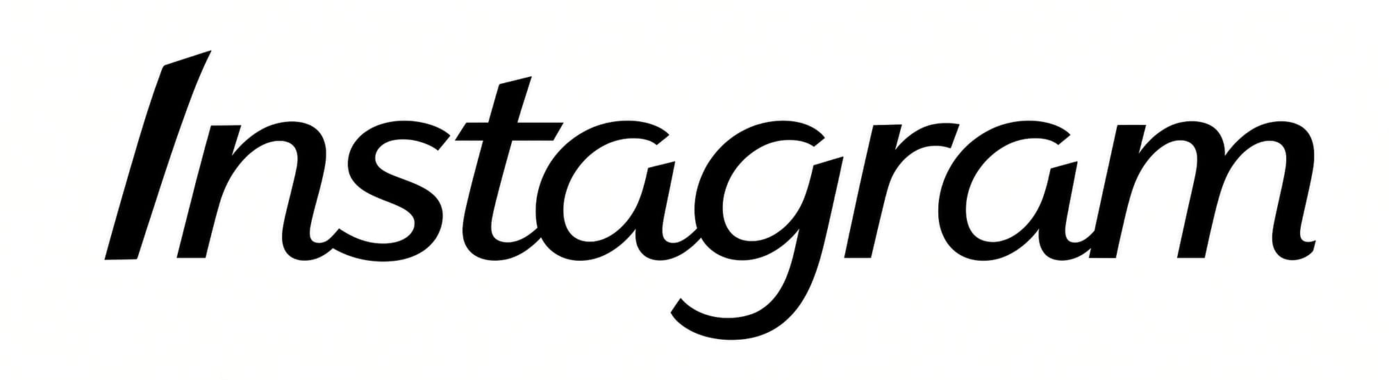
Beside the fact that this isn't too attractive, a couple of things to note:
- The "I" and the "t" have slanted terminals.
- The "ns" is connected.
I really tried to make Grok output something more interesting, and in a way I succeeded, although it's objectively even uglier (the "a"s aren't even the same!).
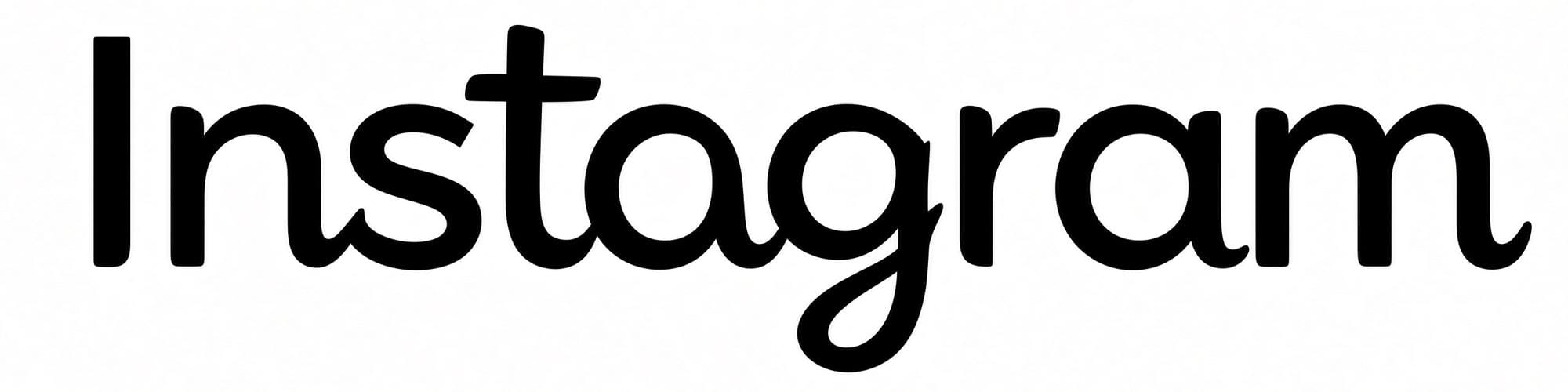
For this image, the points of interest are:
- Connection between "ns".
- Loop on the "g".
I am sure by now you are starting to see the same pattern that I am seeing, but let's round it out with Gemini's creation. I had started out trying to use NanoBanana2, but then I think it just switched itself to Flash, and then I manually started a new chat with Pro, so I have no idea which model is responsible for the images below. As an aside, Gemini was by far the most annoying AI to use because it kept coming up with images that were just the old logo filled with a gradient of Instagram's brand colors, and would very frustratingly not follow my instructions at all. Also, when I tried to download the full-size image, it was not the same as the preview (it was actually much worse, with weird unfinished strokes). That much for Gemini...
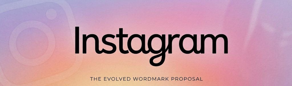
This is the first output I was able to get out of Gemini that actually followed my prompt (never mind the weird colors, I never asked for that). It's similar to what ChatGPT came up with, but slightly worse. The loop on the "g" is particularly ugly. But hey, it tried! As per Claude's prediction, it has a swash, and a tiny bit of stroke contrast (the connection between the "g" and the "r").
What I'd like you to take away from this image is the following:
- The "ns" is connected.
- The "g" has a loop.
I wasn't able to get Gemini to actually iterate on the design, so instead here is a separate second design it came up (after a further 30 minutes of what felt like hitting my head against the wall). Again, never mind the weird stuff around the logo, or the colors, it was never part of what I had asked for.
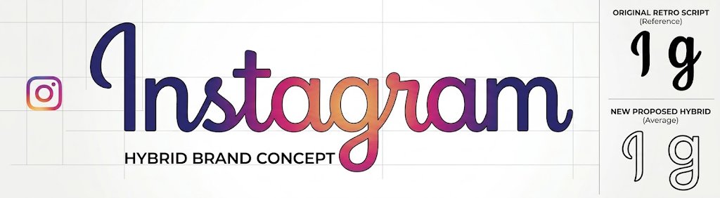
This looks like an "average" between the two versions. It's the only one that leans towards keeping the "s" and the "r" as cursive instead of sans-serif. The key features are once again:
- The "ns" connection.
- The loop on the "g".
So, what does that leave us with? Claude was mostly right in its prediction of what an AI version of the "average" logo would look like. All of the versions above have some of the elements it predicted. But what is even more interesting, they all have something in common!
Every single one leaves "ns" connected, and 5/6 add a loop on the "g".
Remember the things I complained about in the actual 2026 logo? The only one that is missing from these AI outputs is the weird "r". Which kind of does look like an AI hallucination anyway, given how wildly off-base the shape of that letter is.
Why do AIs insist on keeping the "ns" connected, and on adding the loop to the "g"? Nobody really knows. It might be in the training data. It might be the bias of trying to "average" the script and the sans-serif versions. One might suppose it's just "common sense", except it's not, since sans-serif typefaces do not have an "ns" ligature. Whatever it is, though, it's very consistent.
With the current push within most tech companies to use AI more and more heavily, it's almost inconceivable to me that it would not have been involved in Instagram's redesign. And it probably should have been, to help widen the realm of explored possibilities. Some of the ideas I saw with my generated images were definitely worth a deeper investigation, or were a great illustration of "eww, don't do that!".
The important part, though, is not whether AI was used in the making of something. It's whether human judgement was properly applied at the end to decide whether what AI had created was useful, and how much of it should be carried forward to the final product.
I wasn't there, so I will never really know, but it feels like the team behind the logo took AI suggestions a bit too seriously, and incorporated into the final result the elements that no sane human typographer would ever hallucinate.
Comments