Decorated marriage certificate

One morning, I got a pleasant surprise in my inbox: instead of the usual spam submitted through the contact form, someone was actually interested in hiring me to do their marriage certificate!
As we got on a call to discuss, I learned that they liked my writing style for its simplicity and legibility, but they also wanted to add a watercolor painting of a live oak at the top, and a floral border around the certificate. While I felt very comfortable doing the calligraphy part, I was a bit unsure about the amount of painting, since I would not normally consider myself a watercolor artist.
We had agreed that I would send my prospective clients a sample of how I might paint the oak, and if they like it, we will move forward, else we will have to decide whether they want me to do just the writing, or hire someone else to do the whole project.
I will freely admit that I had never painted an oak before, but I watched some watercolor tree tutorials online, and as long as it did not have to be fully realistic and very detailed, I figured it was worth at least trying.
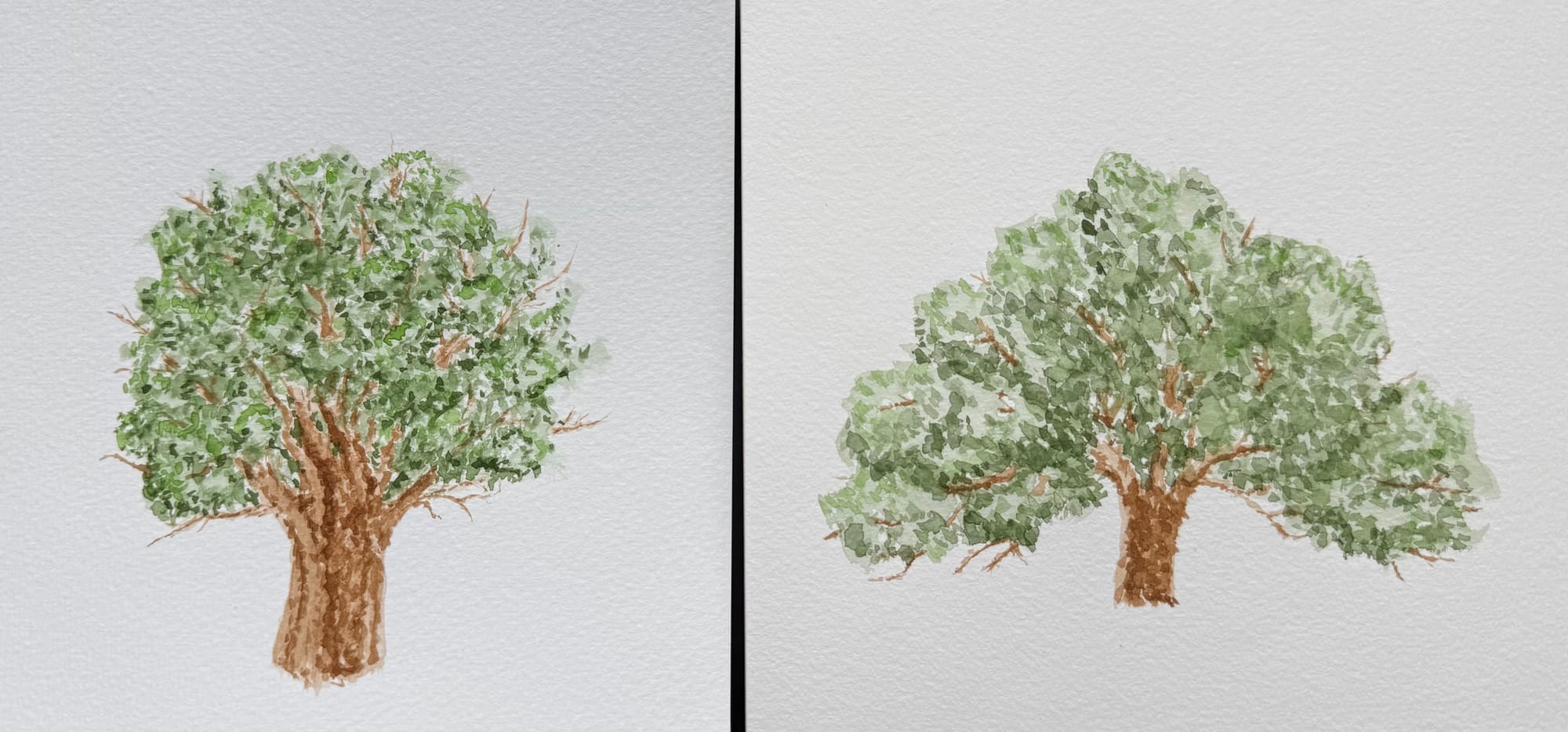
The one on the left was attempt #1. It has a bit more detail, but it's not quite the right type of oak (also, let's admit, it kind of looks like broccoli). Further image search revealed that a live oak is typically a lot more wide, so for the #2 I made an adjustment to more accurately reflect the shape, but the image itself is less finished.
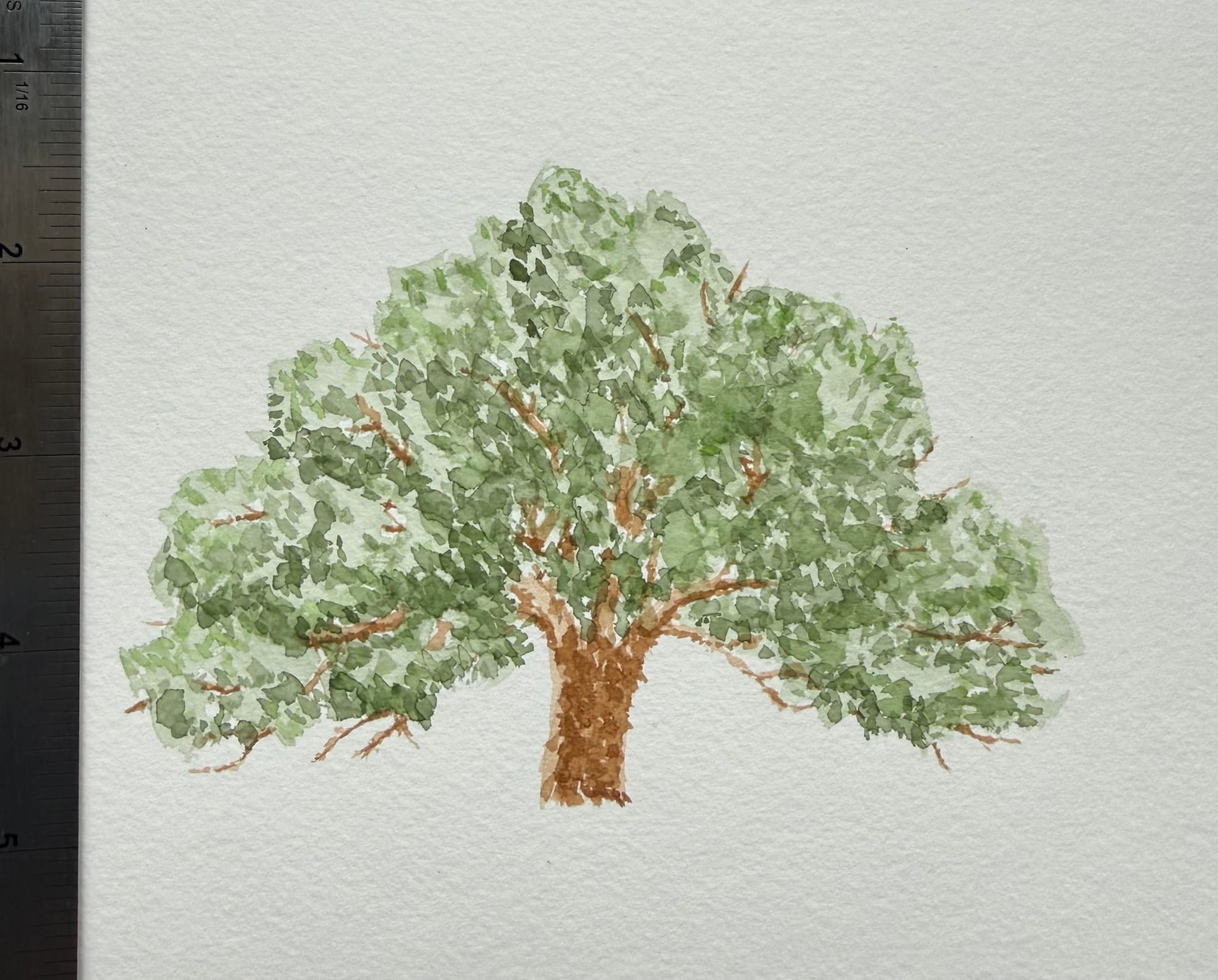
To give you a better idea of scale, here is oak #2 next to a ruler. My goal was to make it more or less the same size as I would expect to be on the final piece.
The clients said the oak looked reasonable, and we decided to keep working on the project together. They sent me some examples of certificates they liked, as well as the list of flowers they would like to see on theirs. While they were working on finalizing the text, I set to work painting sample flowers to make sure we were aligned on what those would look like.
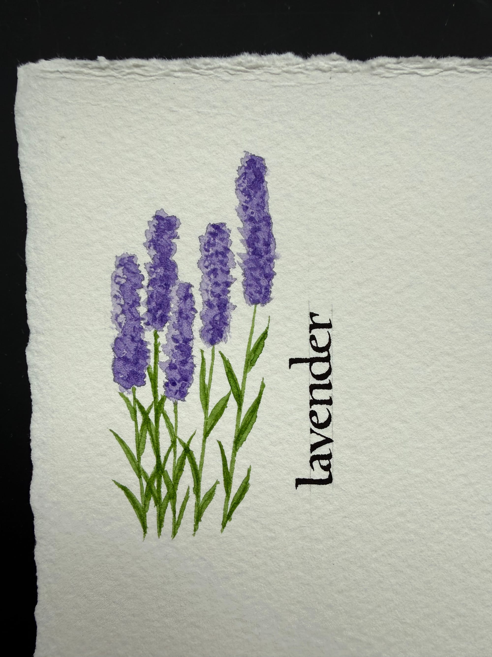
I started with some lavender, which was probably the easiest to paint.
Then, over the next few days, I expanded the flower collection.
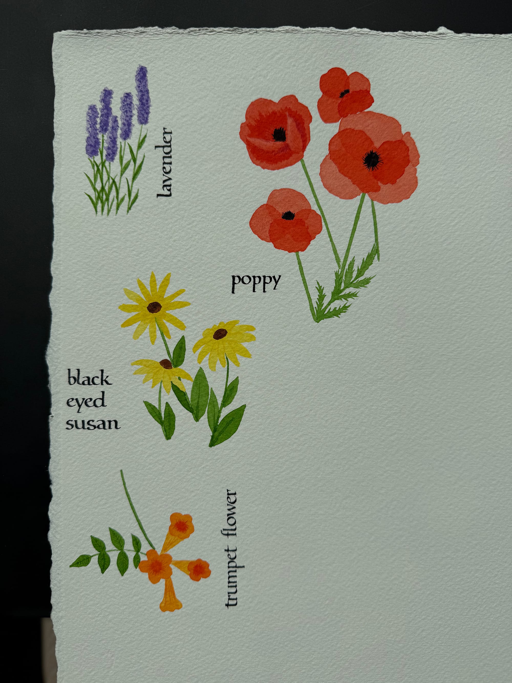
Finally, I had all the flowers on the paper, so I could make sure I knew the relative scale for their size, and also could see which colors worked (or didn't work) together. For example, I can already see here that the pink for cosmos flowers is too bright, and doesn't fit with the rest of the colors. I ended up not using the "manganese blue hue" (the brighter blue) for the same reason.
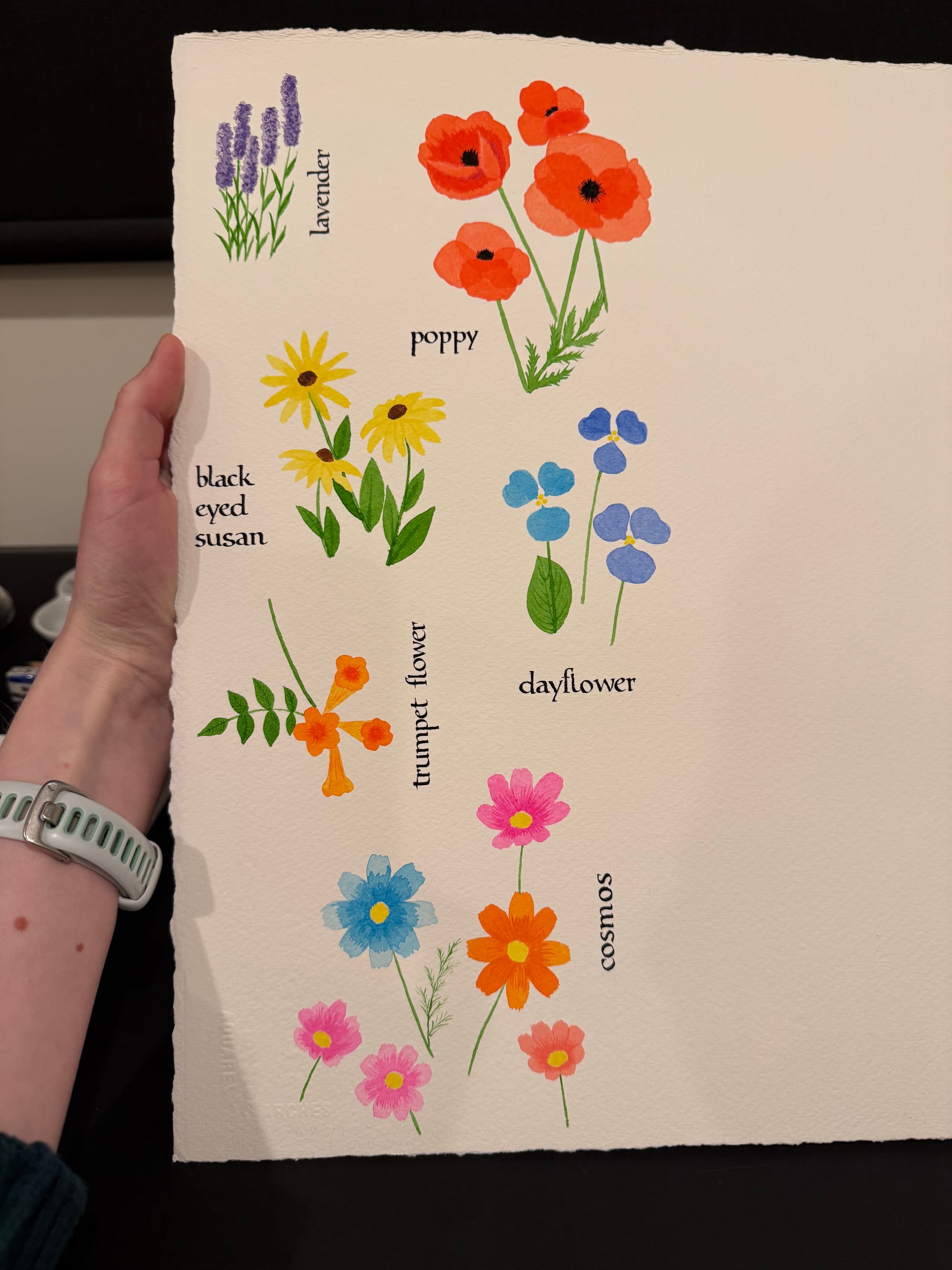
Once that was done, I made a mockup of the layout and size. I used the text from the certificate I had made for my friends Tim and Jo, but replaced the date and the names (I find it very convenient that Palatio is a pretty close match to my writing, for being able to mock things up this way). I also showed the size that the clients requested (24x36") vs a more standard half-imperial (22x30").
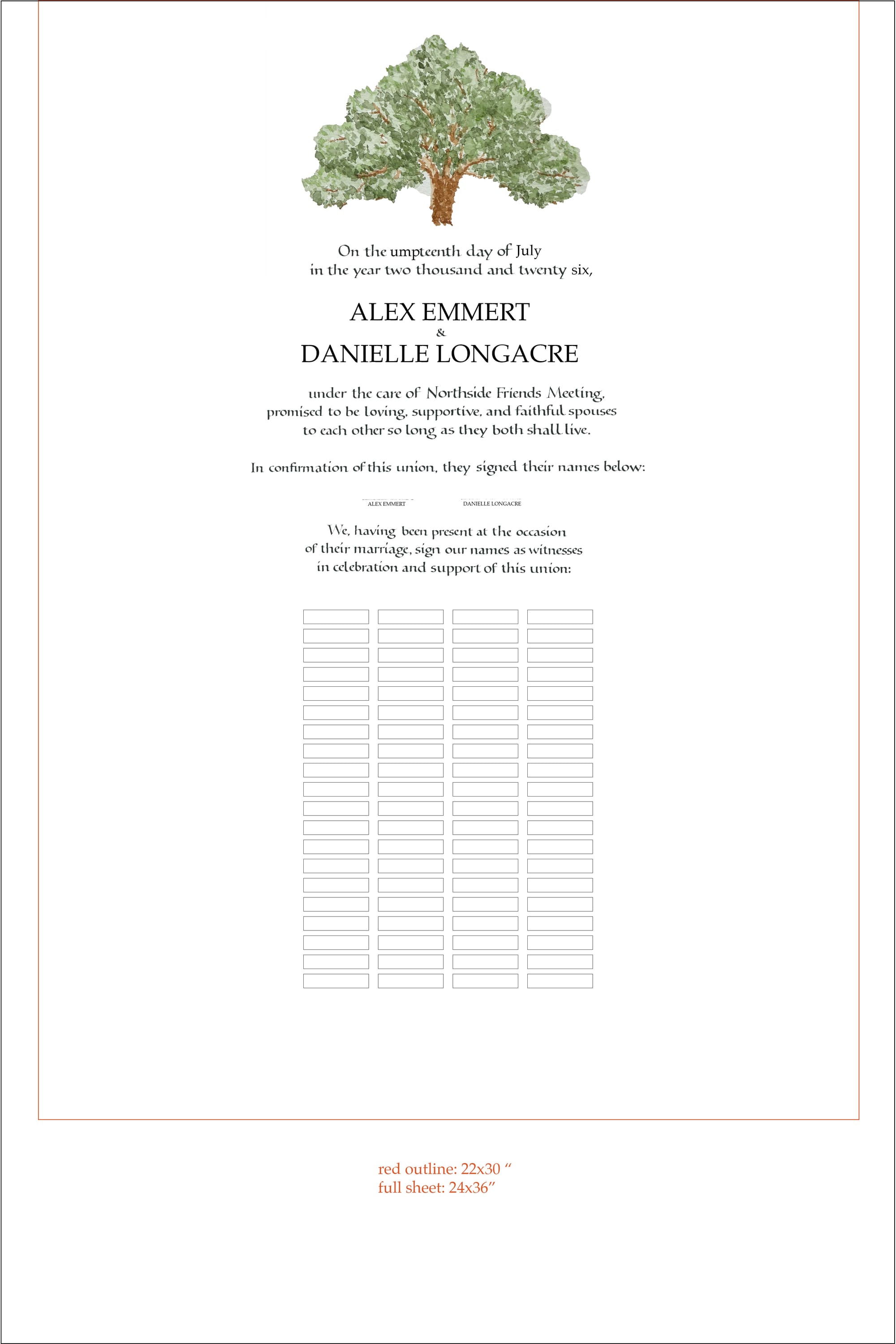
If they still genuinely wanted to move forward with the larger size, I would of course have made it for them, but I have to admit I was relieved when they agreed to a smaller size. Paper typically does not come in 24x36" size, so I'd have to get 30x44", and then trim it down. I went to all the local stores in Seattle, and nobody carried anything above 22x30" (except for rolls; but roll paper would not be thick enough for this project). I could get some online, but the minimum order was 5 sheets (at $30 per sheet), plus ~$150 in shipping (because it's huge). To be fair, nobody in Seattle carried Fabriano watercolor paper anymore anyway, so I did eventually have to order more online, but at least it wasn't as much of a sticker shock for a smaller size. I tried using Arches (which was available locally), but it's just not the same. It might be great for watercolor painting, but there are too many stray fibers that get caught in the nib, and make writing a pain.
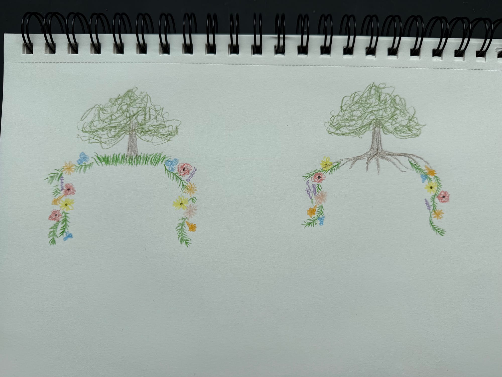
As part of the layout considerations, I also thought about how I would connect the oak to the floral frame, and I had 2 ideas: have oak roots that morph into vines, or just add grass at the bottom, and have the flowering vines come out of that. Spoiler alert: the final ended up being neither of the two, but it was a useful exercise nonetheless. If I didn't sketch it out on paper, I would continue having this perfect, but impossible version of the painting in my head.
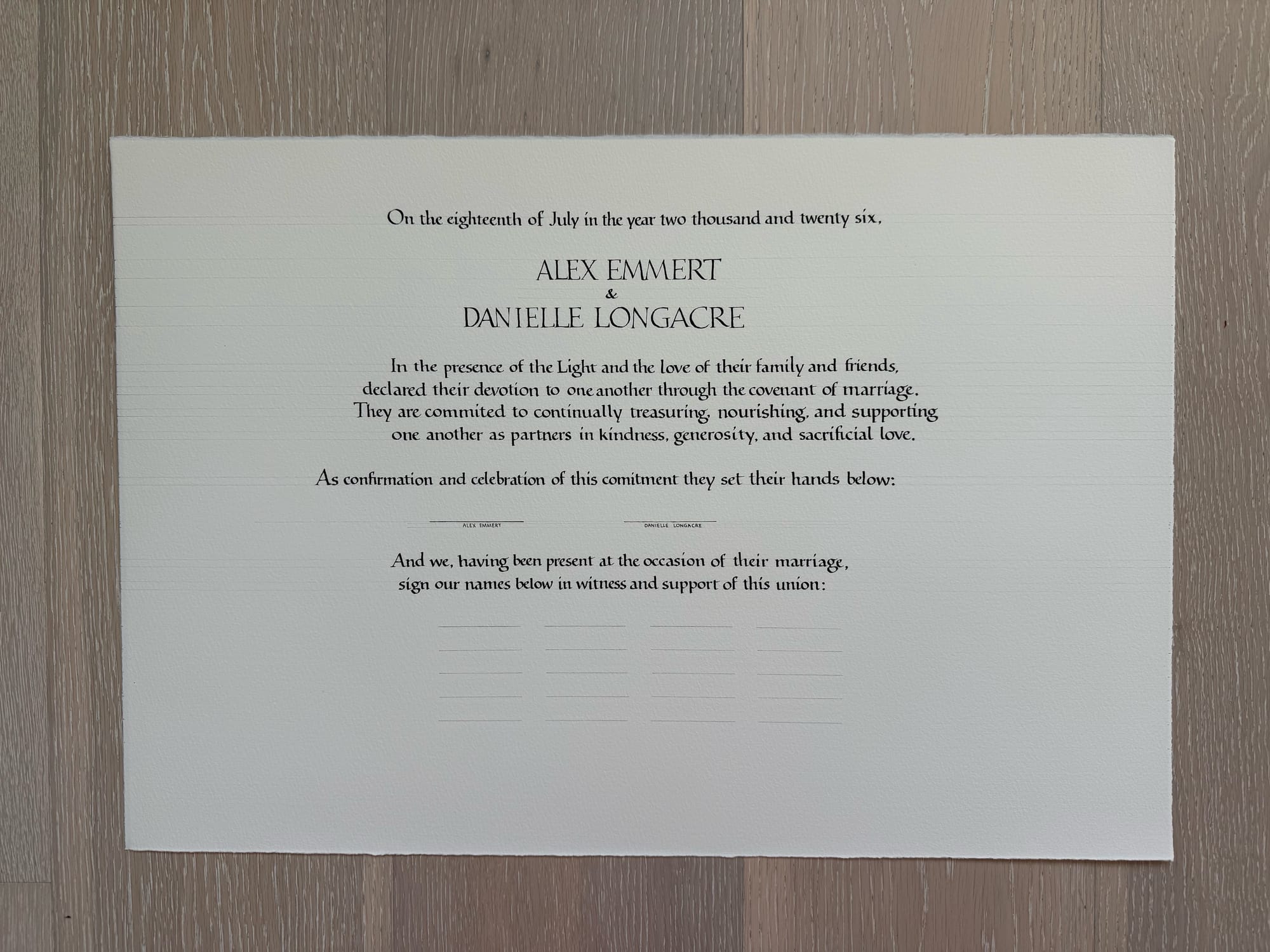
Then, I moved onto making a quick draft of the actual text my clients sent to me, to make sure I had the spelling right (managed to misspell the words "committed" and "commitment", in different ways), and that the layout structure matched their expectations. The writing is purposefully not perfect, I was writing a lot faster than I normally would. The alignment is also off, since this is the first time I wrote this text, and I was guessing at what it might looks like when I try to center it.
I used a smaller sheet of paper for this, and only showed a small portion of the planned signature lines.
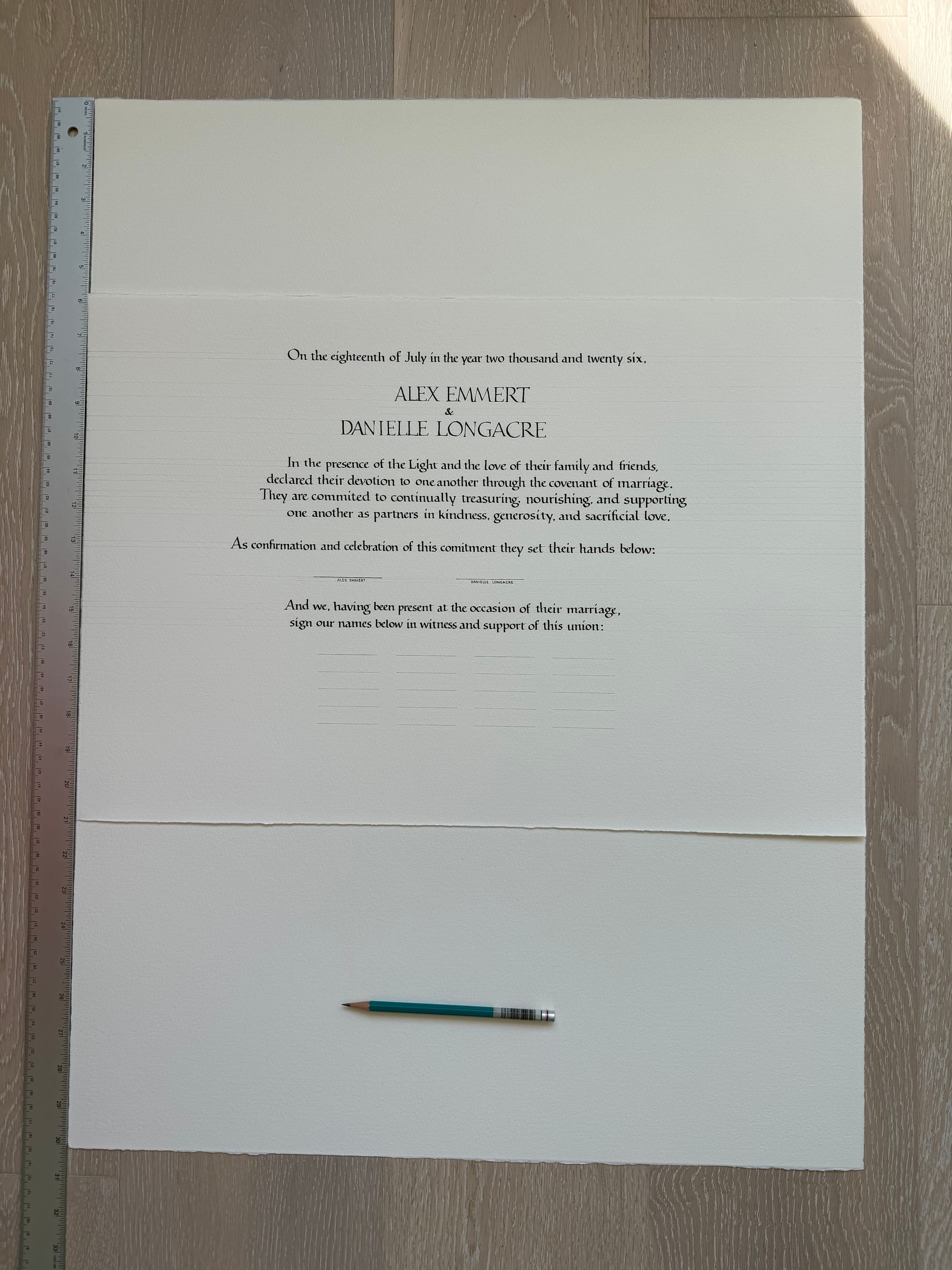
I also showed them how it would be positioned on the actual sheet of paper, with ruler and pencil included for scale.
I then proceeded to write the text out on the final sheet of paper. I added some guidelines to make sure things were better centered this time around.
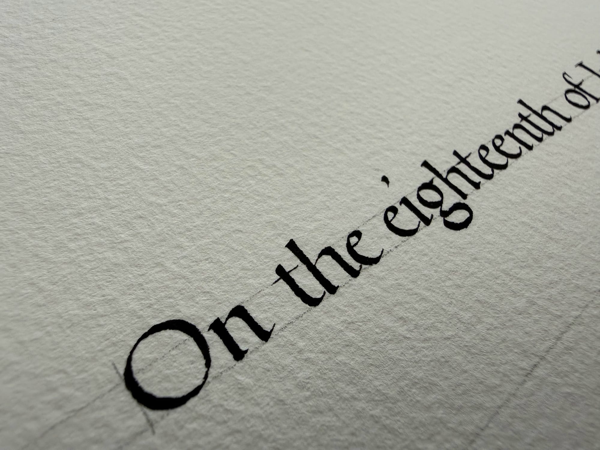
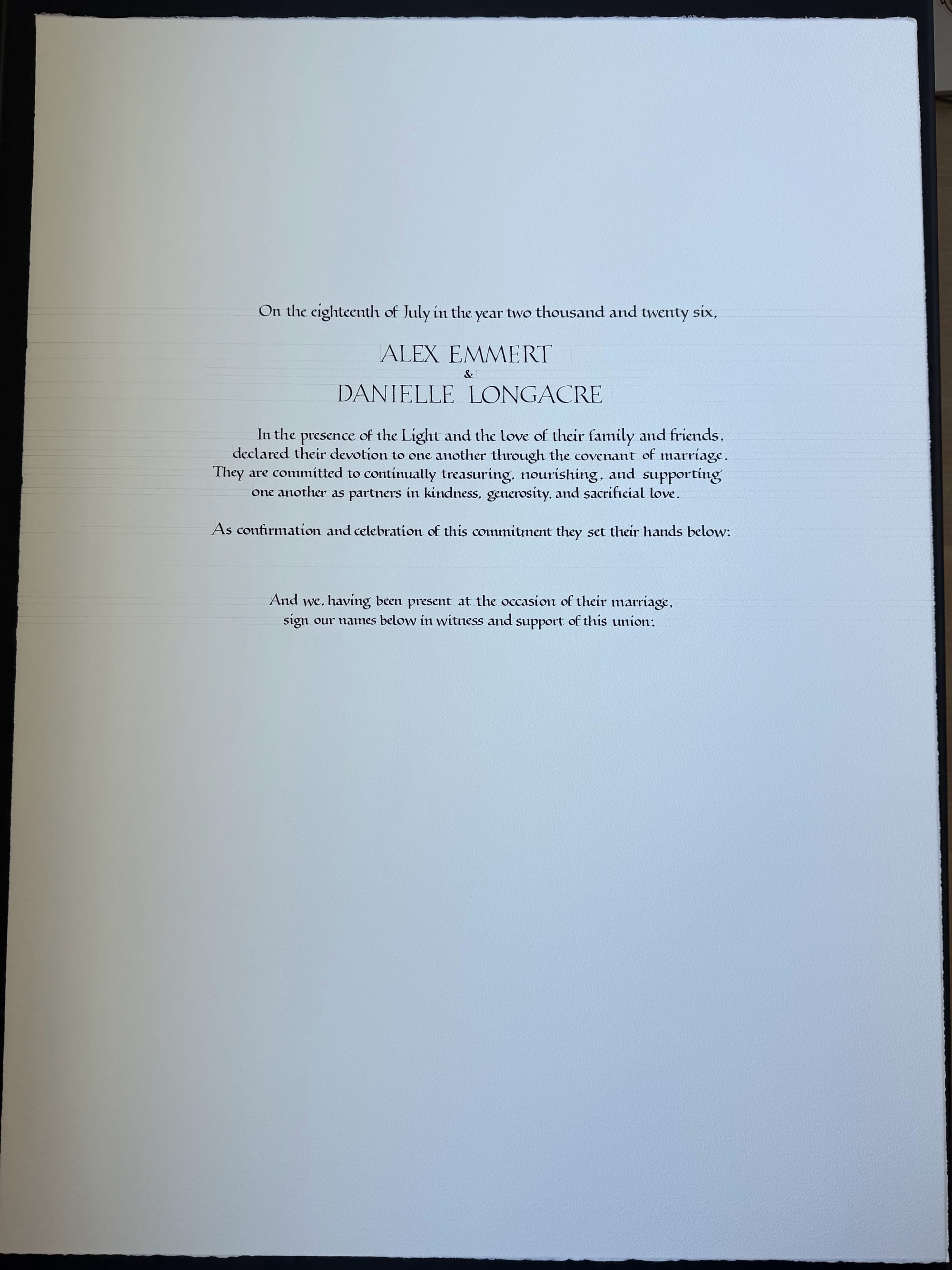
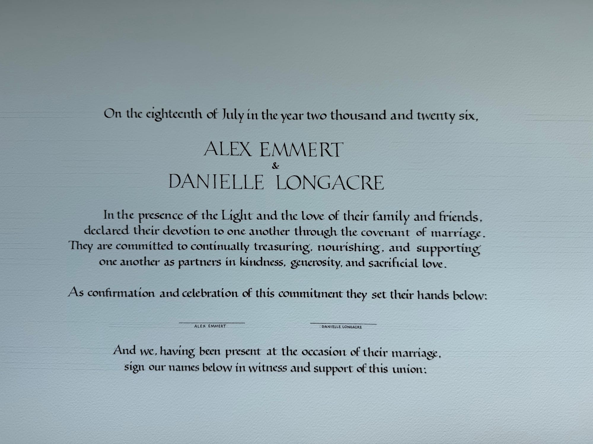
Centering is hard, and I didn't quite nail it in this one: some of the lines are a bit off. I was happy enough with this version, and thought the frame would help draw attention away from any alignment issues, but I was asked to do it over, so the second time around I had a "cheat sheet" with the same text set in Palatino taped under my writing. This helped ensure that the writing width was perfectly consistent with the typed text, and thus better centered.
And yes, I did write the first version on my last sheet of good paper, so I had to order more to do the second one. Fortunately, I had planned ahead for that possibility, so I only had to wait for a day for the new paper to arrive before I could get back to writing.
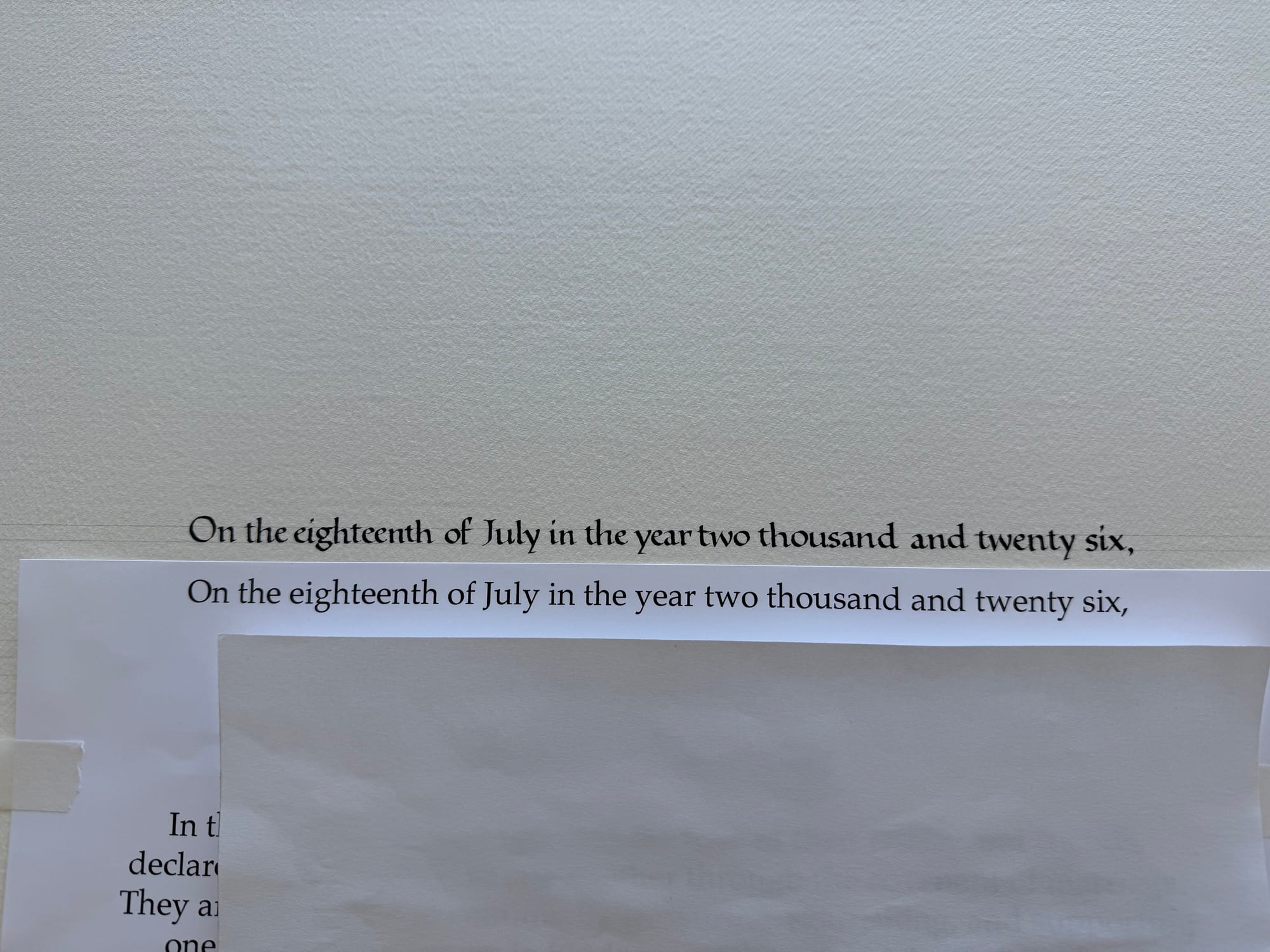
Below is the finished version #2.
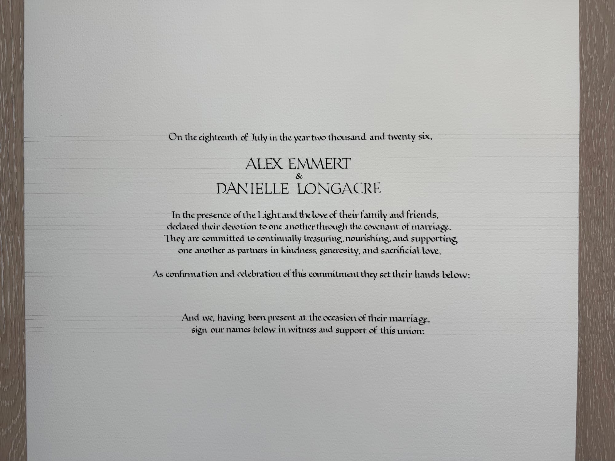
The two versions together for comparison:
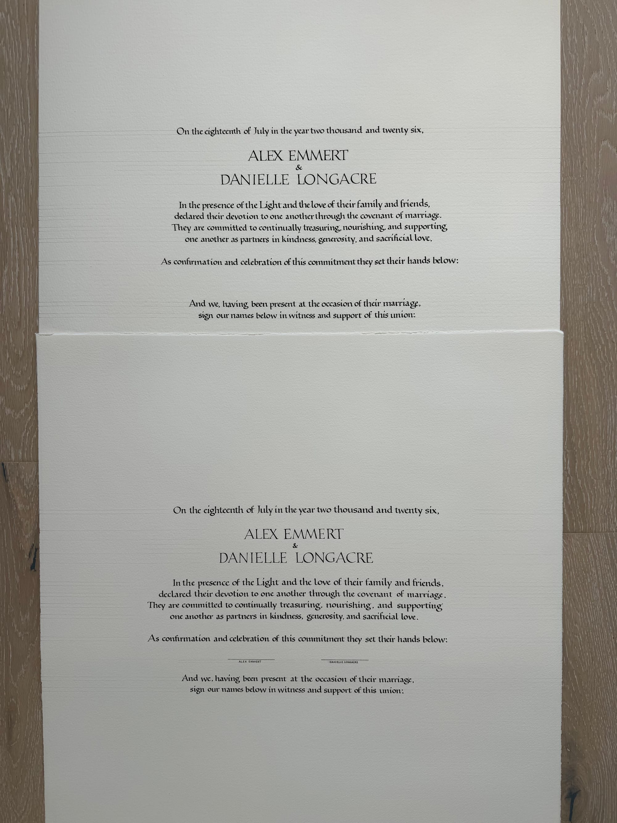
While the two versions look nearly identical, if I am to be honest, I still like the #1 better, even though it's not quite lined up. It's hard to say exactly why, but I have this feeling that when I was trying very hard to keep the perfect width, the writing ended up looking more mechanical. It's not sloppy or worse quality than the first one, it's just... different. A bit more rigidly structured. But in the end, the only thing that matters is the clients liked it better, so that's the version they get. I get to keep the version I liked for my archive :)
Now, with the "easy" part out of the way, and just over a month remaining until the wedding, it was time to get to painting, this time for real. I definitely was anxious that I would do something stupid, and ruin the piece, and have to write it all over again a third time, but fortunately that did not happen.
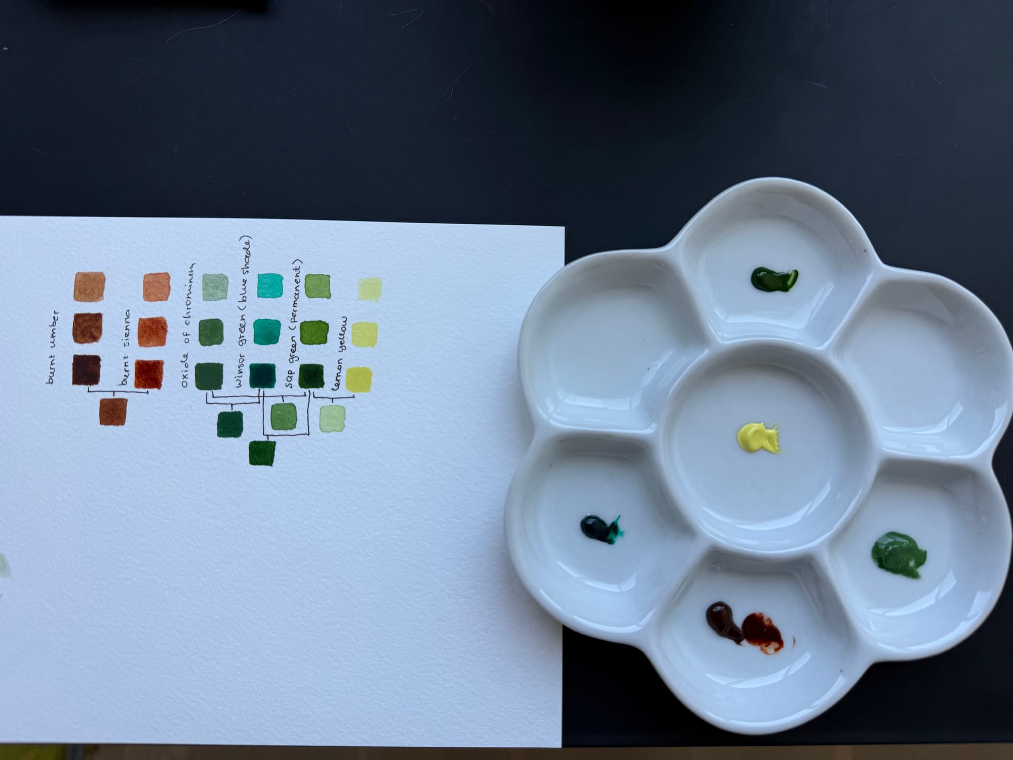
I had gotten some critique on my original oaks, and a suggestion to use more yellow for the highlights, and more blue for the shadows, so the foliage looks more realistic. I also felt like the trunk in my original explorations was too light, so that had to be adjusted too. I tried different combinations of the colors I had to see how I could best mix them to get the desired effect, and I landed on doing burnt umber with a touch of burnt sienna for the trunk, sap green for most of the leaves, mixed with lemon yellow for the highlights, and with winsor green (blue shade) for the shadows.
I then painted a draft oak above the rejected version of the text:
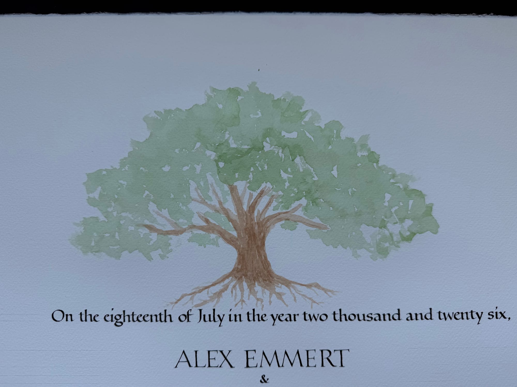
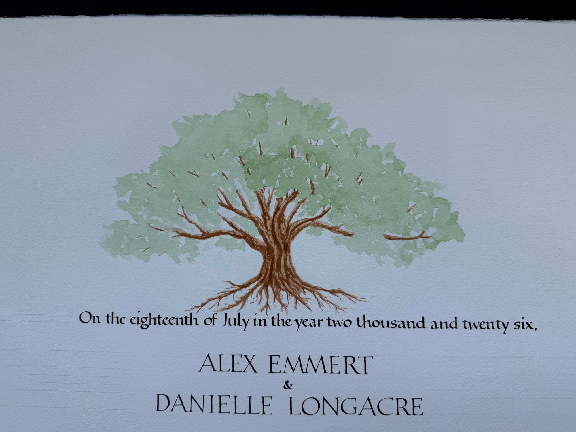
I didn't finish adding detail to the leaves because I got what I wanted from this attempt, which was to confirm the size, shape, and positioning of the tree.
Next, I painted the same oak again, but on the final piece. I tried to capture more of the "in-progress" versions.
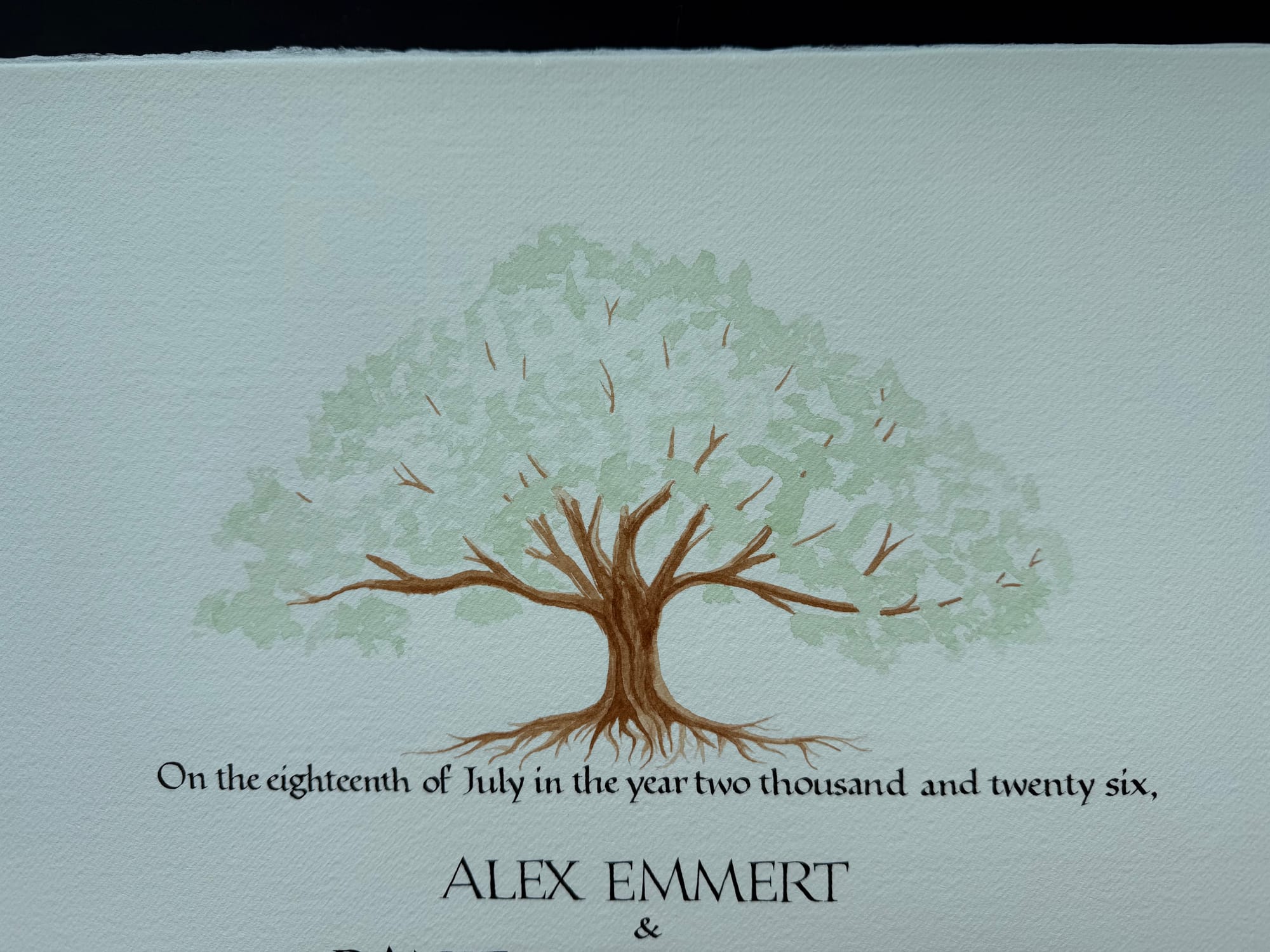
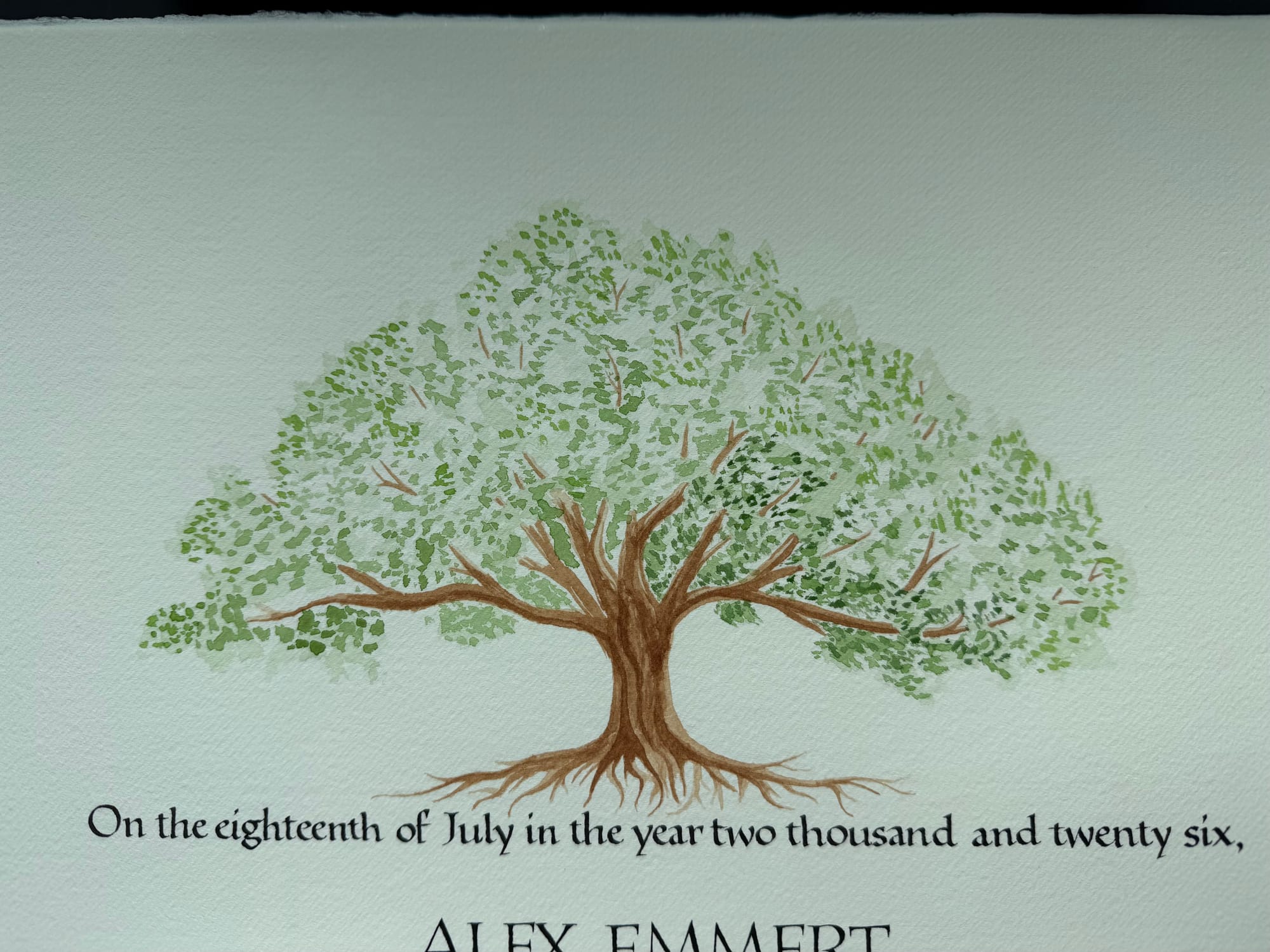
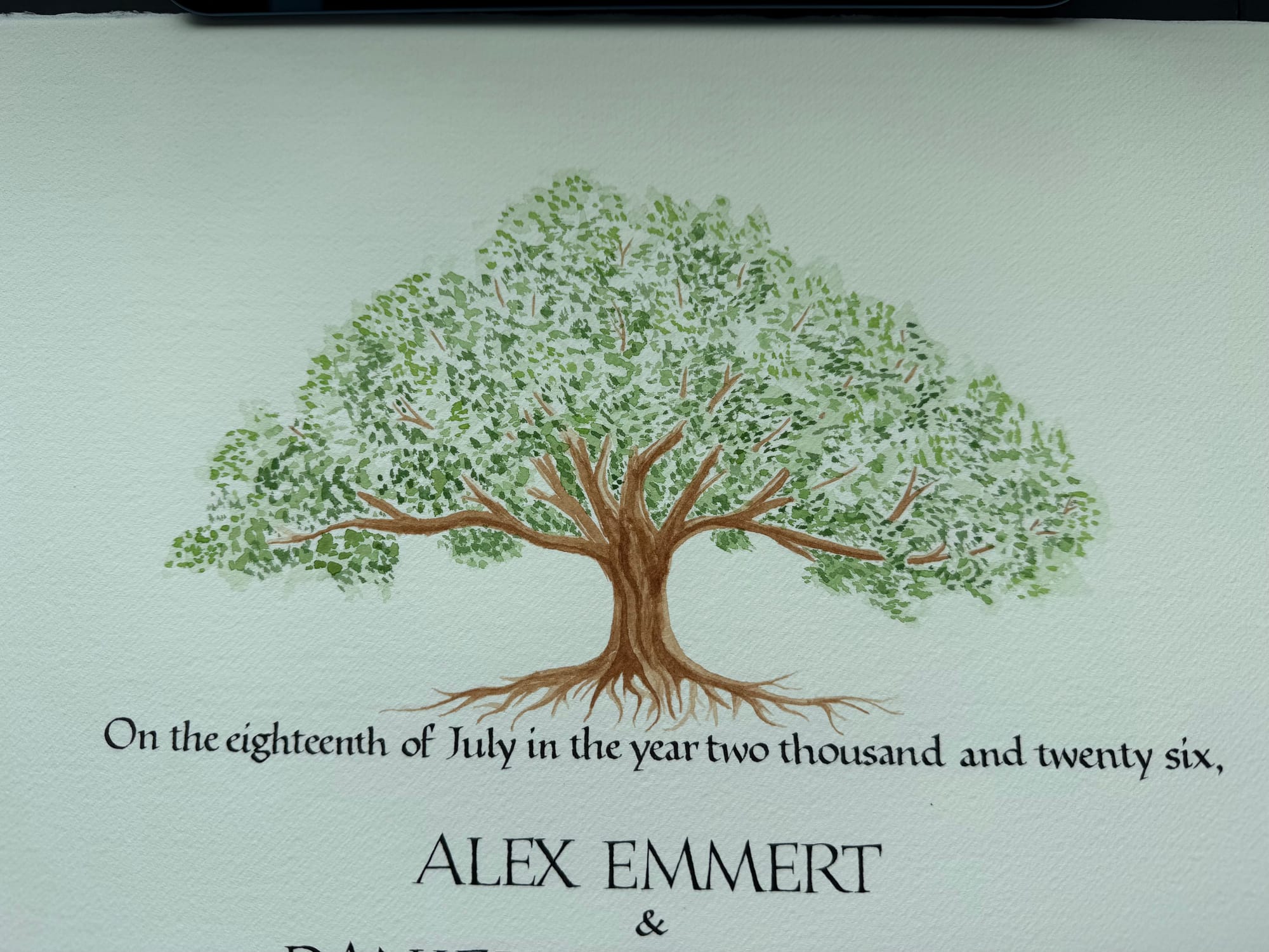
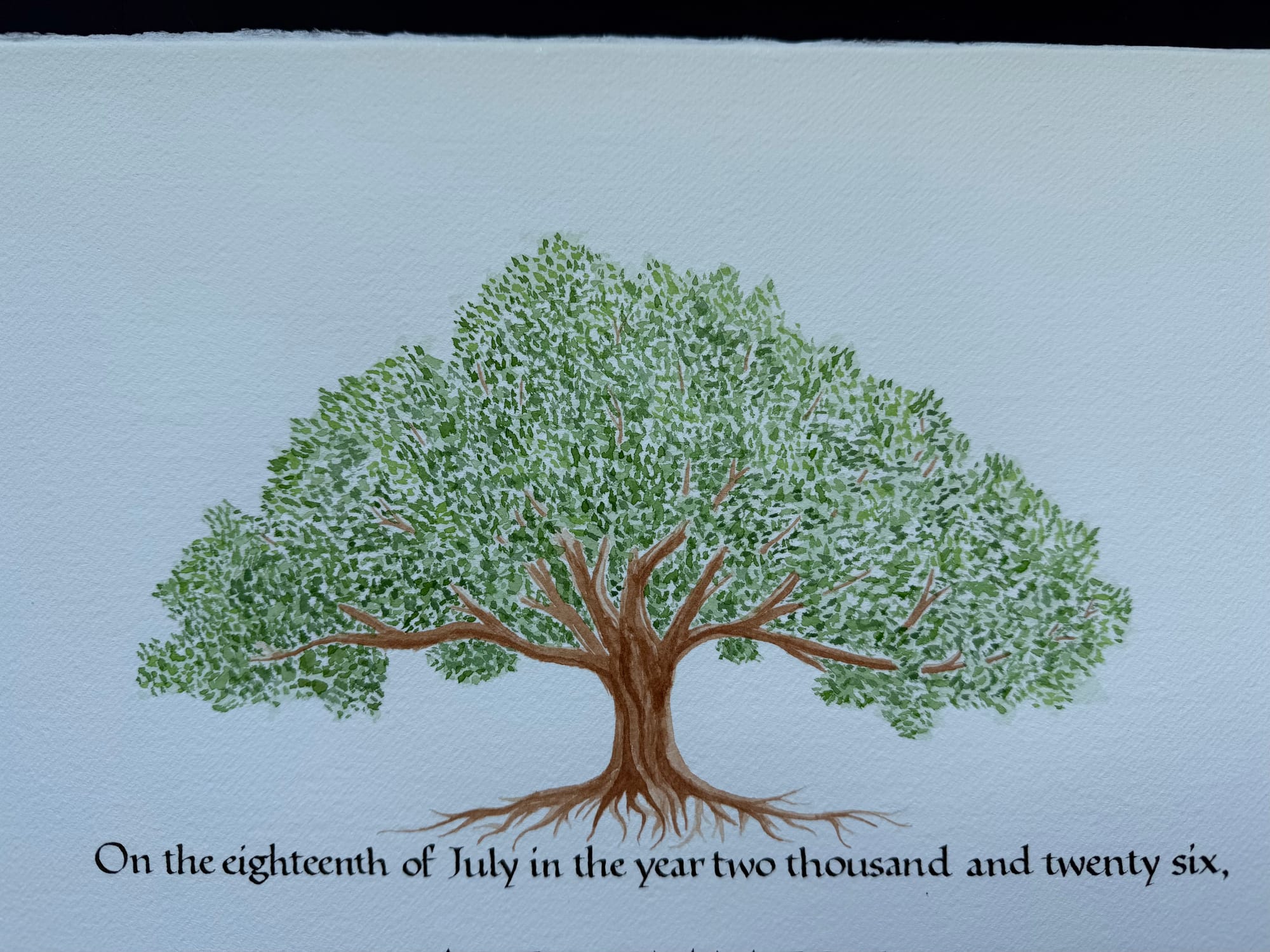
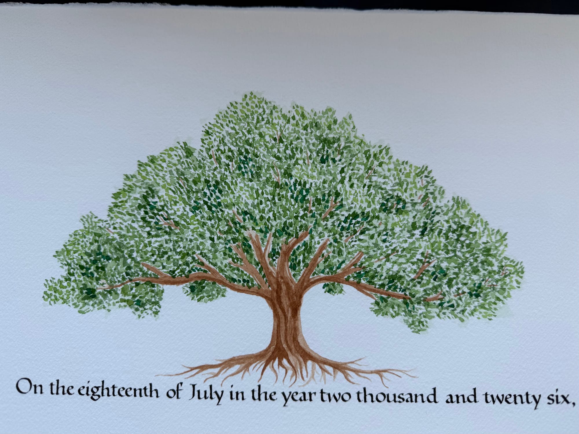
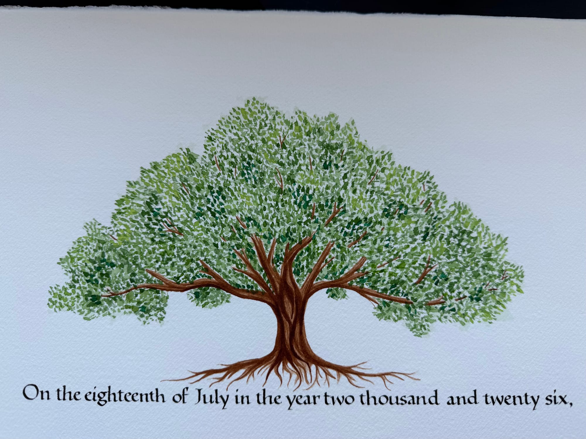
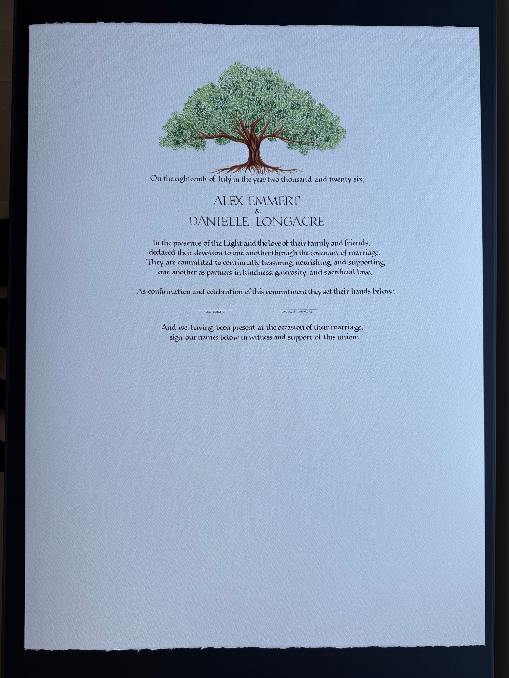
Phew! Below is what this final oak looks like with the rest of the text. So far so good.
Now, of course, it was time to paint all of those flowers. I wasn't entirely sure what size they should be. I could imagine a thin frame made up of tiny flowers, or a thick one made up of large ones. I ended up paining segments of both on my draft sheet, so I could make a choice.
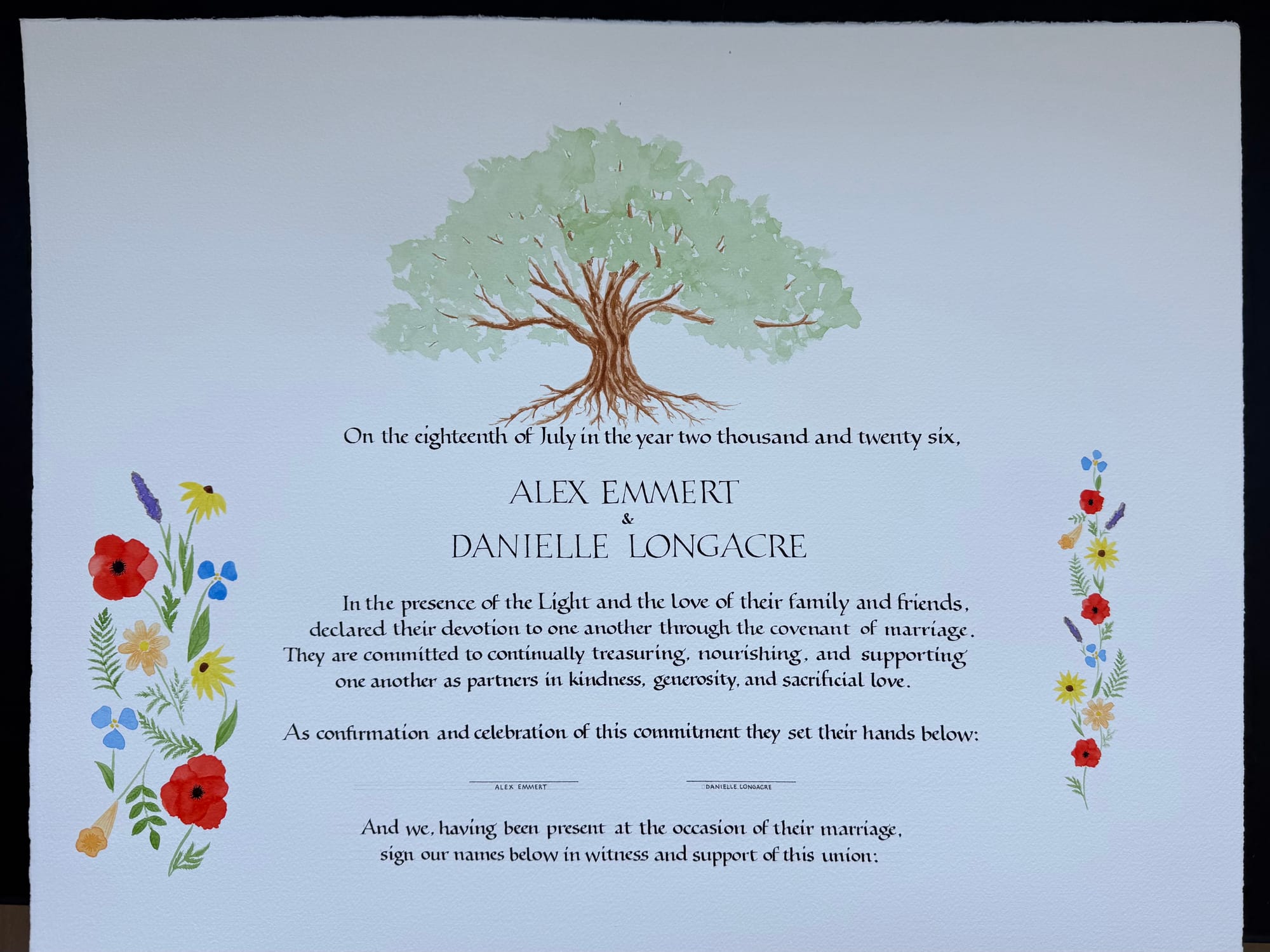
I sat there and looked at this sheet of paper for a while, and concluded I could not make a choice without seeing how the frame would look when there was more of it, so I made 3 versions in Photoshop:
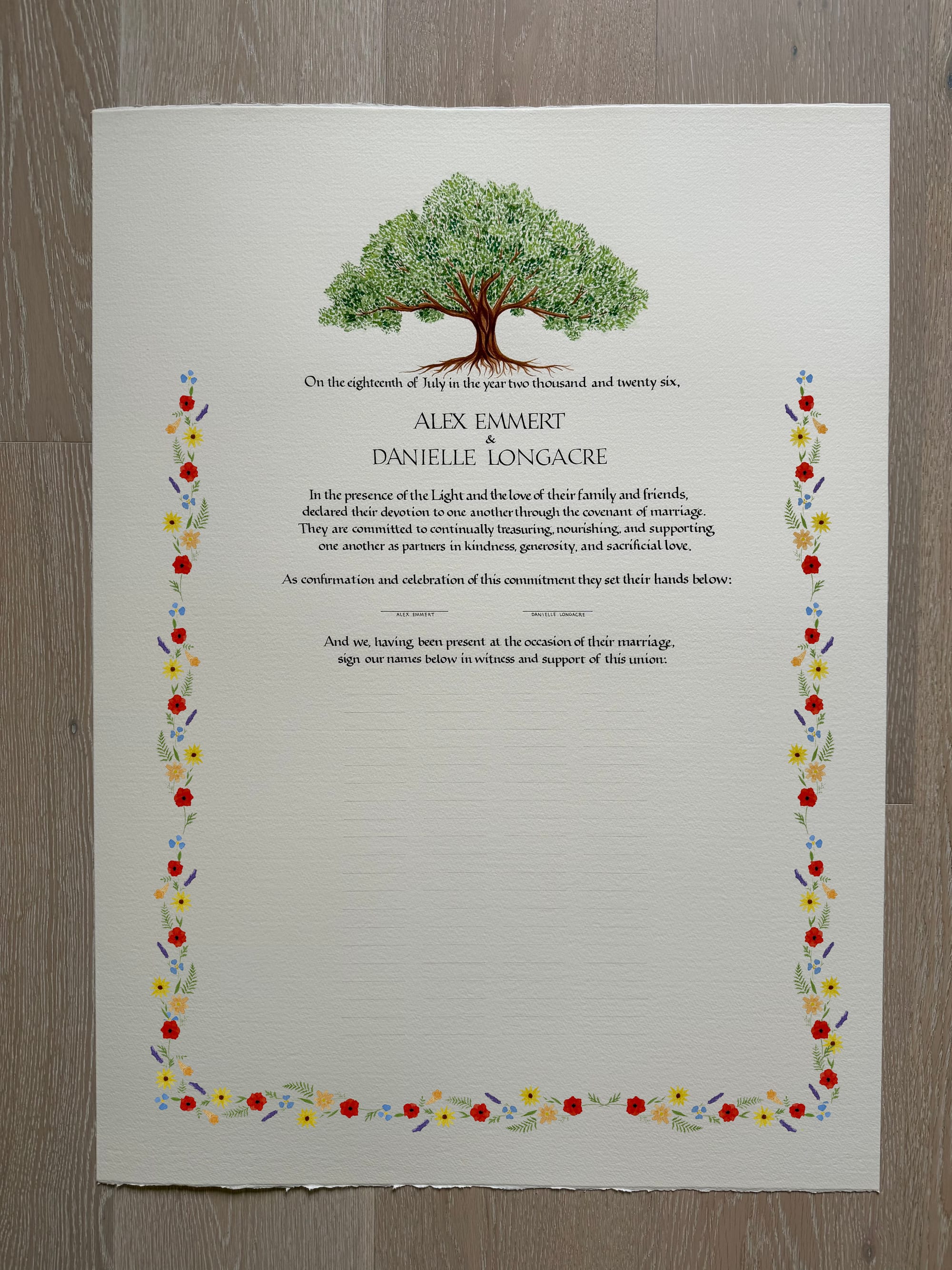
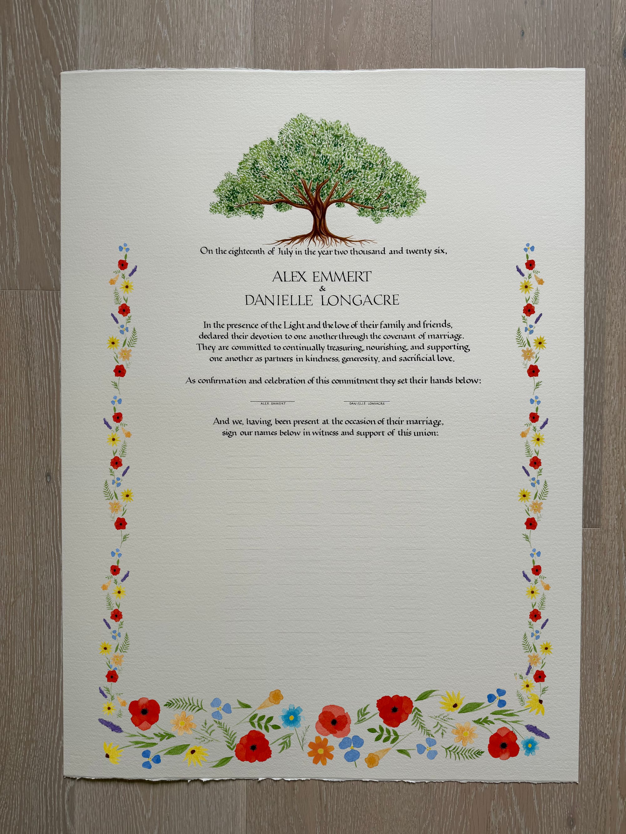
The mixed version seemed like a good idea in my head, but once I had a visual, it was a clear reject. Choosing between thin and thick was not that obvious. I could see pros and cons in both versions, but I wasn't in love with either.
I tried extending the thick frame all around, but that also looked too busy.
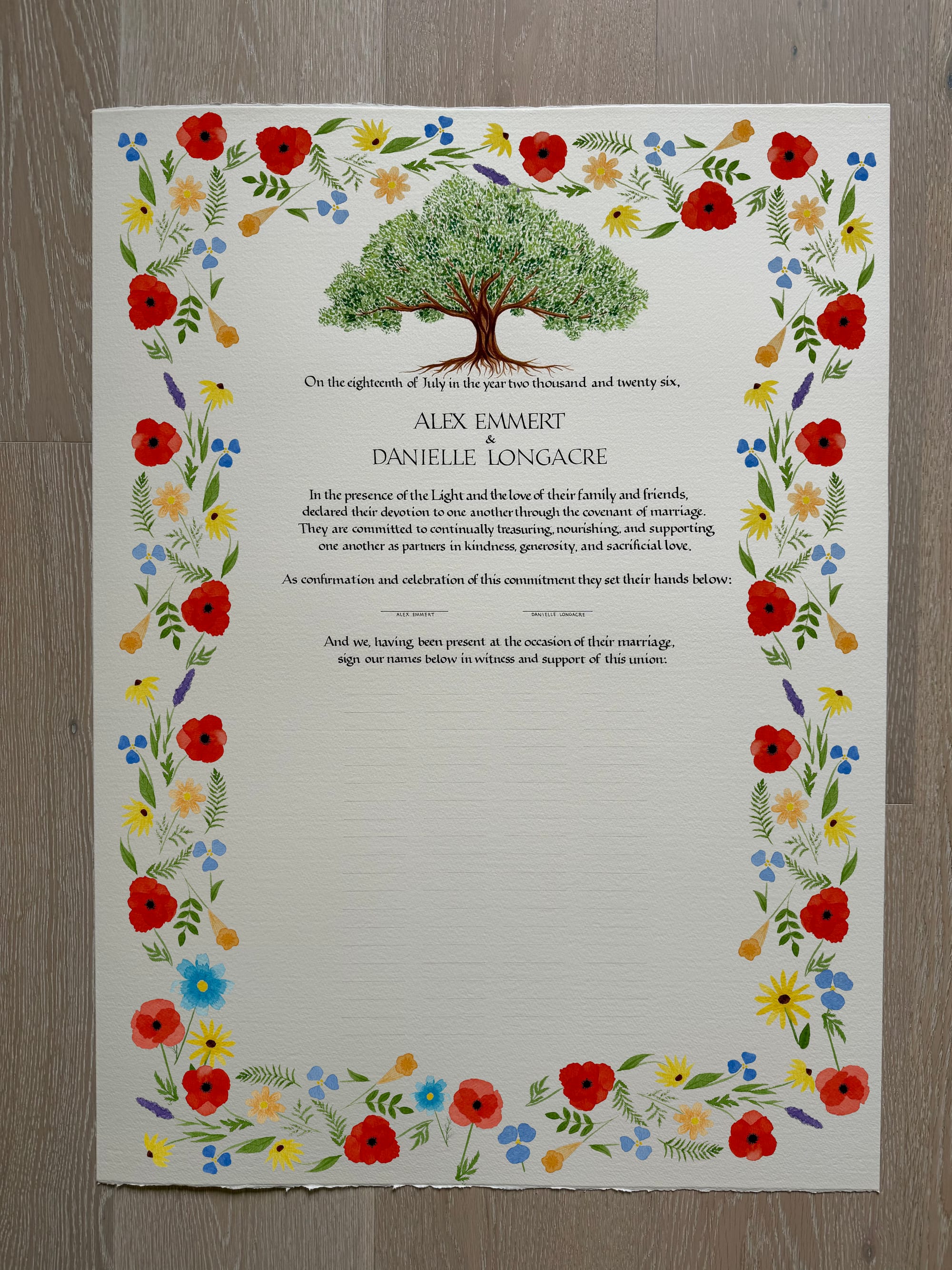
Finally, after tormenting my friendly artists about this for a whole day, I got a great suggestion from my cousin: why not make it medium width? While I wish I had come up with this idea on my own, I am grateful for receiving it nonetheless :)
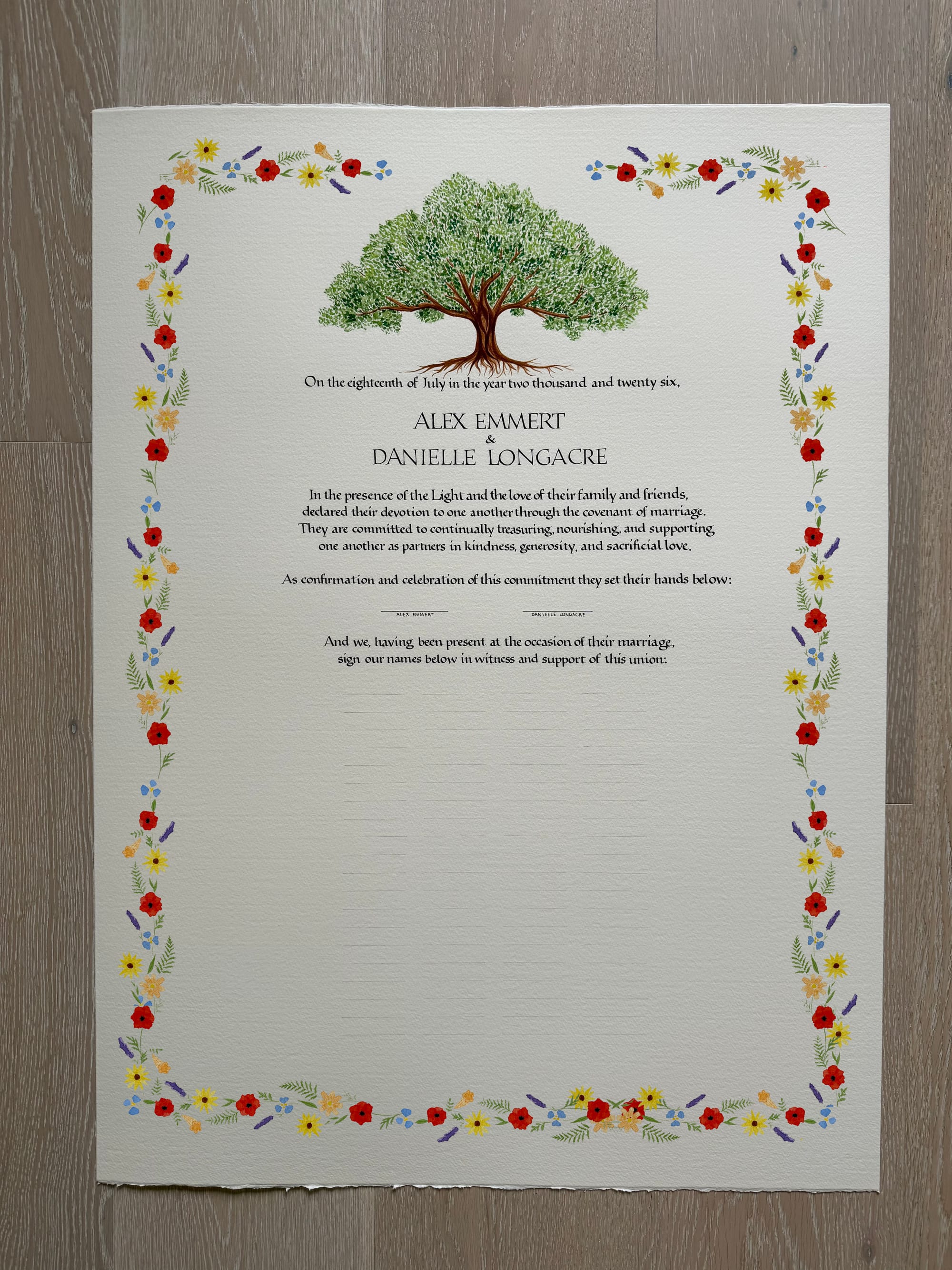
Now, I was in the final stretch. All I had to do was paint the frame and not mess anything up. June 27, just 22 days before the wedding date, no pressure at all!
When I counted the flowers at the end, there were exactly 100, although I had never even tried to make it a round number. It just came out that way. Below are lots of in-progress photos of the flowers frame.
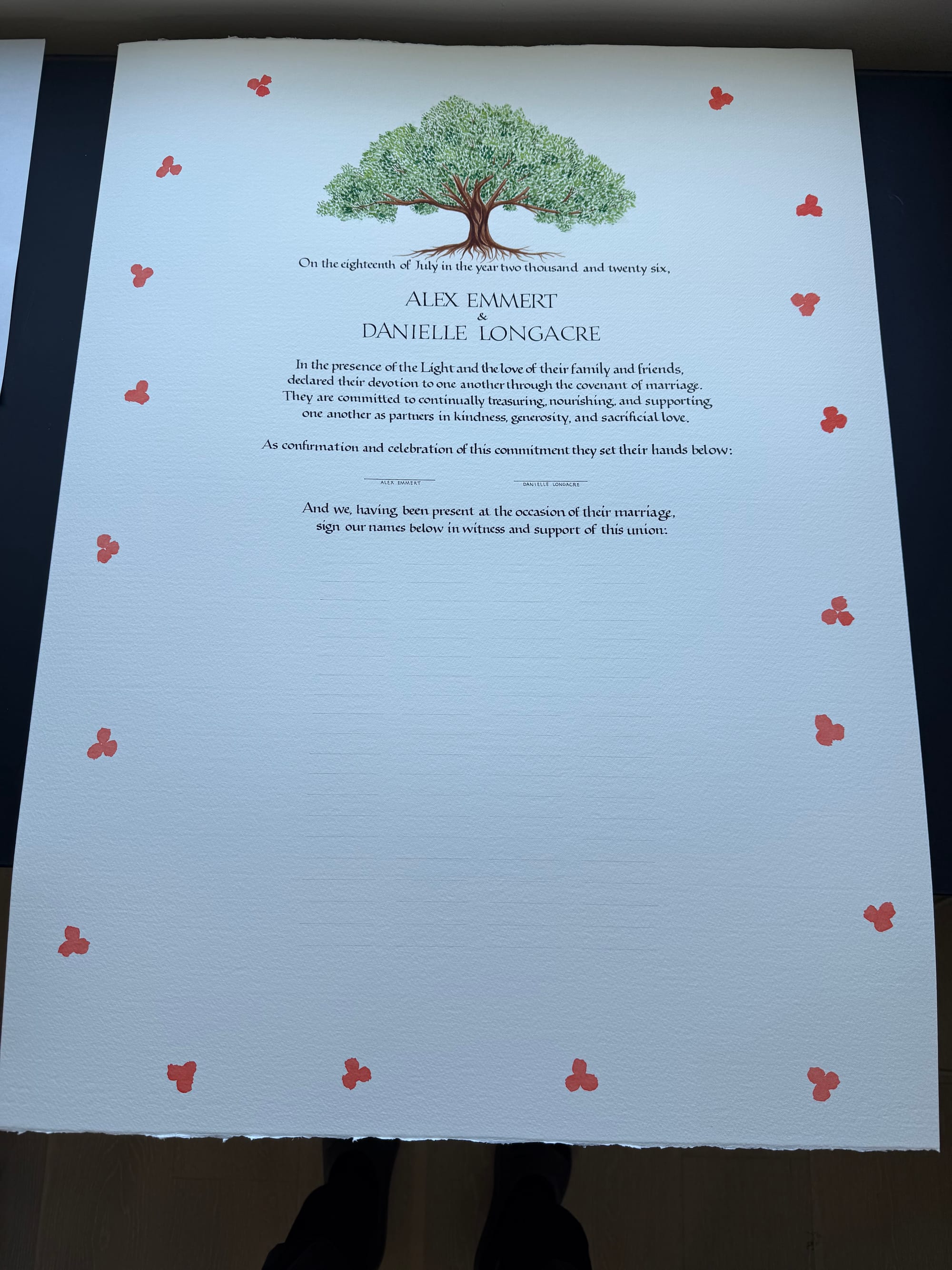
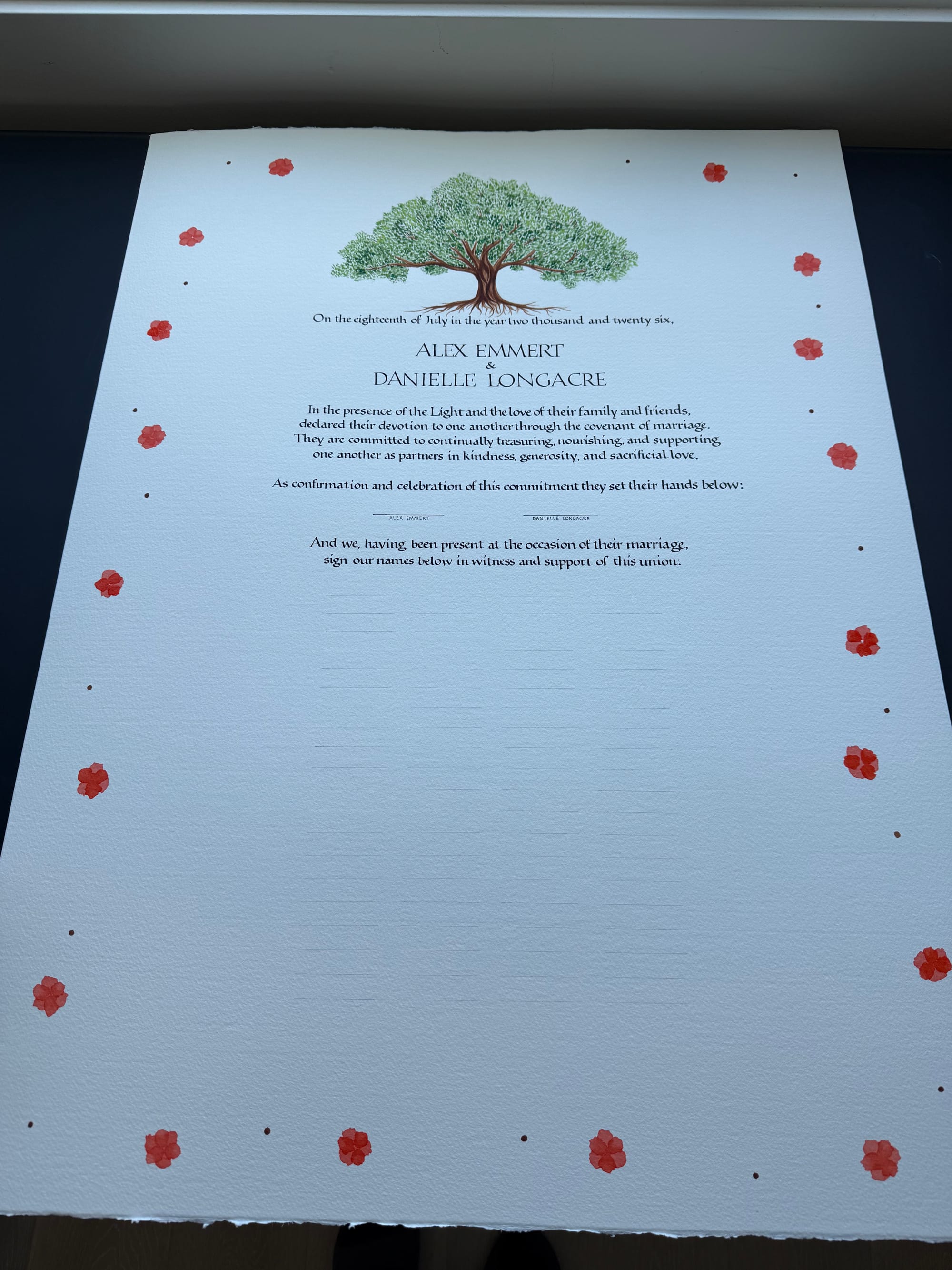
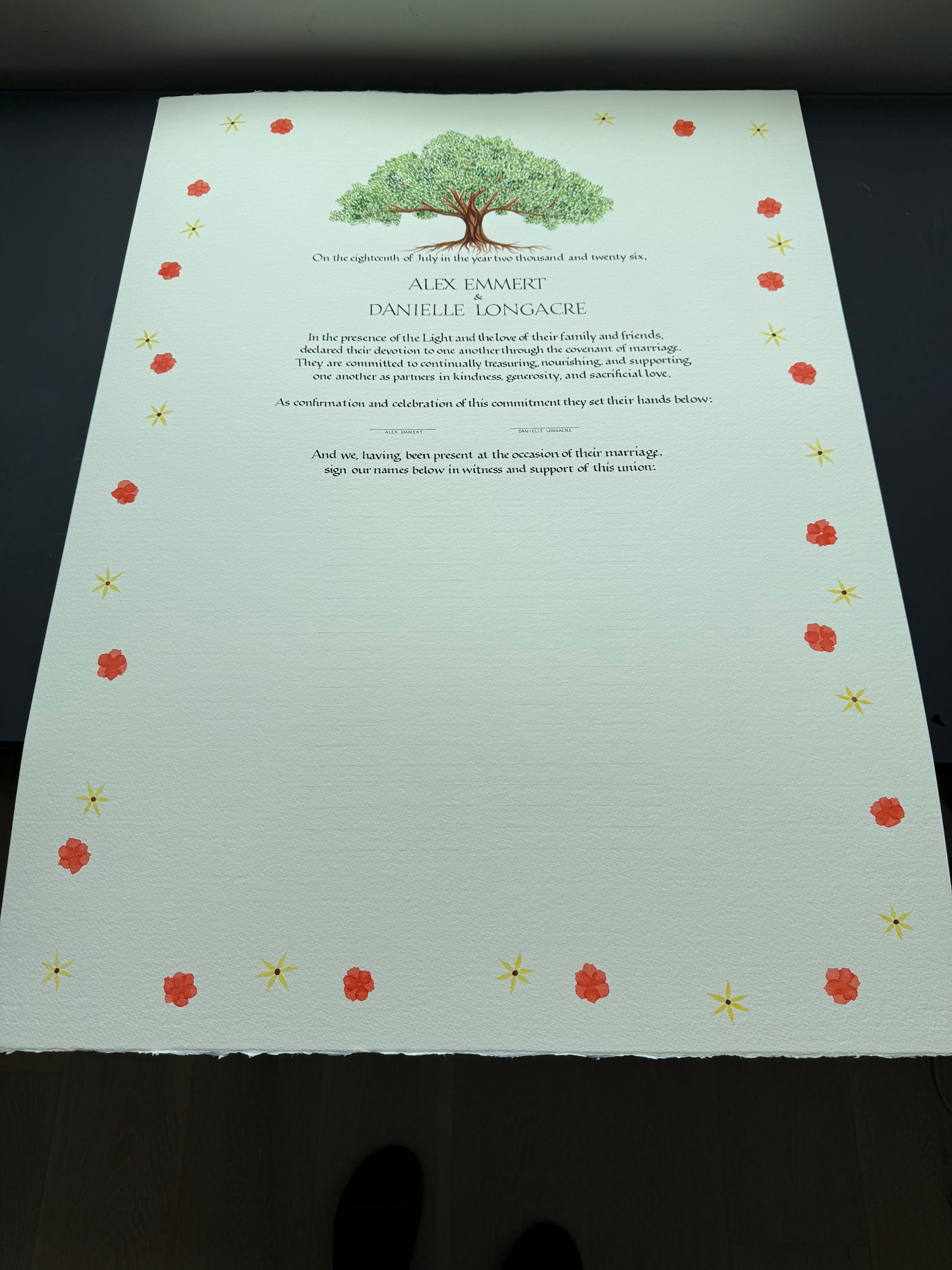
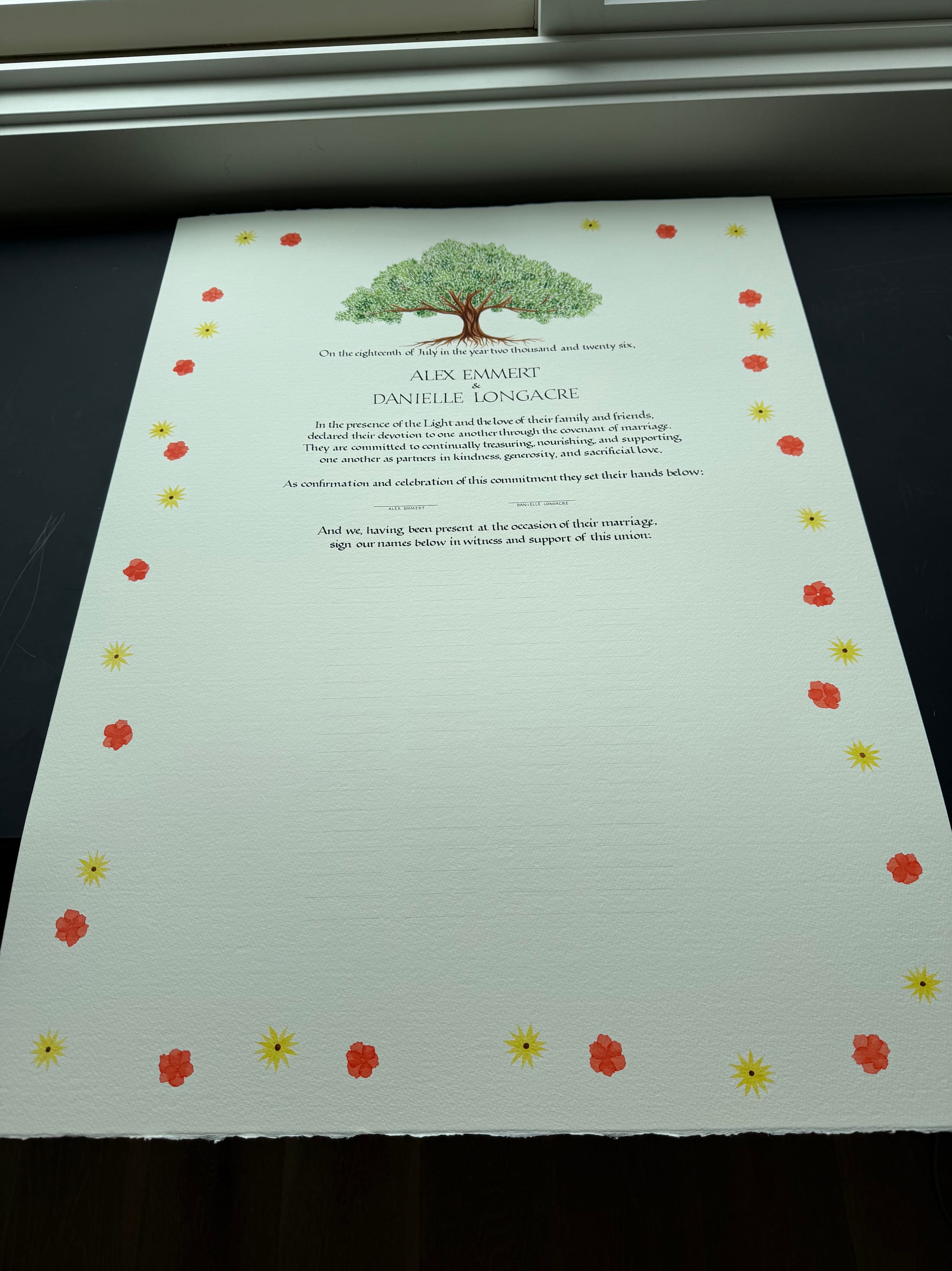
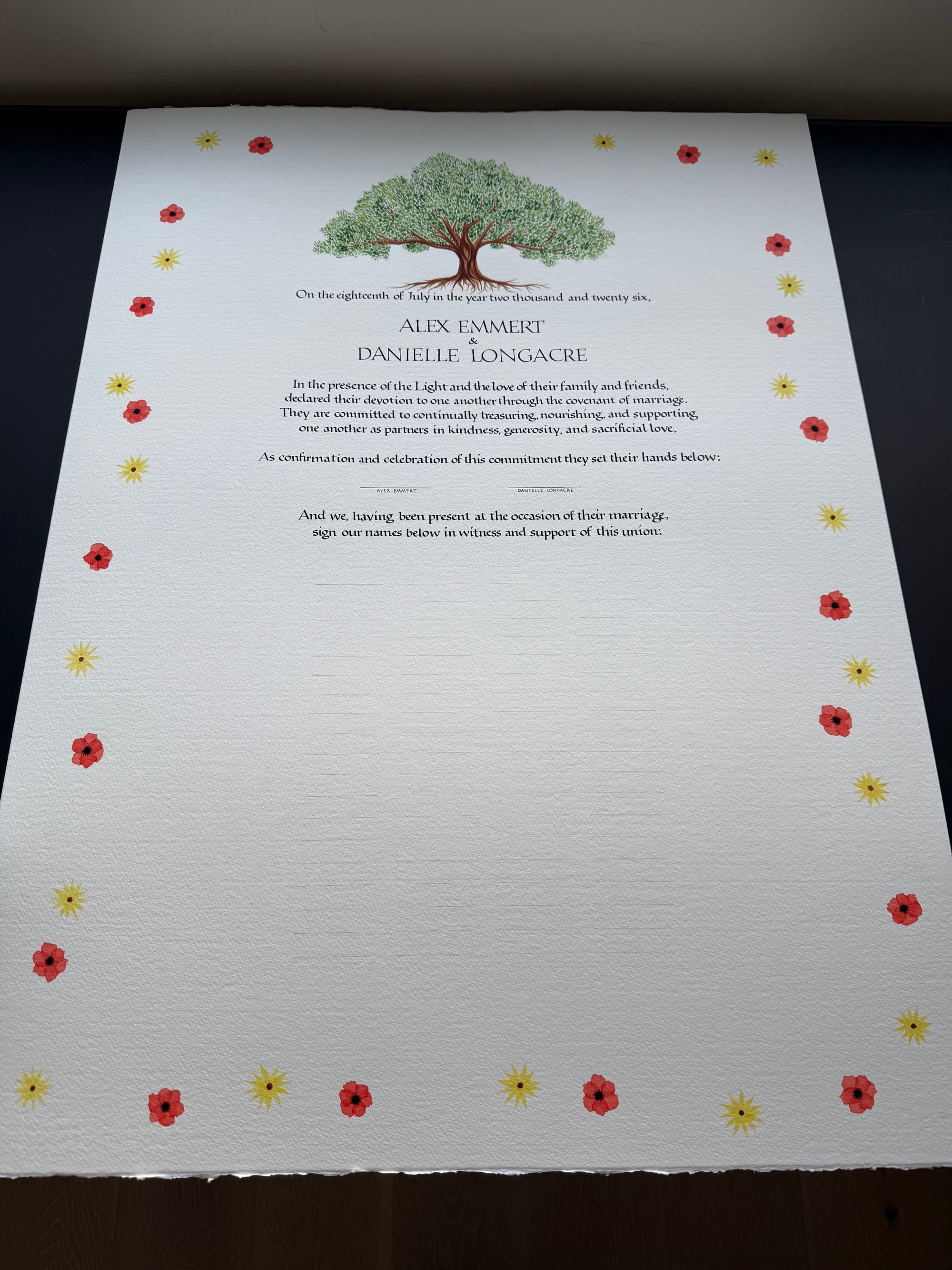
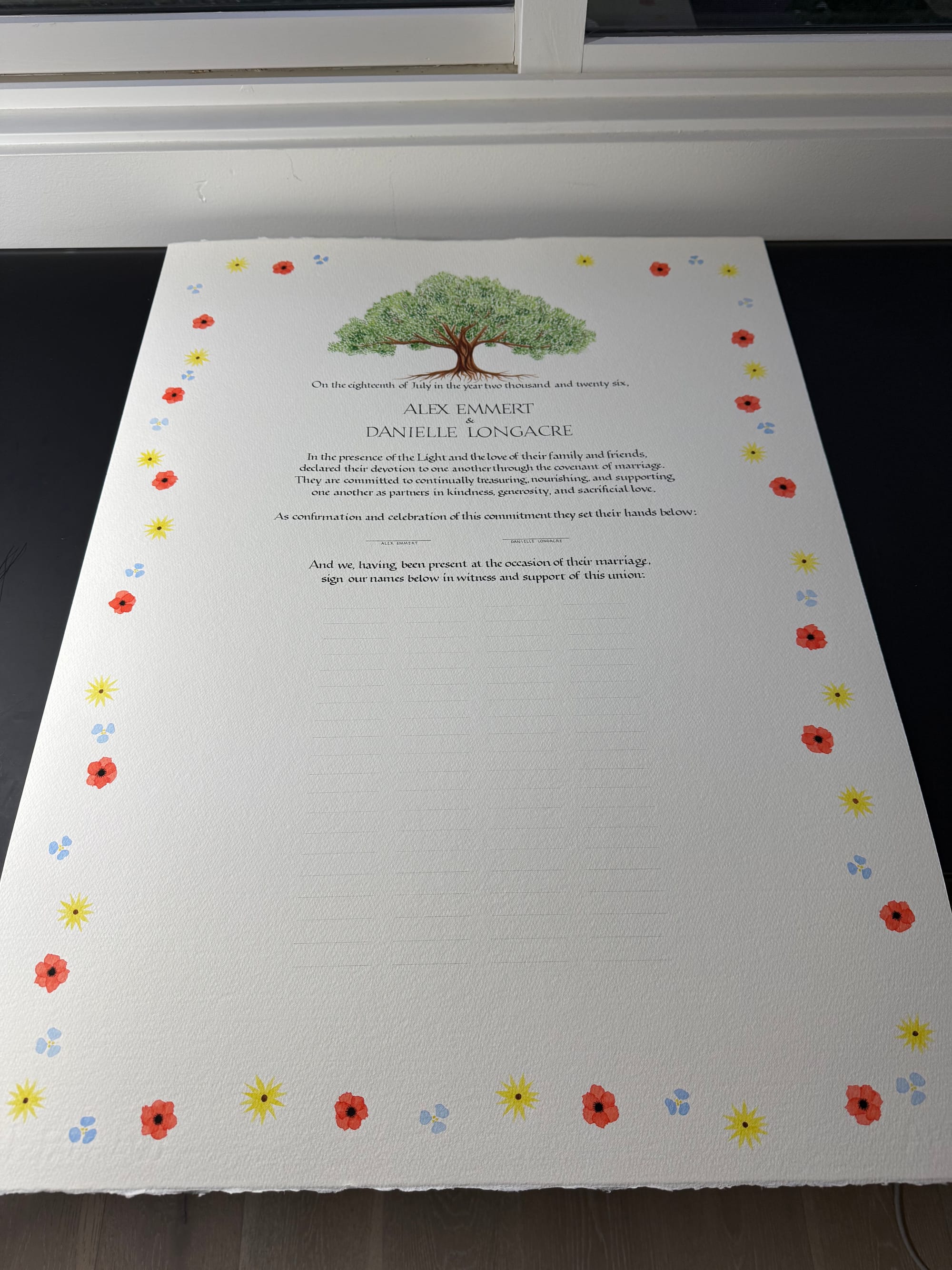
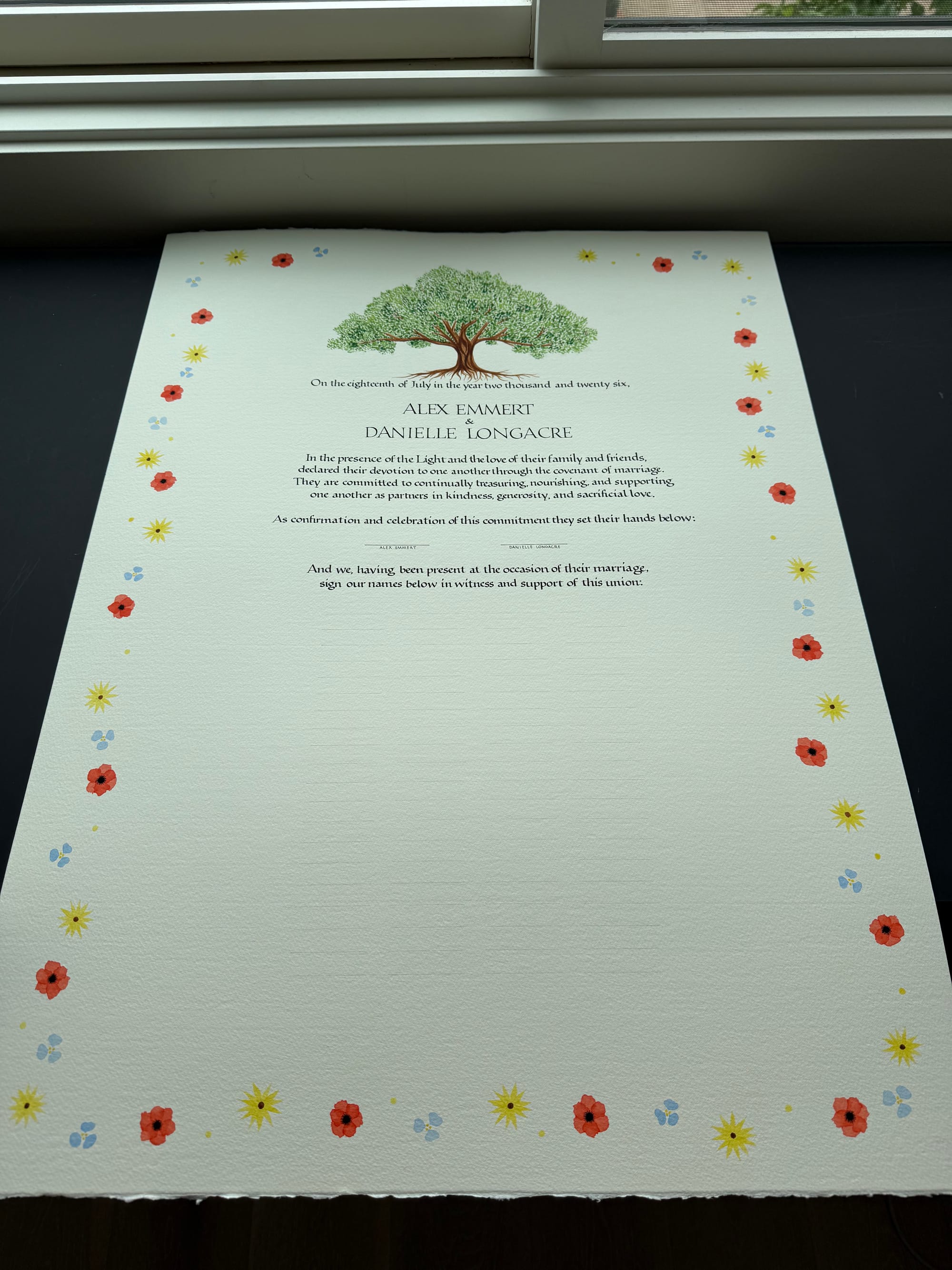
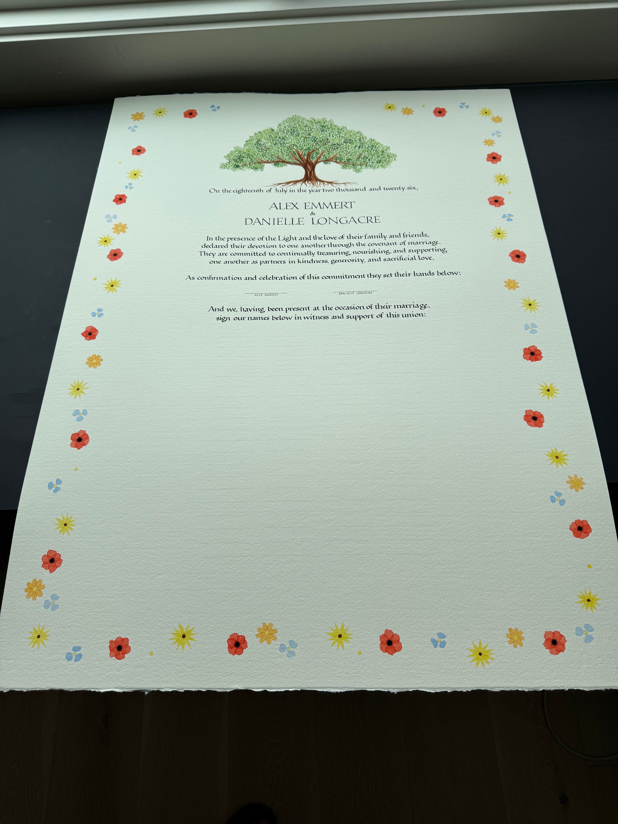
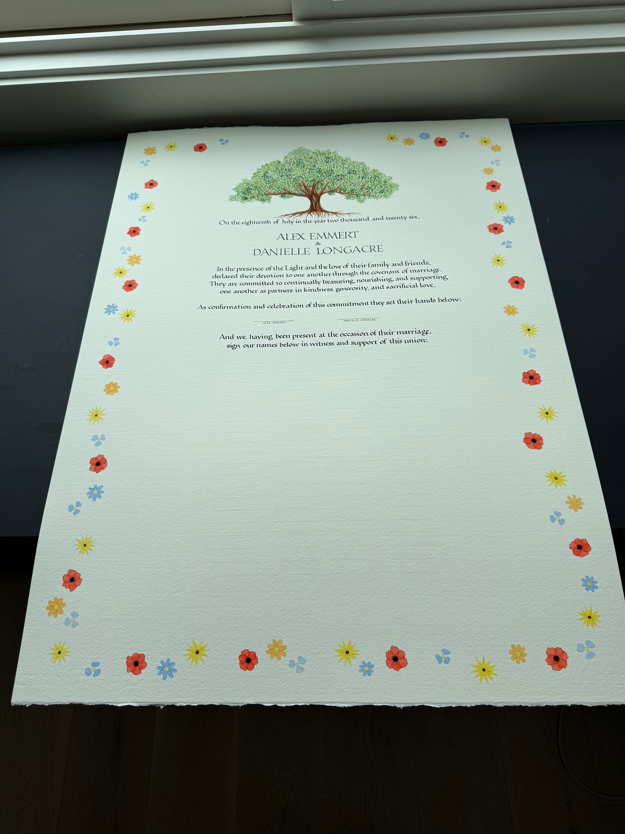
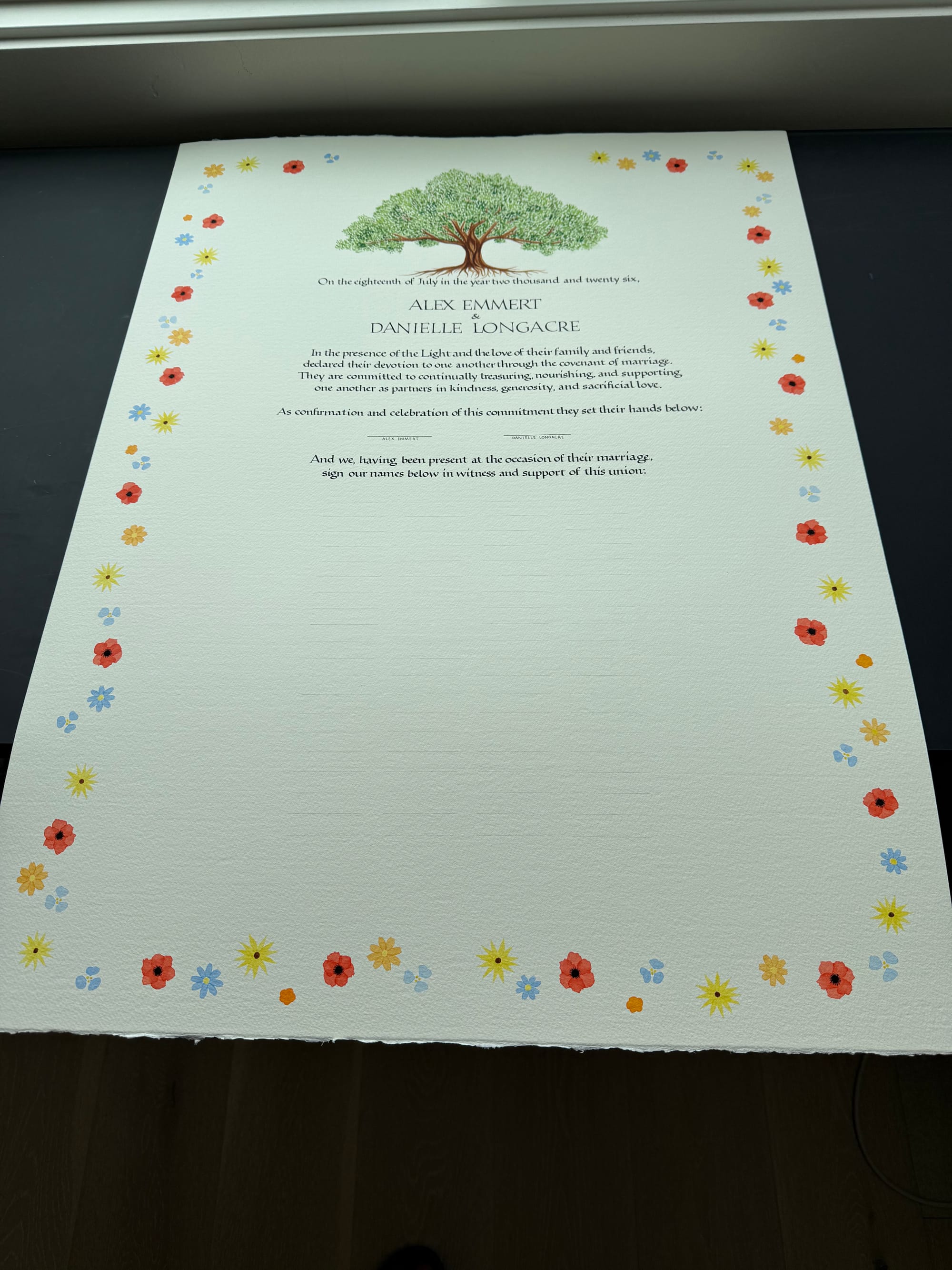
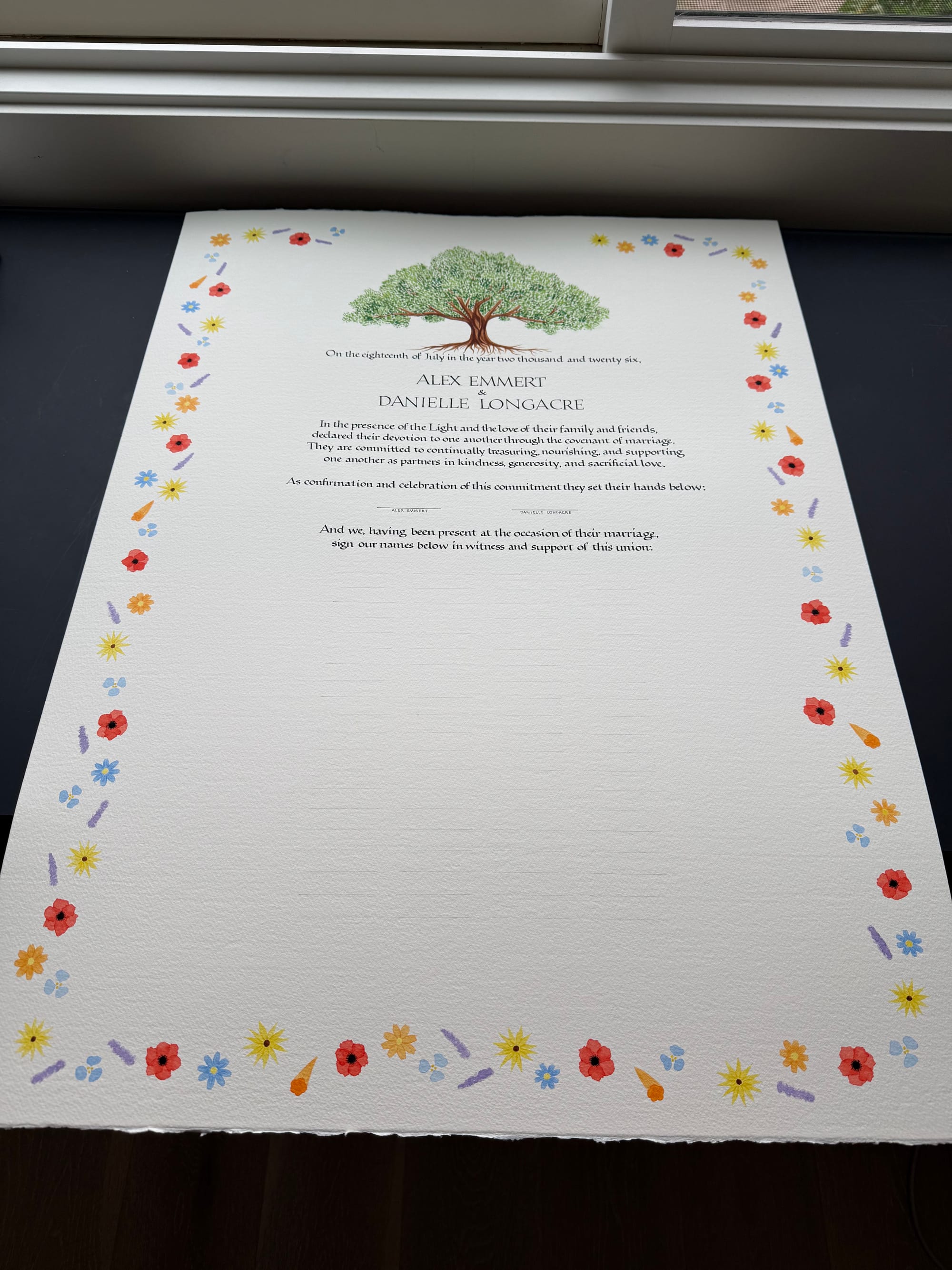
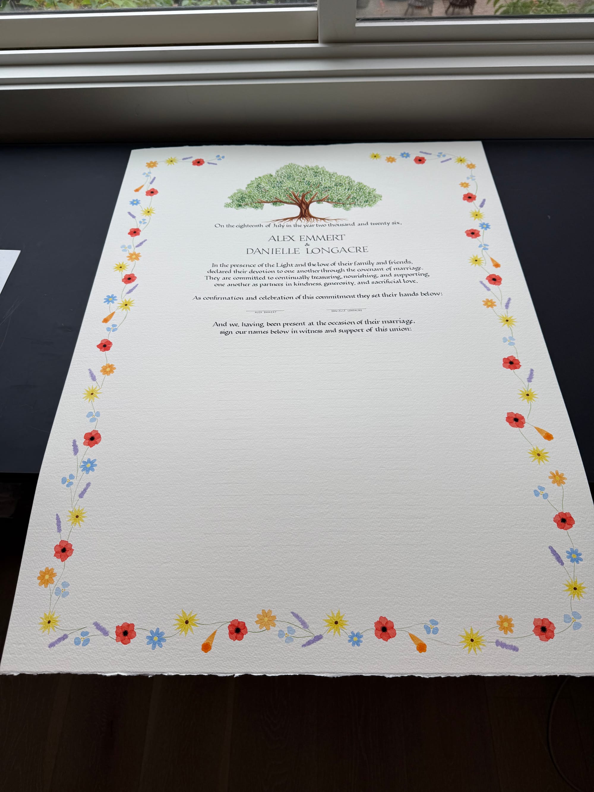
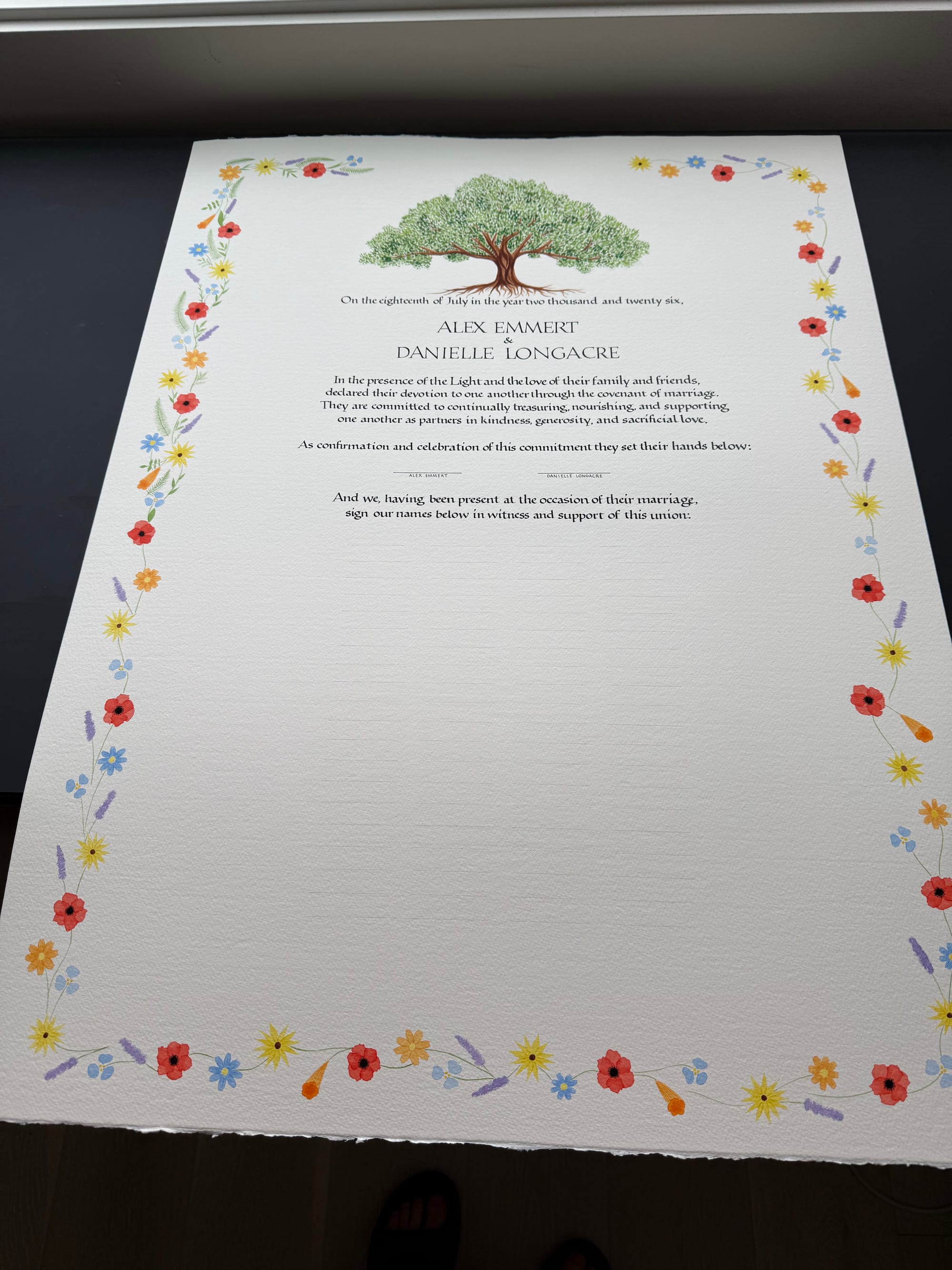
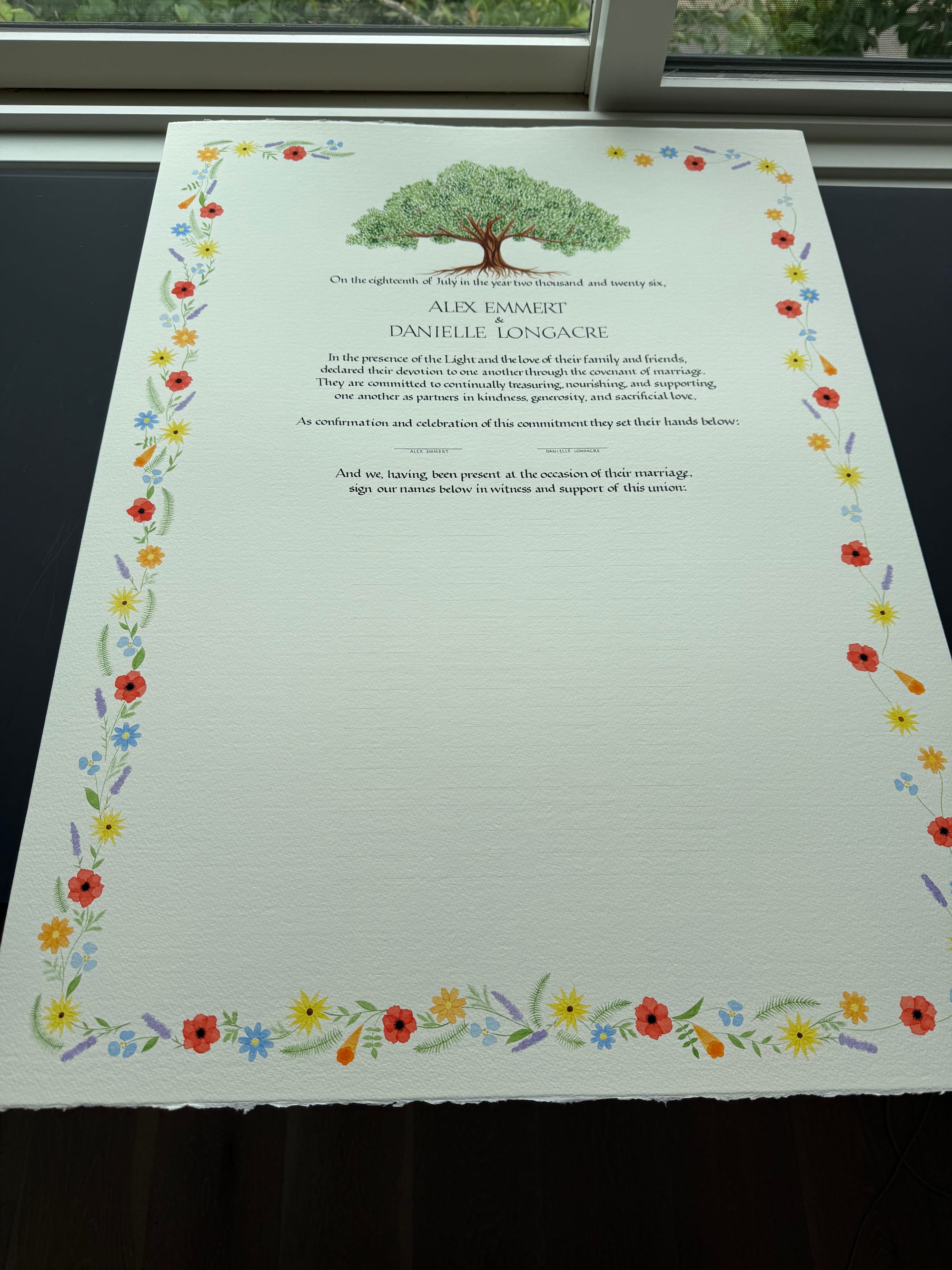
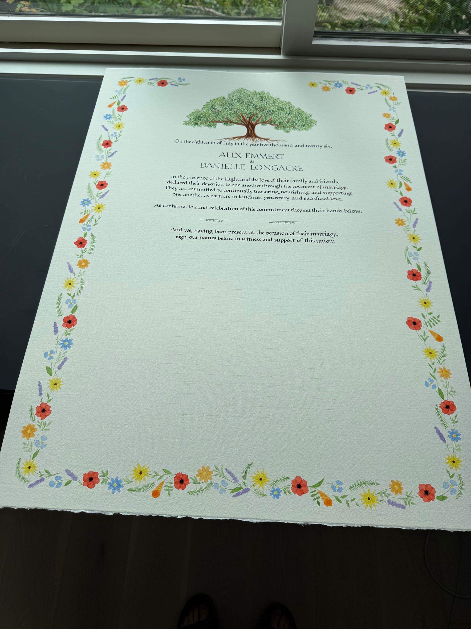
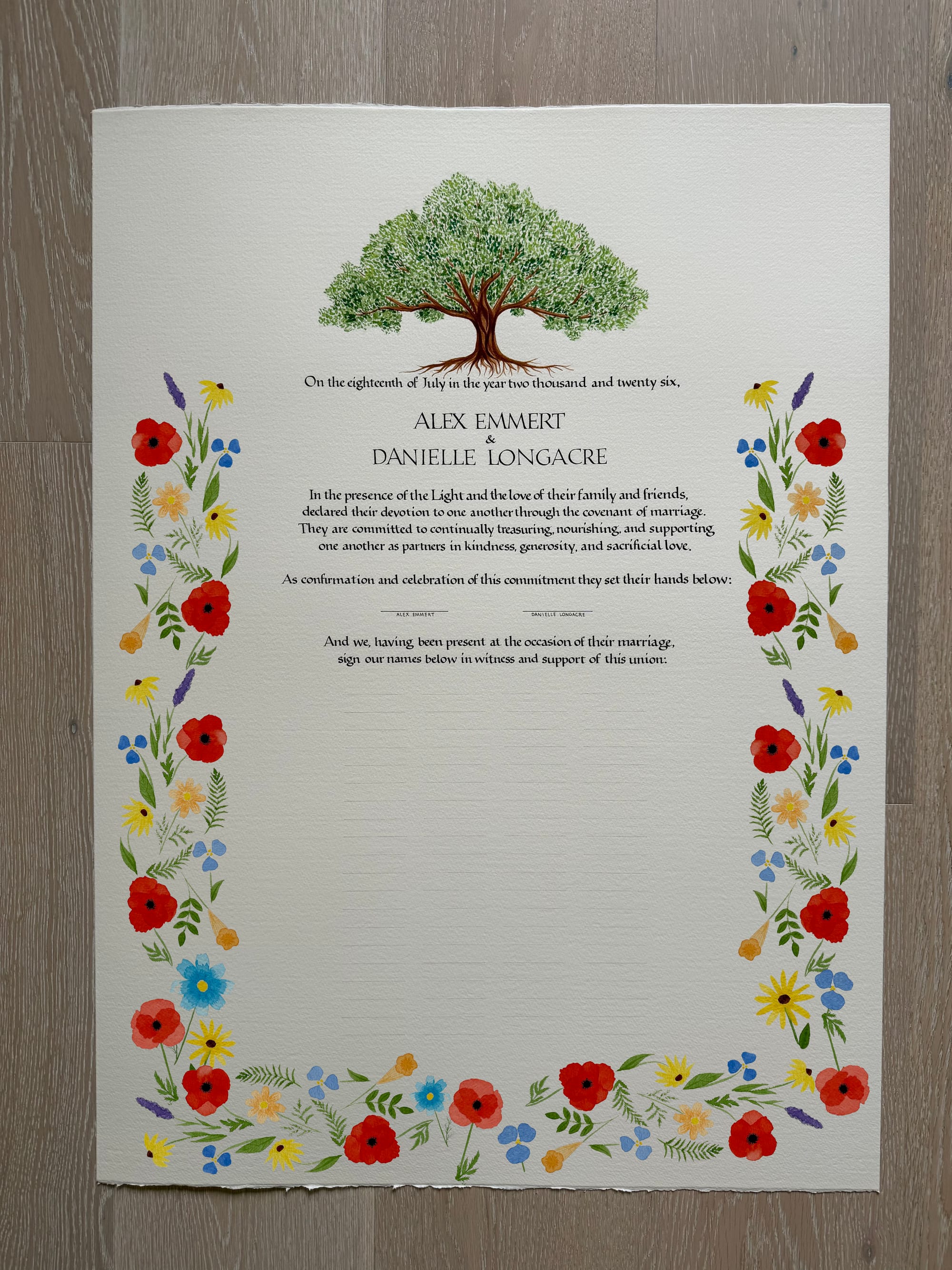
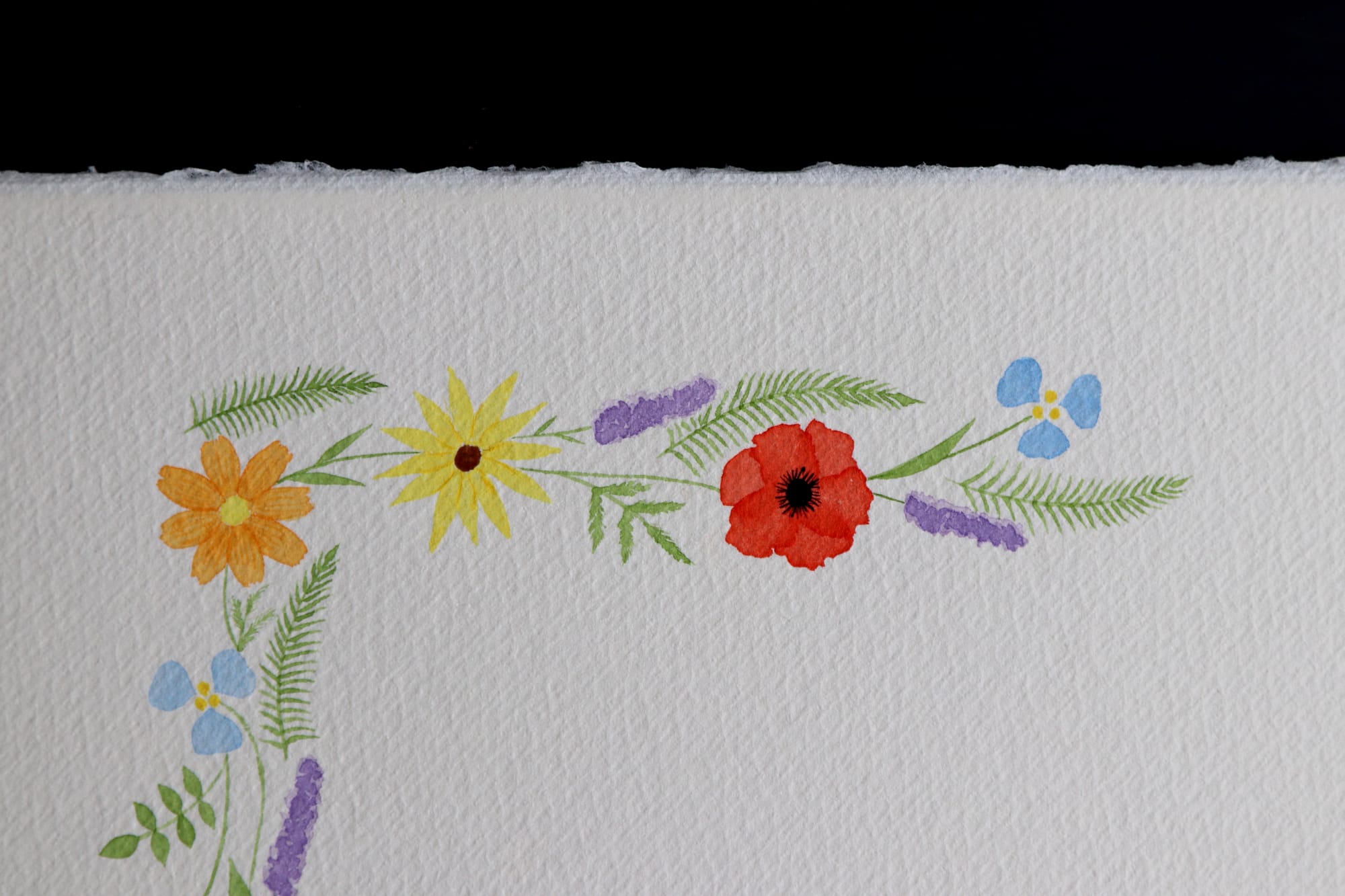
Just for fun, here is a close-up photo of part of the floral arrangement:
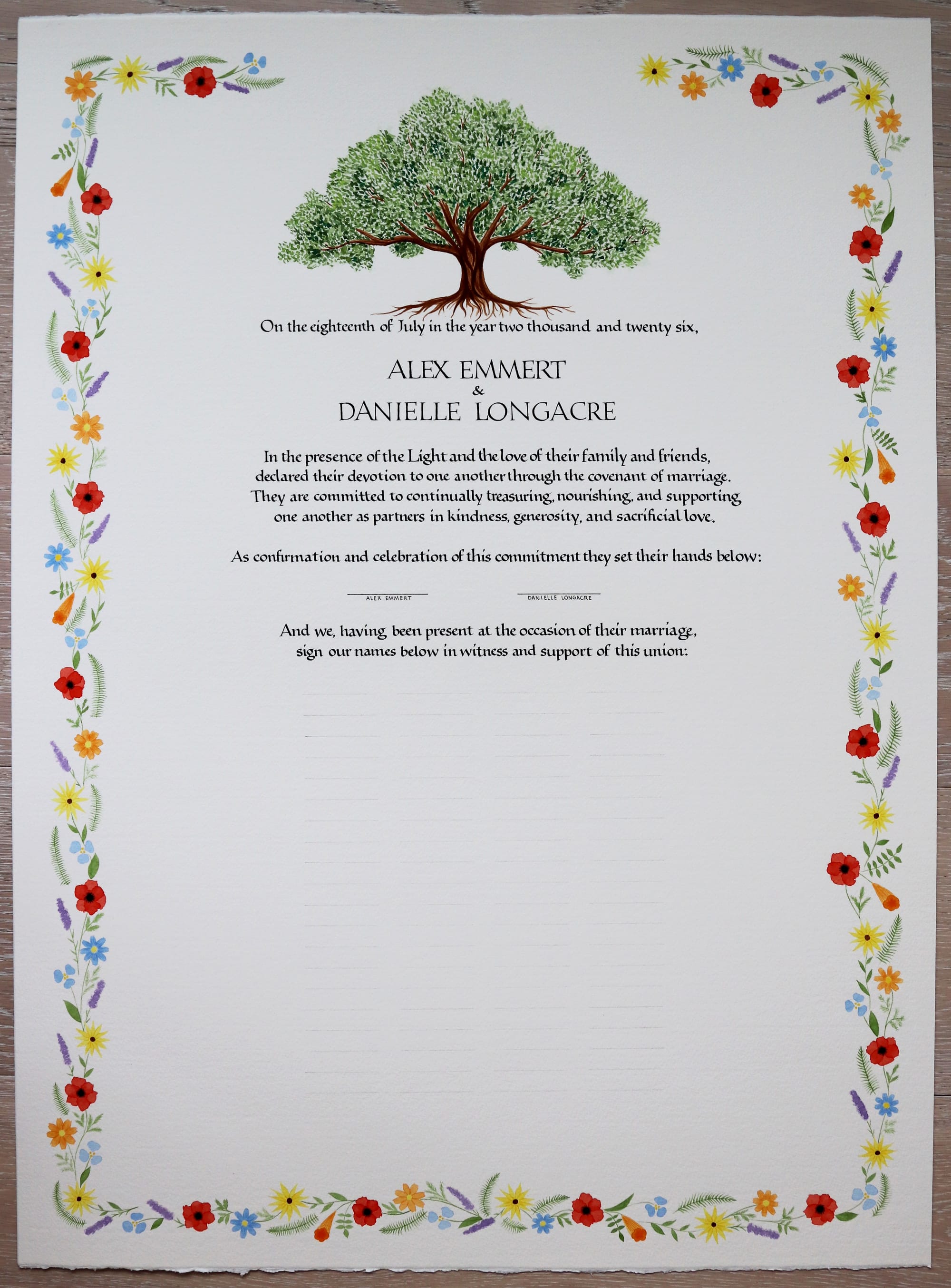
Here is a straight-on view of the final version:
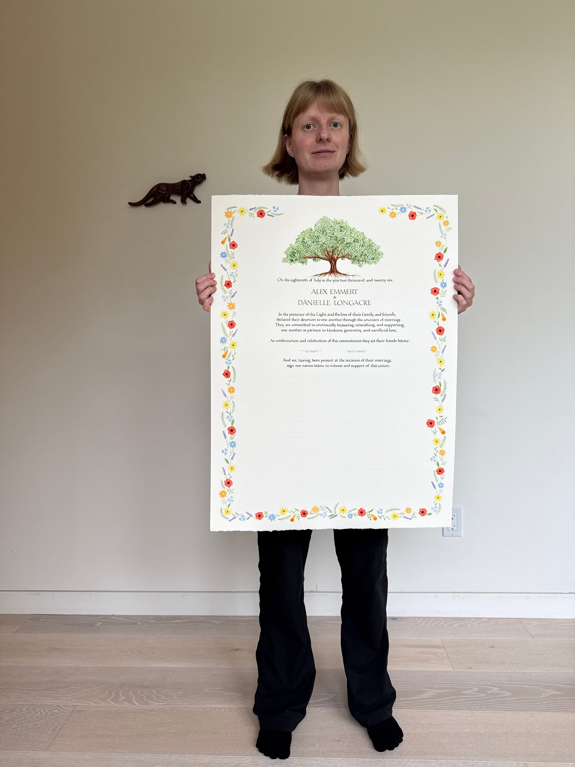
And just for the sense of scale, here is a picture of me holding it. It's funny how all the other photos don't really give an accurate idea of the size. This thing is huge!
While I didn't keep time for this project exactly (it's not something I typically do, I just let things take as long as they need), I was curious how long it took in the end. Based on the timestamps for the progress photos, and also on my general schedule and availability, I was able to come up with a pretty good estimate.
- Initial call + follow-up emails: 2 hours
- First 2 oak paintings: 2 hours
- Initial flower sketches: 2.5 hours
- Layout mockup: 0.5 hours
- Paper shopping: 2 hours
- Oak/flower vine connection exploration: 0.5 hours
- First rough draft of the text: 3 hours
- First full version of the text (including practice and refining certain letter shapes): 8 hours
- Second full version of the text: 5 hours
- Color exploration: 1 hour
- Oak draft: 1.5 hours
- Oak final: 2.5 hours
- Flower frame draft: 2 hours
- Flower frame width/positioning exploration: 2 hours
- Flowers for the flower frame: 4.5 hours
- Vines and leaves for the flower frame: 3.5 hours
Phew! All of this adds up to 42.5 hours of work, but that doesn't mean I could have finished the project in just 1 week of full-time work. I would say I can do at most 4 hours of writing / painting in any given day, and even that is a stretch, because as I get tired, there is a real risk of the quality going down, or me making a mistake. Also, it does help to have some smaller projects to work on here and there, just to do something different for a bit, so I can come back to the big project with renewed energy.
It was a fun (even though admittedly challenging) project for me, and I feel like I learned a lot both about watercolor painting, and about managing projects and client expectations. But if I had a chance to go back and decide whether to take this project on or not, I would definitely still take it.
Comments