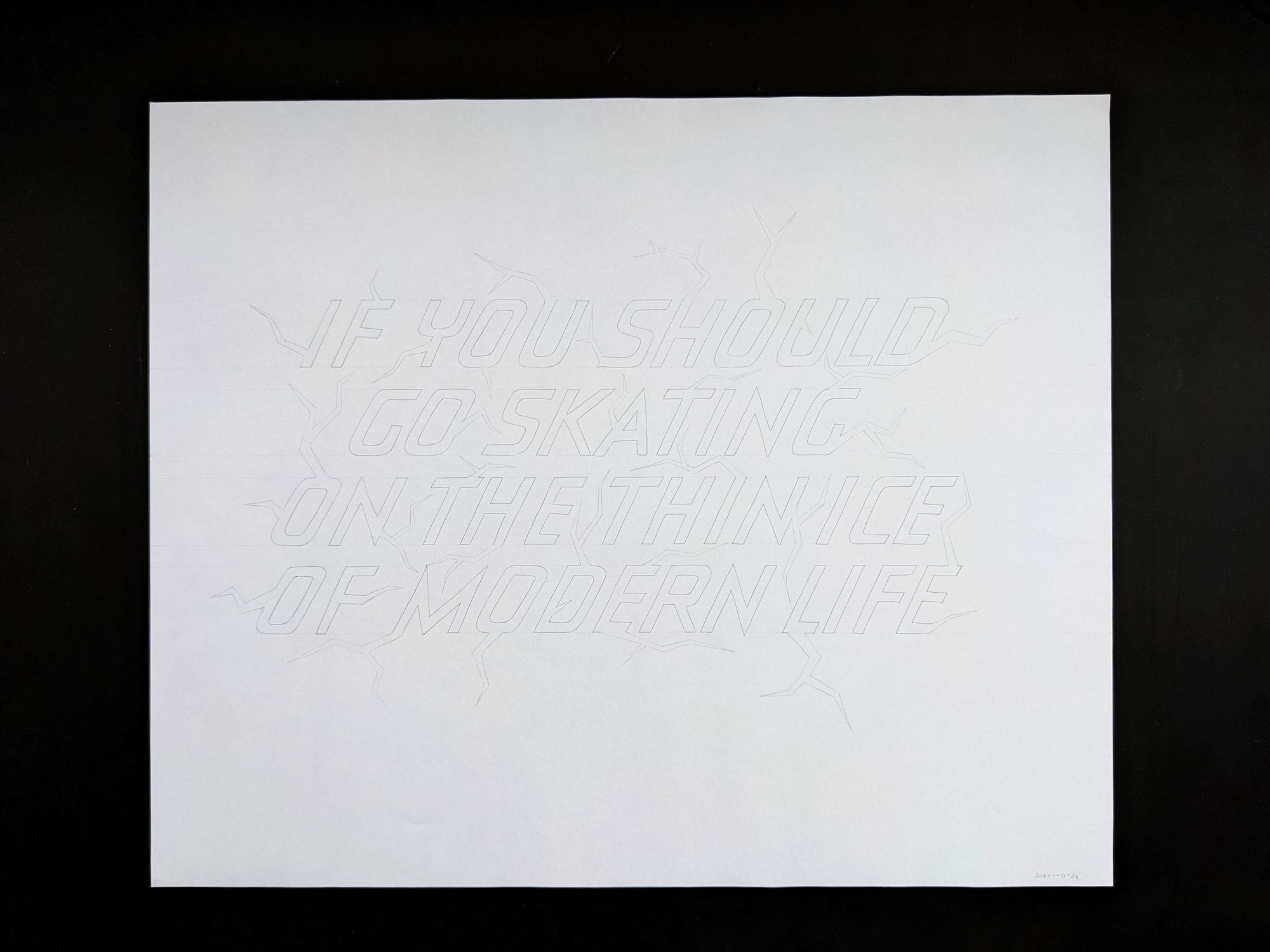
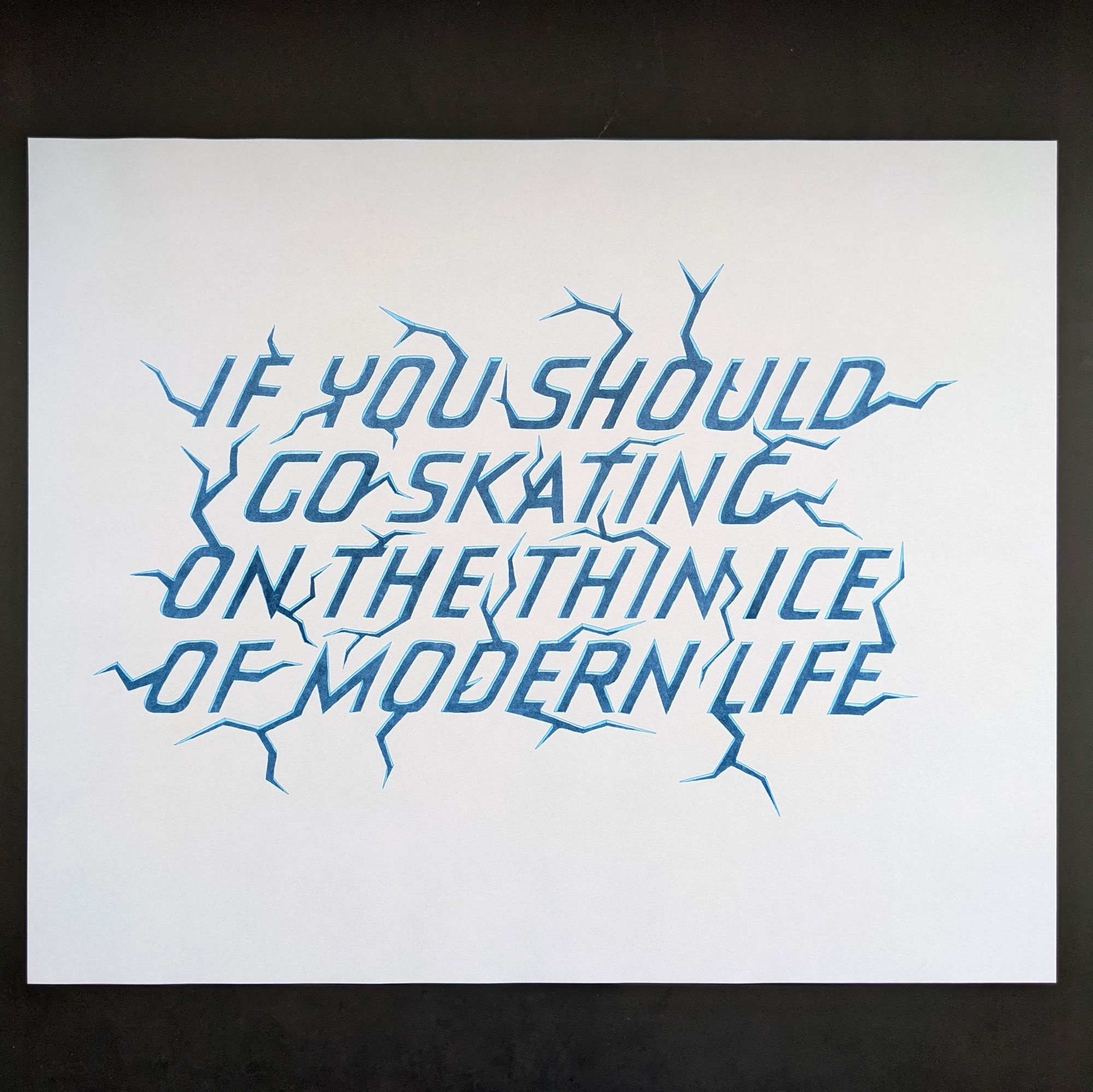
The thin ice

Sometimes, I feel that books, movies, or even songs that were written years ago still resonate with the state of the world today.
I was listening to The Wall by Pink Floyd, and for some reason this song really caught my attention this time around. So I decided to write out some of the lyrics that I felt very accurately describe today's life.
The idea was to write the letters as if they were cut into ice (presumably a frozen lake or something like that), and then add some cracks around those letters. Of course, it is for the viewer to judge whether that comes across as intended or not :)
I didn't use a font as a reference for this piece, and every letter is hand-drawn from scratch. I did use a grid paper for the first draft to make sure the letters were all the same size, but that is about it.
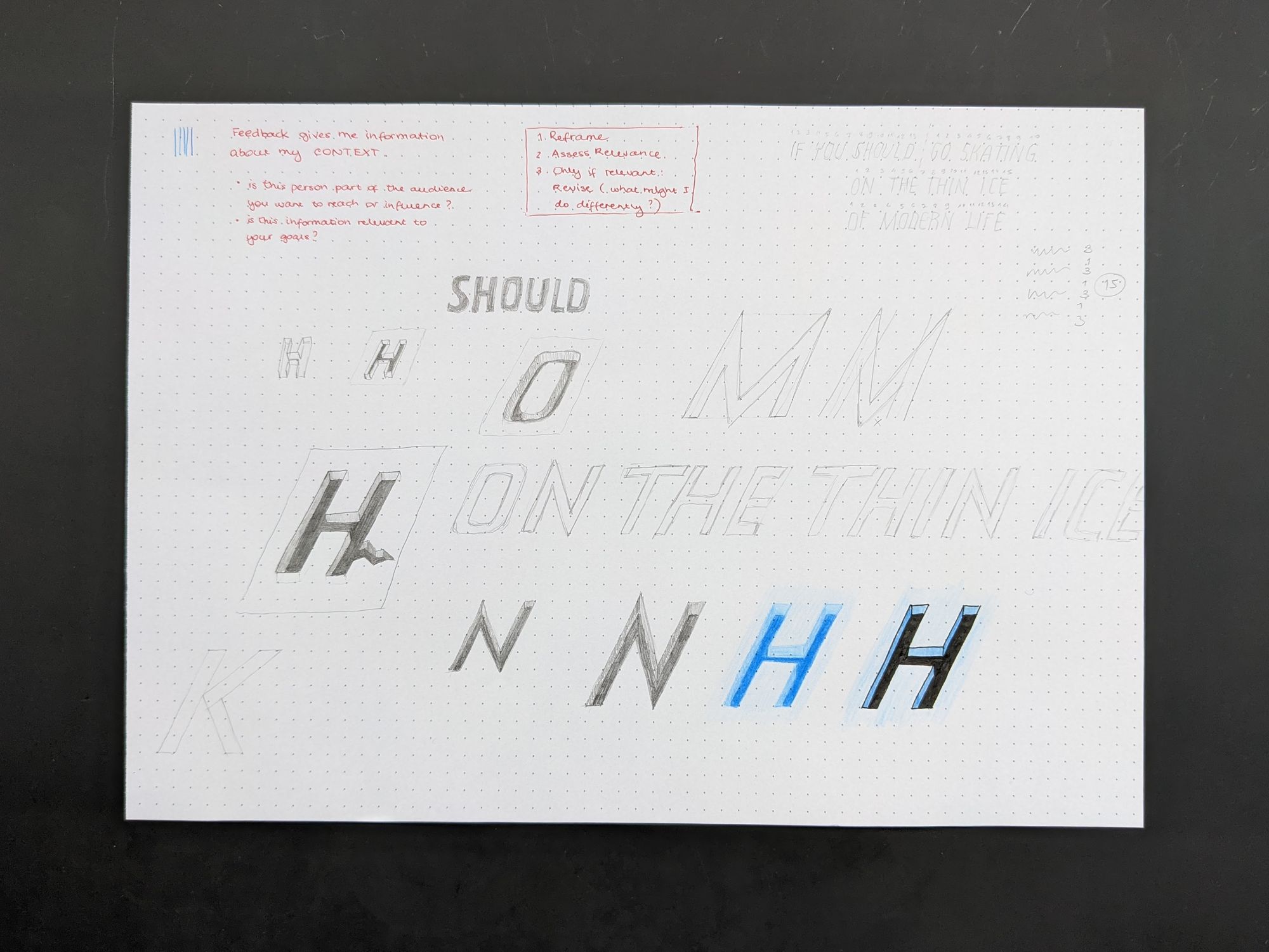
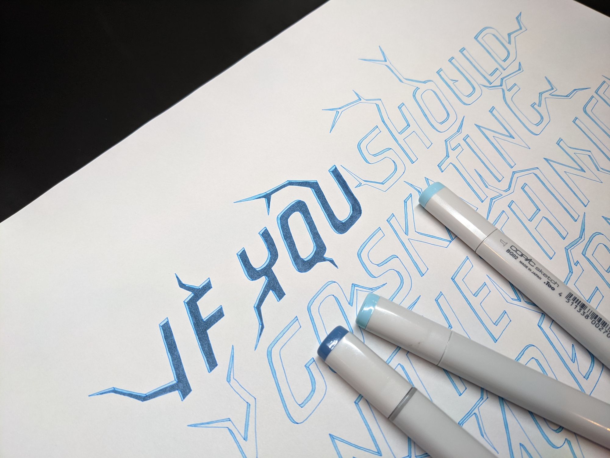
I wanted to make the ice light blue, and the water underneath a much darker color. For the initial exploration, I used colored pencils.
Next, I moved onto figuring out the layout. I had originally started with the idea of using 3 lines, but given the size of the letters, I decided to make it 4 instead. I didn't want to make the letters any smaller because then it would be harder to show the ice thickness while keeping a nice heavy letter shape.
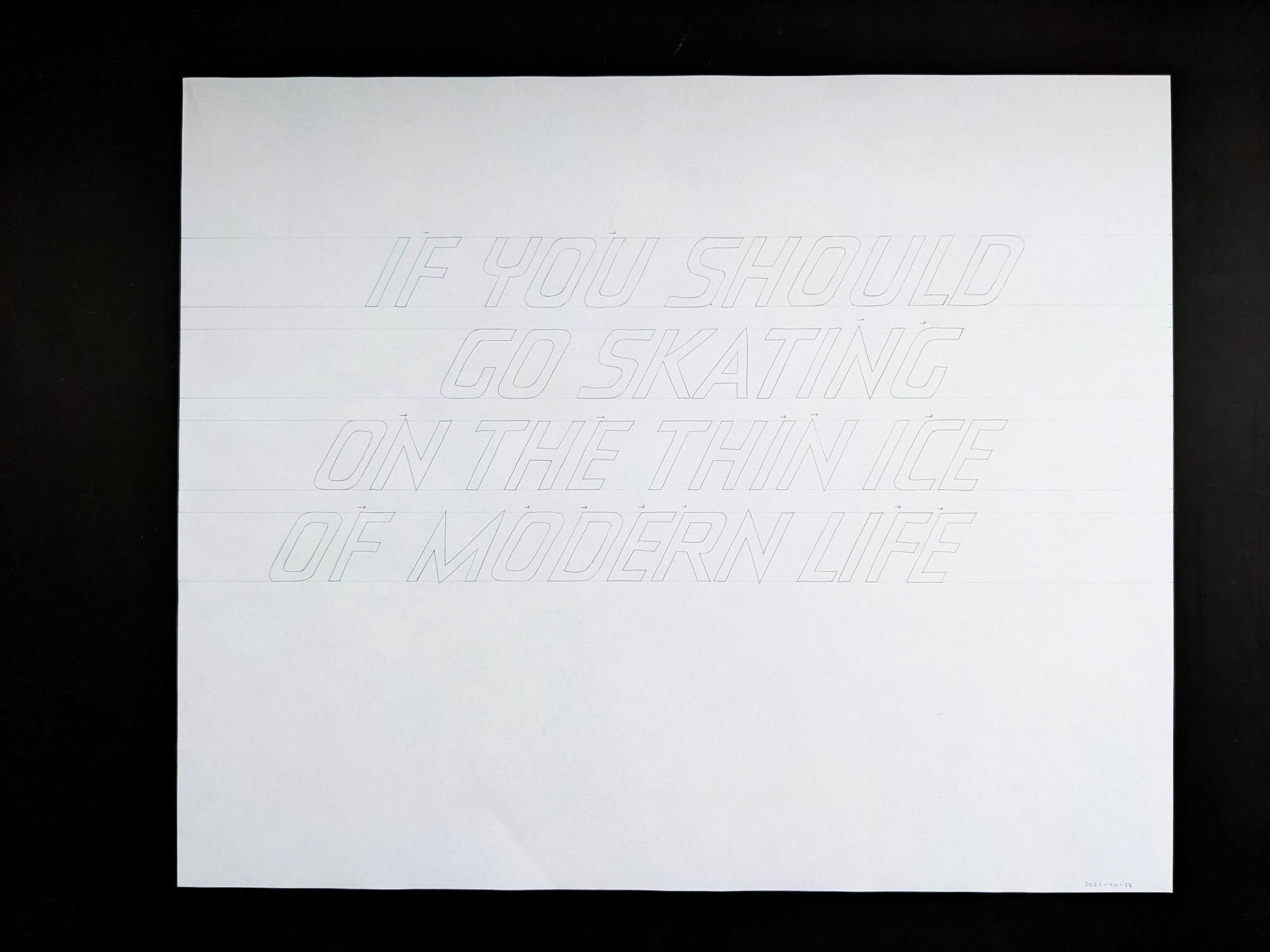
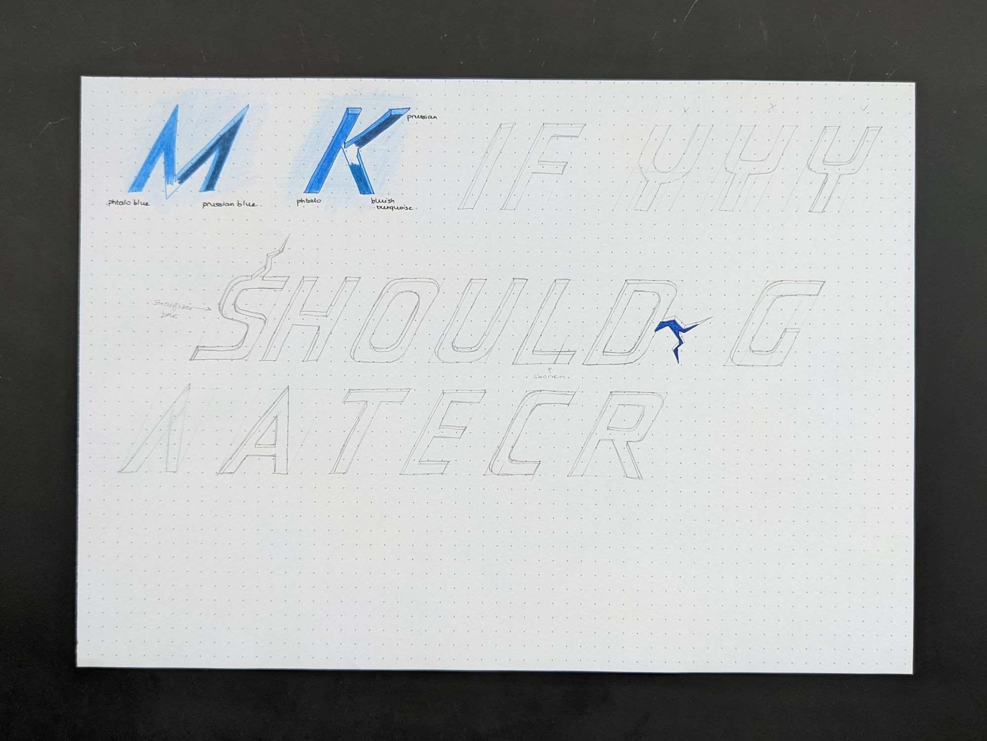
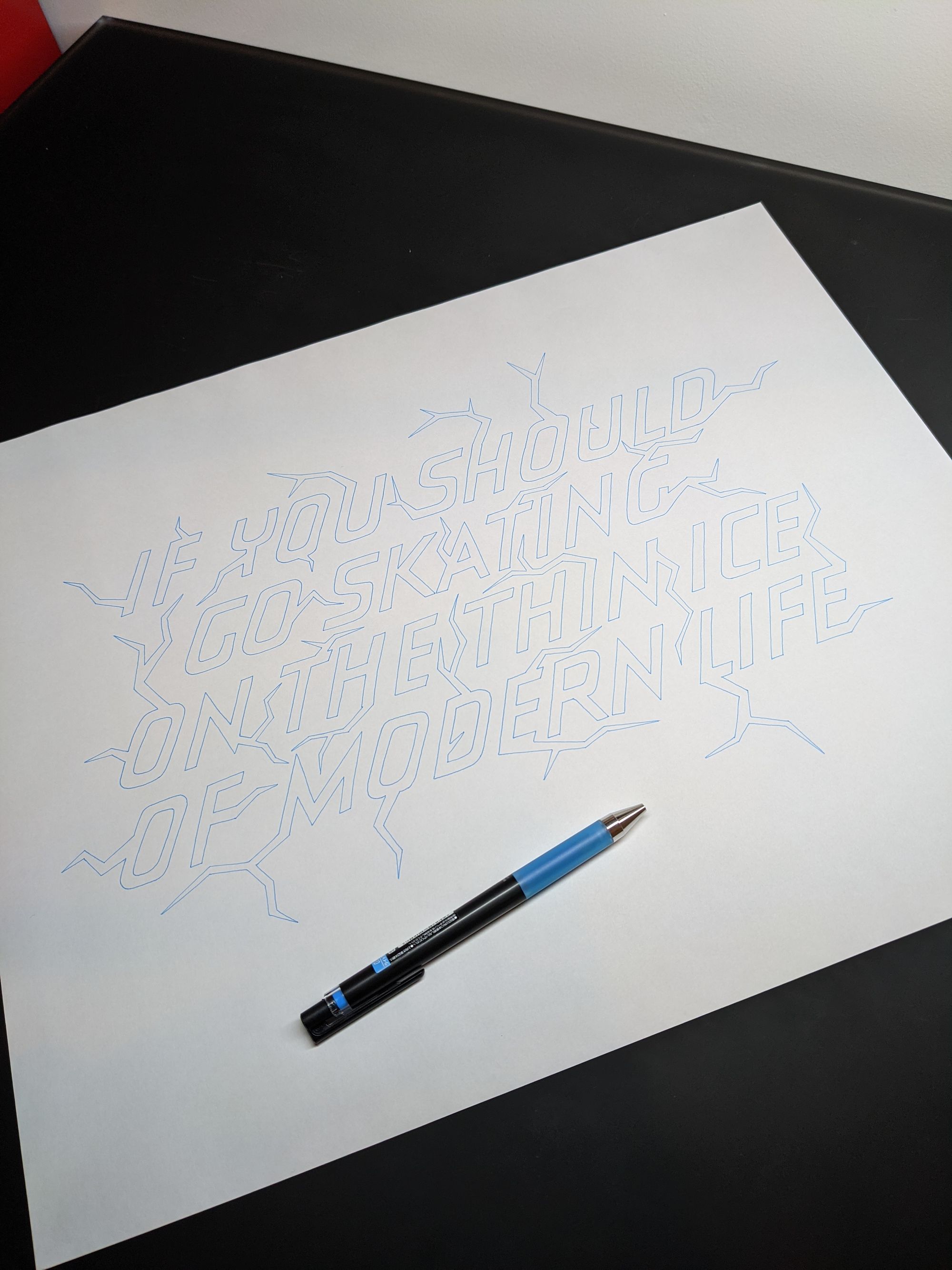
Off course, I didn't get the spacing right the first time around, but I wasn't expecting that. You can see the places I marked with arrows, where the letter should be moved to have more space before it.
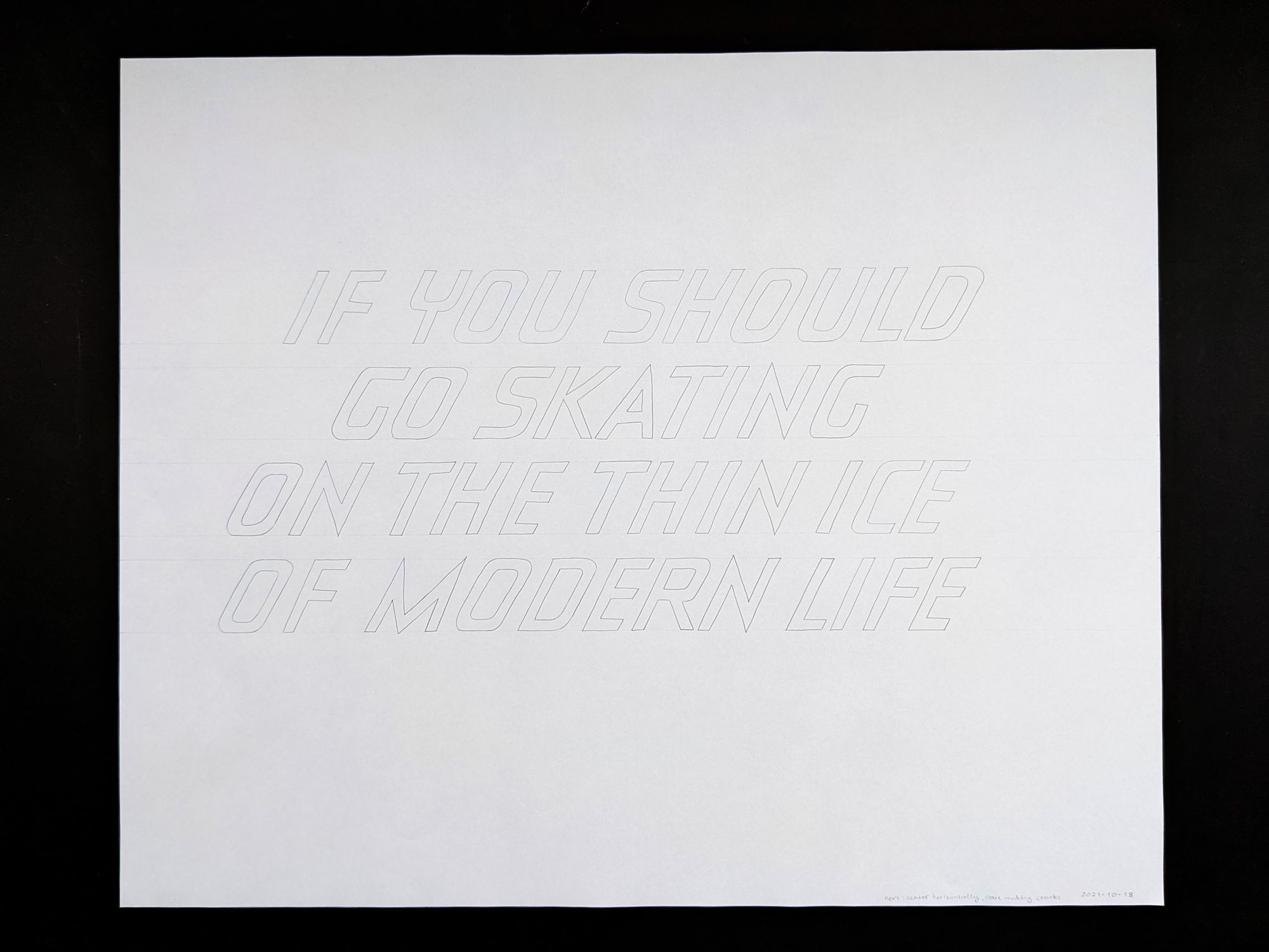
Once I got the spacing improved, I realized the lines were not quite centered either. I am still a bit puzzled over this effect, but if I had tried to center them perfectly, it just didn't look centered to me (probably because the letters are slanted), so I decided to go with the "looks about right" approach instead.
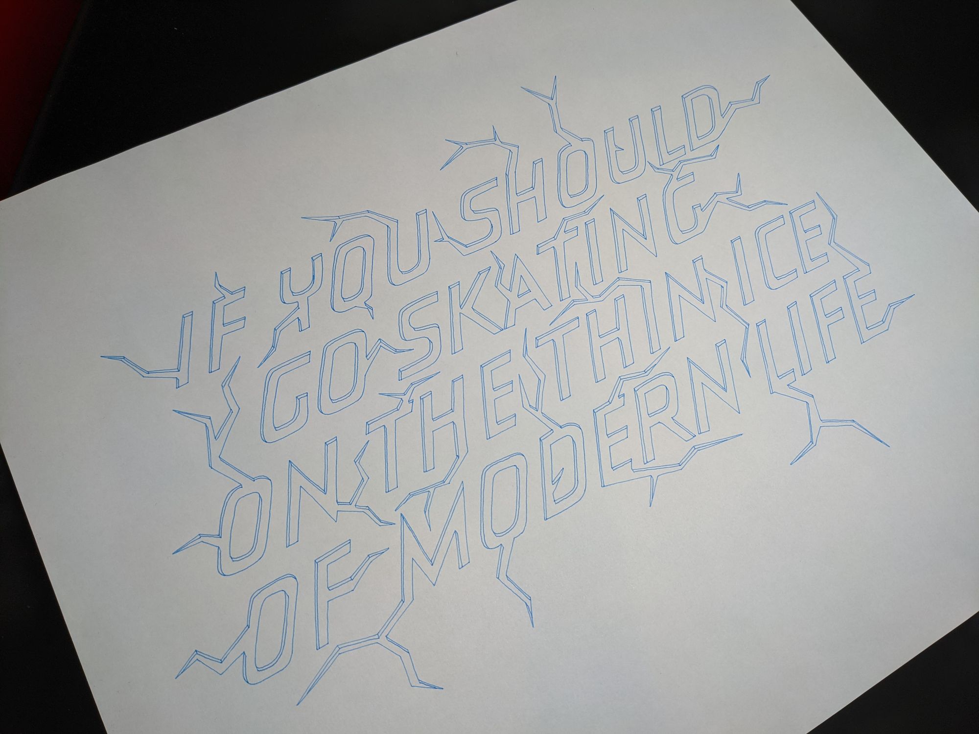
In the next version, in addition to better centering, I also added the cracks to the letters.
And yes, every one of these is still traced by hand, no photocopies and such for me. I know some people swear by making copies and then adjusting them, but I feel there is more flexibility when I simply make a new similar version, and I know exactly which dimension I am iterating on.
The next step was to decide on the colors. I tried the same pencil on this paper, and it just didn't work, so I decided to use markers instead.
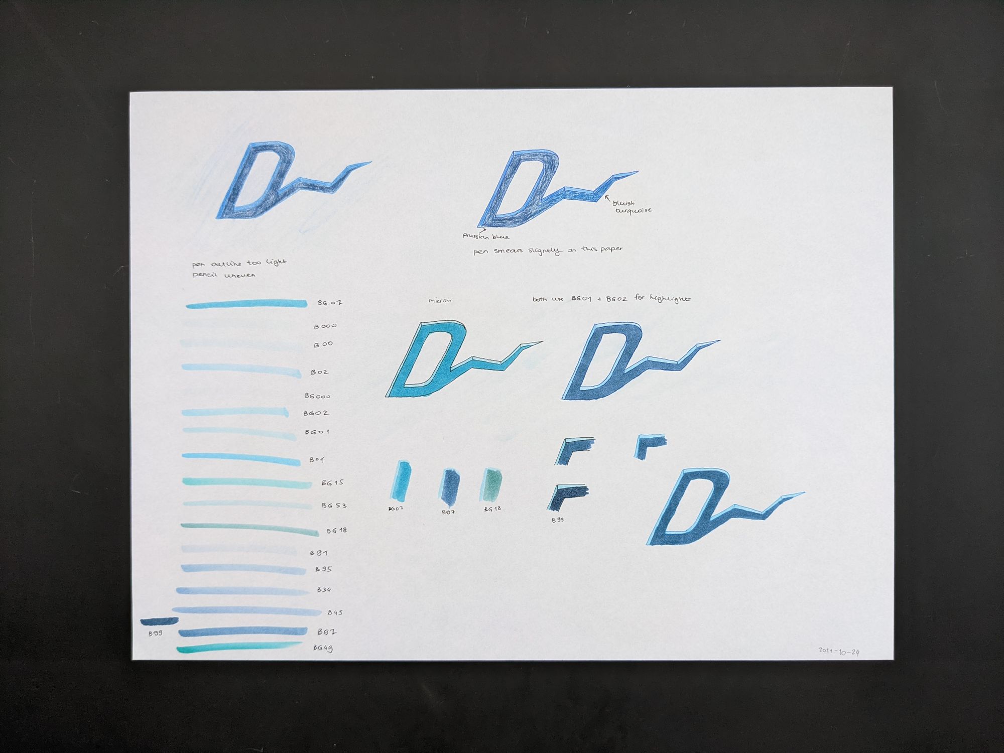
An interesting thing that I noticed is how the line color can affect the fill. If you look at the two D's in the middle of the page, and examine the "ice" part, you will see that on the left one (with black outline), it appears blue-green, but in the right one (with blue outline), there is no green tint. Both of these use the same exact markers for that part, but different ones for the "water". I ended up settling on the bottom right color combination.
I traced the outlines of the letters and cracks in a light blue pen.
Then, I added outlines for the thin layer of "ice".
Next, I shaded the "ice" with 2 colors of light blue-green markers.
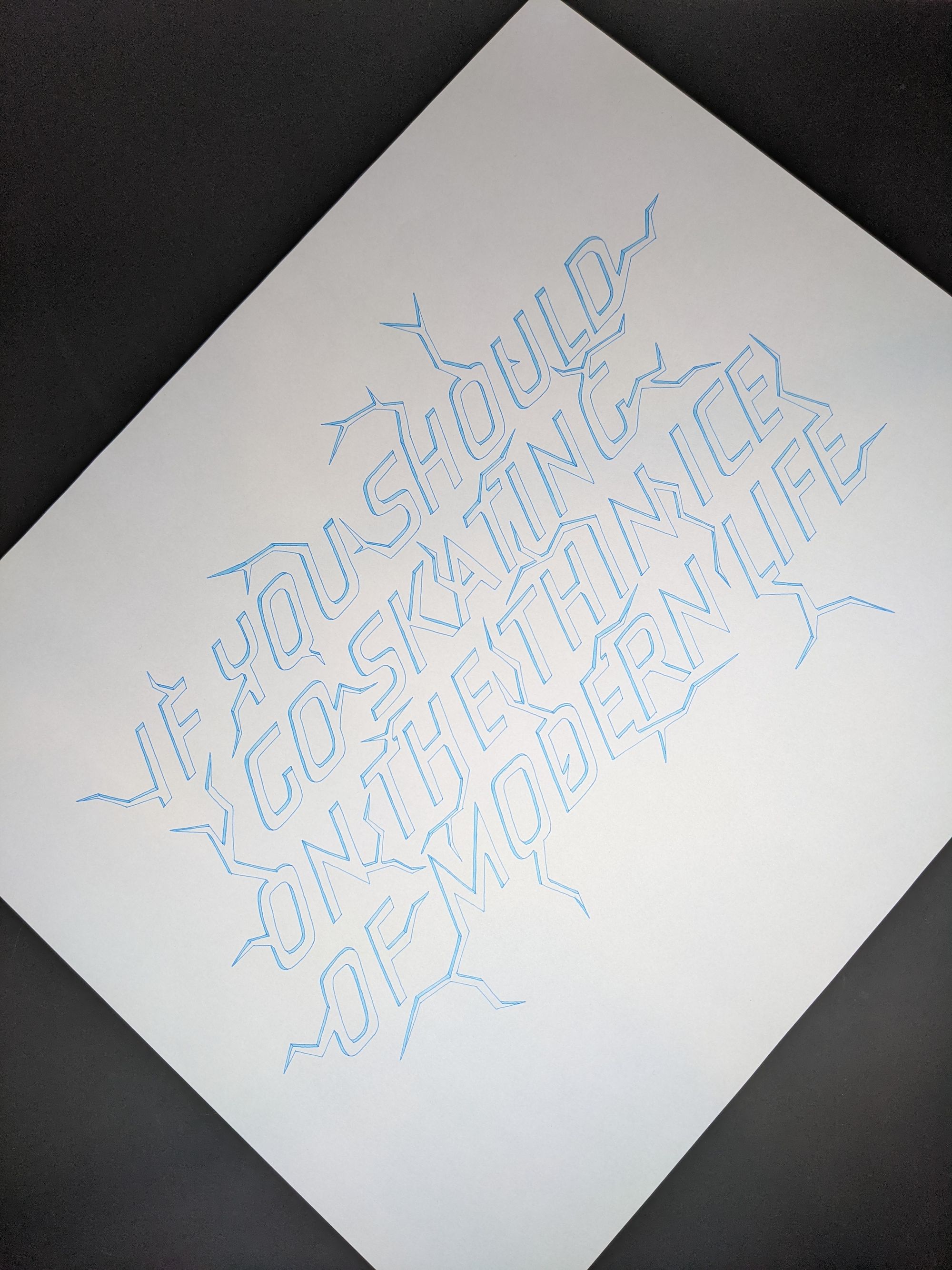
Then, I filled in the letters themselves.
And here is the final result!
Comments