inkmeblue
  • Home
  • Portfolio
  • Workshop
  • About
  • Contact
Subscribe

legibility

A collection of 4 posts
Teavana's new labels
legibility

Teavana's new labels

At the end of last year, the local Teavana store got a major facelift. Now the teas are no longer hidden behind the register, but can instead be browsed by buyers. I am assuming that similar changes are happening across the other Teavana stores in the US. Yesterday I discovered
Jan 7, 2016 2 min read
Material matters
type

Material matters

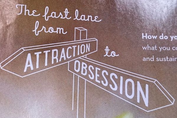
Signs of all sorts surround us. Some are good and clear, such as most of street signs, while others can be hard to read and confusing. However, typography is not the only thing that makes a good sign. It is true that bad typography will likely make it bad, but
Dec 24, 2015 3 min read
Last, fast or fart?
type

Last, fast or fart?

I was staying at a boutique hotel in Cambridge, MA. It was all nice and cozy, and there were some elegant flyers on my bed when I arrived. I was browsing through them idly, and then... and then I saw this one. I've shown it to several people, and they
Sep 15, 2015 1 min read
License plate legibility
type

License plate legibility

Every time I traveled to California, I would always look at the license plates and think to myself: "Yikes, this typeface is so ugly!" Of course, it would be unfair just to say that something is ugly, so I tried to figure out what it was that I didn't like.
Sep 9, 2015 3 min read
inkmeblue © 2023