From paper to digital

I've been studying calligraphy for almost 10 years now, and I found that depending on where you are geographically, it can either look like calligraphy is just another art class anyone can take, or like it's some special club where a selected few get to study from the great masters.
I have been extremely lucky to start in the "just another class" place at my university, and it was only a few years later (when I finally was ready to register for the big calligraphy conference) that I felt a bit out of place in the calligraphy world.
Just like with any art (or anything, really), there are many levels of expertise in calligraphy. Some classes I've taken definitely went over my head, and it was for a good reason they were labeled "advanced".
But you can't start with advanced classes. Going to workshops full of professional calligraphers can be soul-crushing. Just imagine: you are barely keeping up with the class, and then during the break you walk up to someone else's desk, and they effortlessly produce a masterpiece in front of you in 5 minutes. Daunting, right?
This is why I believe it is important to have calligraphy teachers who work with all student levels, and not just the best artists who have already proved themselves. It is also crucial that entry level classes have the same high standards of instruction as the advanced ones.
There are plenty of calligraphy classes, especially online, usually with the word "modern" in the title, that are really low quality. When you are a beginner, how are you supposed to know what's good and what's bad? If you don't know calligraphy and design rules, how will you know when it's okay to break them?
Ideally, every beginning calligrapher would take a weekly semester-long intro class from a good teacher. I swear we spent the first session of my class just learning how to line the paper correctly. But who has the time for it these days?
For those who want to understand the fundamentals within a short period of time, I have designed a 1-day intro workshop.
Obviously, one day is not enough to cover everything there is to know, but one of my priorities is to call out everything I am compressing or omitting in the interest of time. For example, instead of making everyone line their paper, I am going to pre-print some guidelines. However, I am not going to compromise on the tools (we are going to use real broad-edge nibs and ink) or the letterforms (we will stick to one hand, or style of writing, but cover it in a lot of detail).
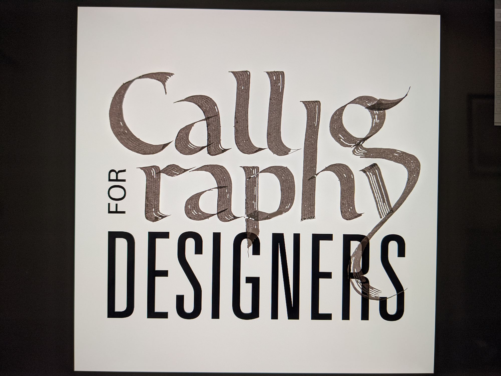
When I designed the logo for this workshop, I wanted to convey that calligraphy is both beautiful and practical, which is why I called it "Calligraphy for designers".
I am now going to show you my entire process for the logo, including all the parts that were ugly, looked unprofessional, and where you could say I "cheated". All of the images are photos of my actual work, and they have not been modified except for cropping and minor contrast adjustments.
Ideas always look beautiful before you put them down on paper.
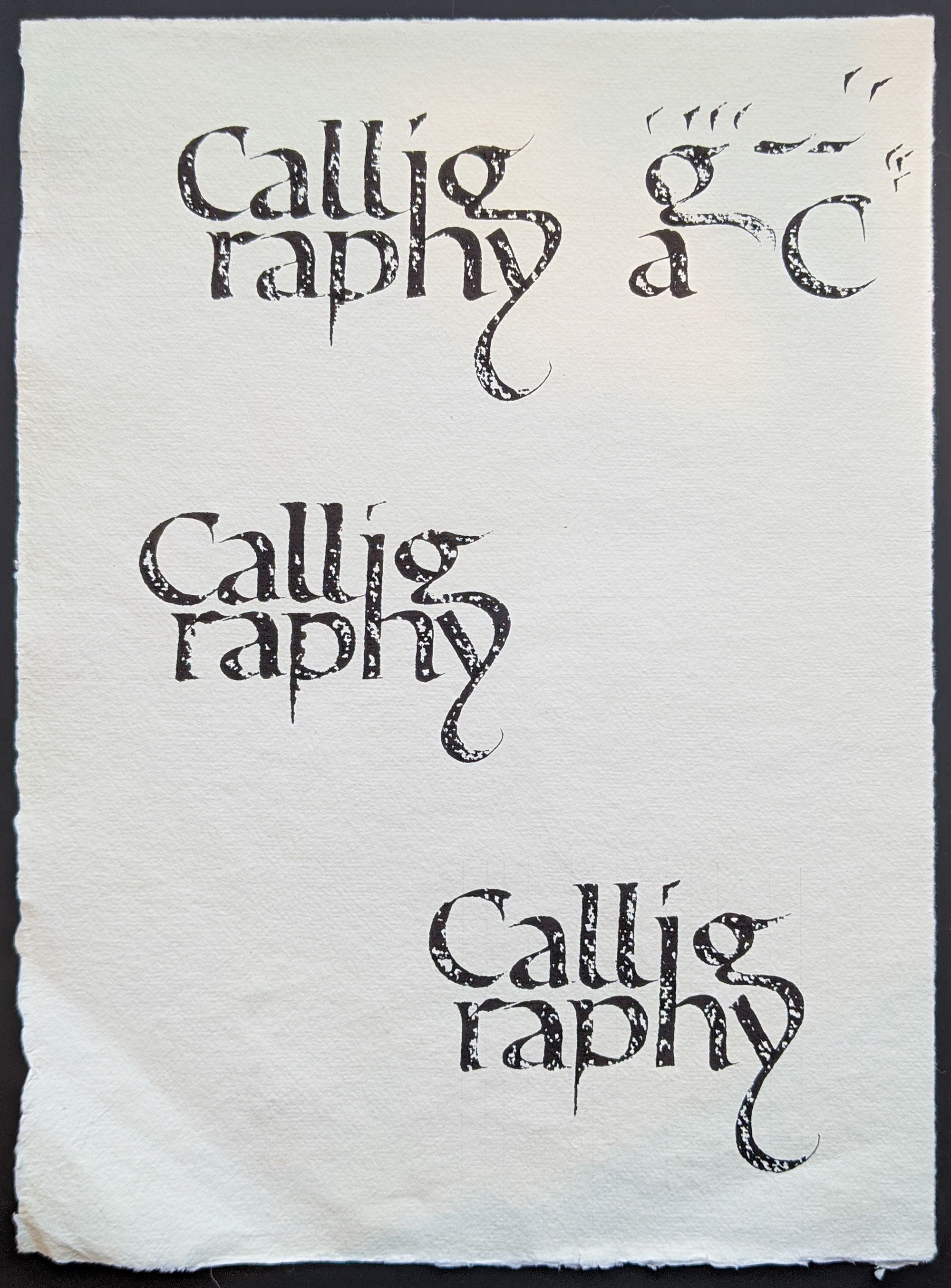
In the image below, you can see the first two attempts I made to convey my idea. I did not particularly care about the accuracy of my letterforms, or even keeping the lines straight. And for this stage of the project, this is perfectly fine. You don't want to spend an hour on your rough draft when you can do it in about 1 minute.
When I wrote out the first one, I realized 2 things:
- The word "calligraphy" is awfully long.
- Whatever I do for the "for designers" part, that descender of the y is going to cause trouble.
What's the first thing to try if the line is too long? Break it in half.
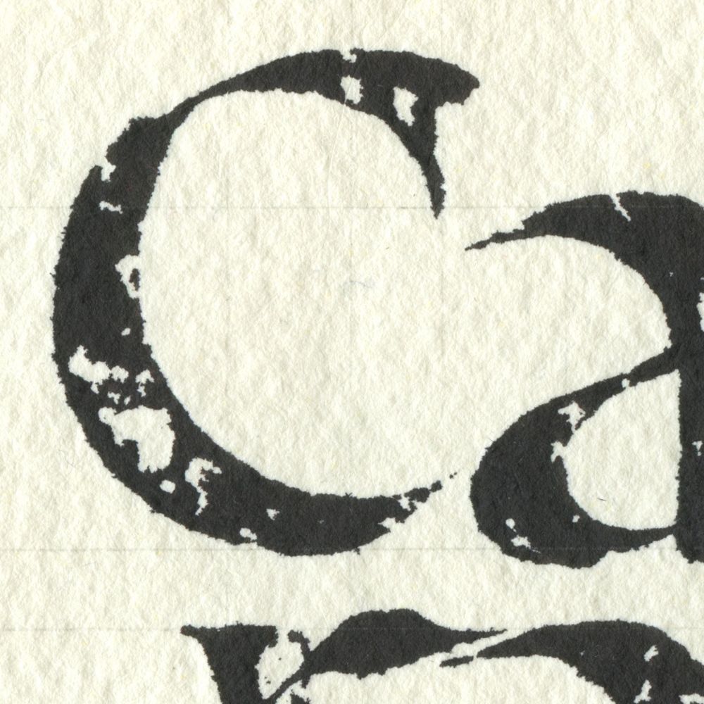
I wrote "Callig" on the first line, purposefully leaving the tail of the g unfinished because I did not want it to overlap with the second line. Then, I wrote "raphy" on the second line, and suddenly I discovered a happy accident of g and y connecting into one fluid shape!
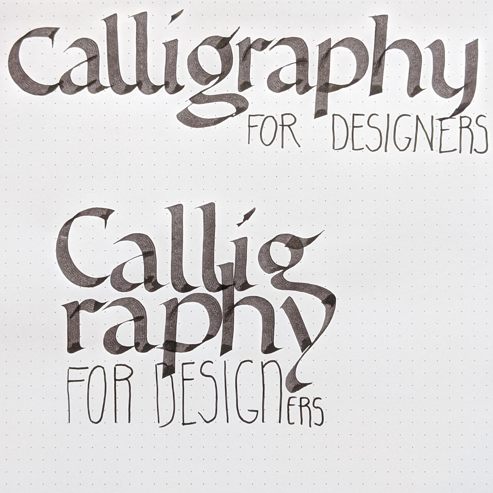
I can tell you right away that no matter how long I thought about it, I would have never come up with this clever combination if I did not try it.
Sure, there are other things that look wrong, like that really awkward ascender of the h poking through in the top line, or the ugly bottom of the p. Perfection is not what I was looking for in this piece. It was an idea, and it did its job beautifully.
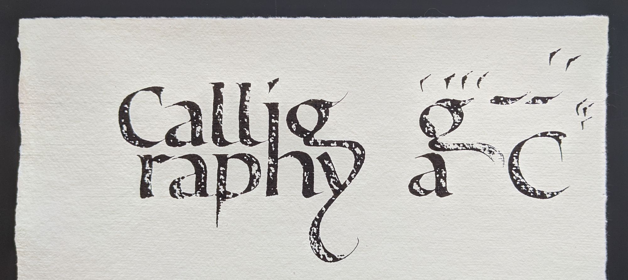
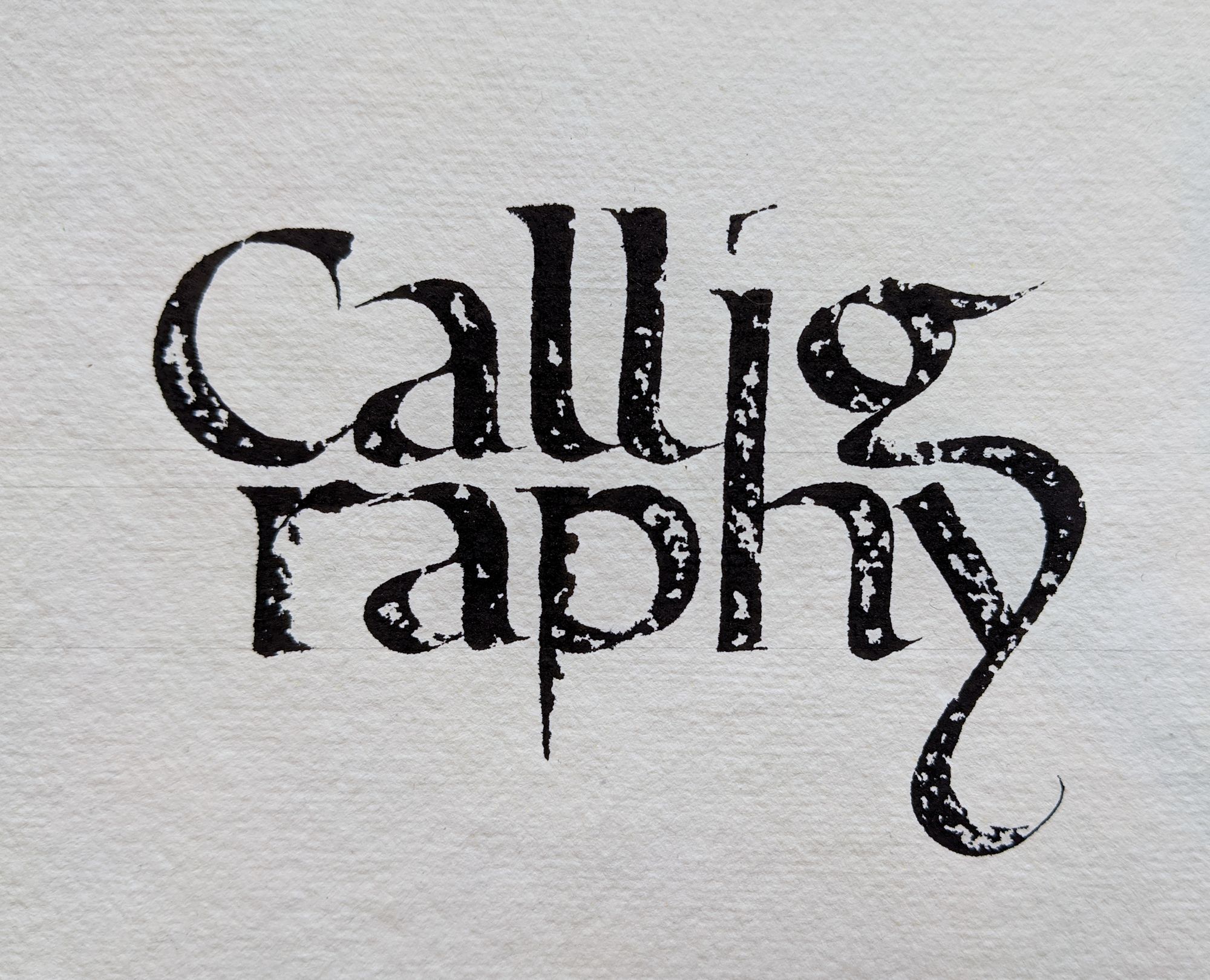
I went on to play around with the letters and see how I can arrange them in a way that is harmonious. The top attempt's spacing was too loose. The bottom attempt overcompensated by making it way too tight.
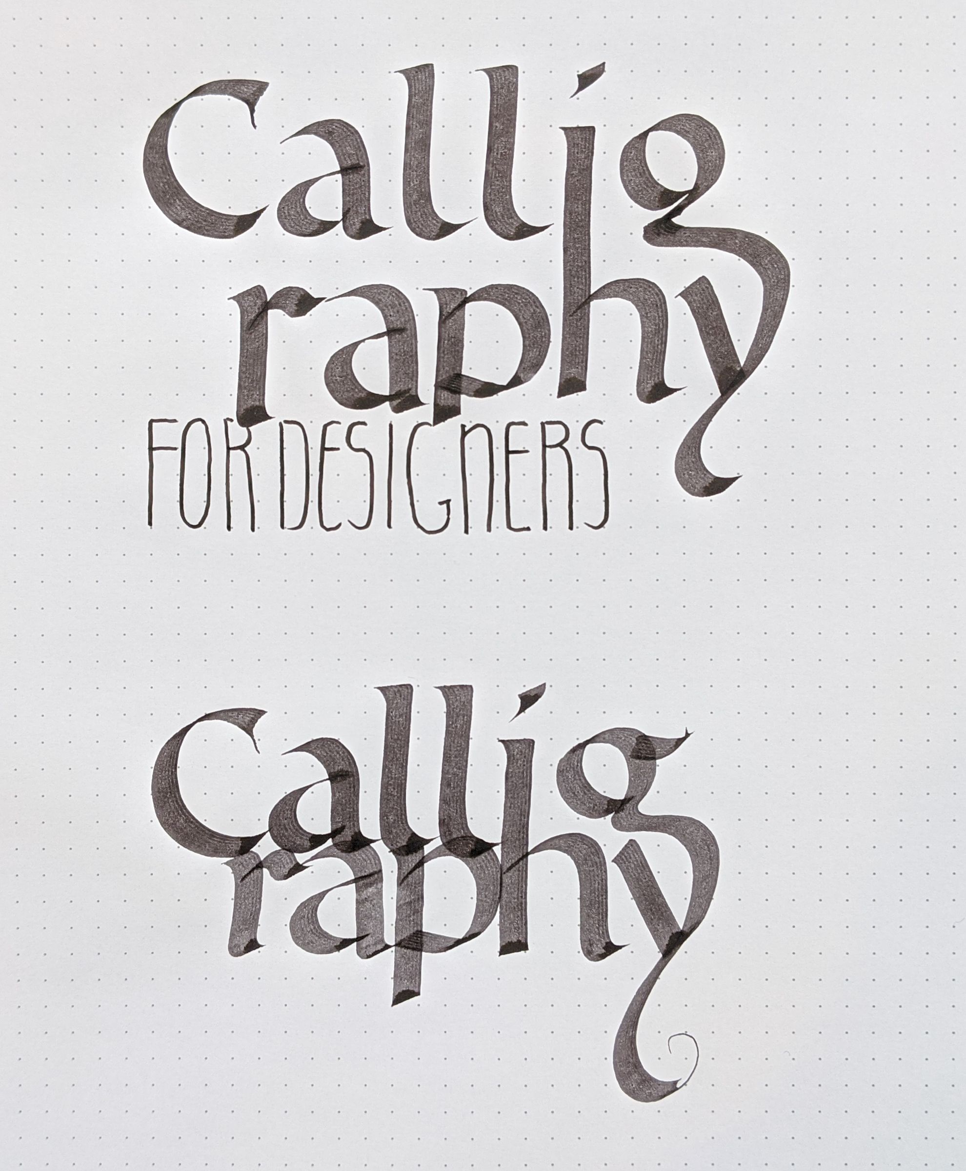
Sometimes, you can only find the happy middle after considering the extremes, which is what I did here. And I also figured out how to deal with that annoying ascender of the h: I just combined it with the i.
Oh, did I mention that "for designers" part is really weak? I know. And once again, at this stage it's okay. It stands for all-caps sans-serif type, which is all I need to indicate.
If I were to allow my inner critic to point out every imperfection in my drafts, I would never get any work done.
The sheet below has two more attempts. At this stage, I was trying to make the lettering tight enough so I could take it to Photoshop and try adding real type. I rejected the top attempt because the space between r and a is too large, and the tail of the y is too short.
The bottom attempt went on to have some adventures, but not before I asked a designer friend for some critique. Yes, no matter how clever we think we are, it always pays off to have a second set of eyes on our work. She did confirm my suspicion that the monoline letters on the bottom were no good, but the calligraphic part survived.
Not everything I tried looked great. For example, below is a "screenshot" of one of initial attempts that didn't quite cut it.
I was much happier with the next version, which I again sent to my friend before doing the final.
I like the "brushiness" of the strokes in the written part, but it was solely due to the fact that the ink in my Parallel Pen was running out, and I was too lazy to replace the cartridge. It actually did run out at the end of the y.
In other words, it would be more trouble to reproduce than I thought was worth, so I decided to use a textured piece of paper instead to make sure the letters stay "alive".
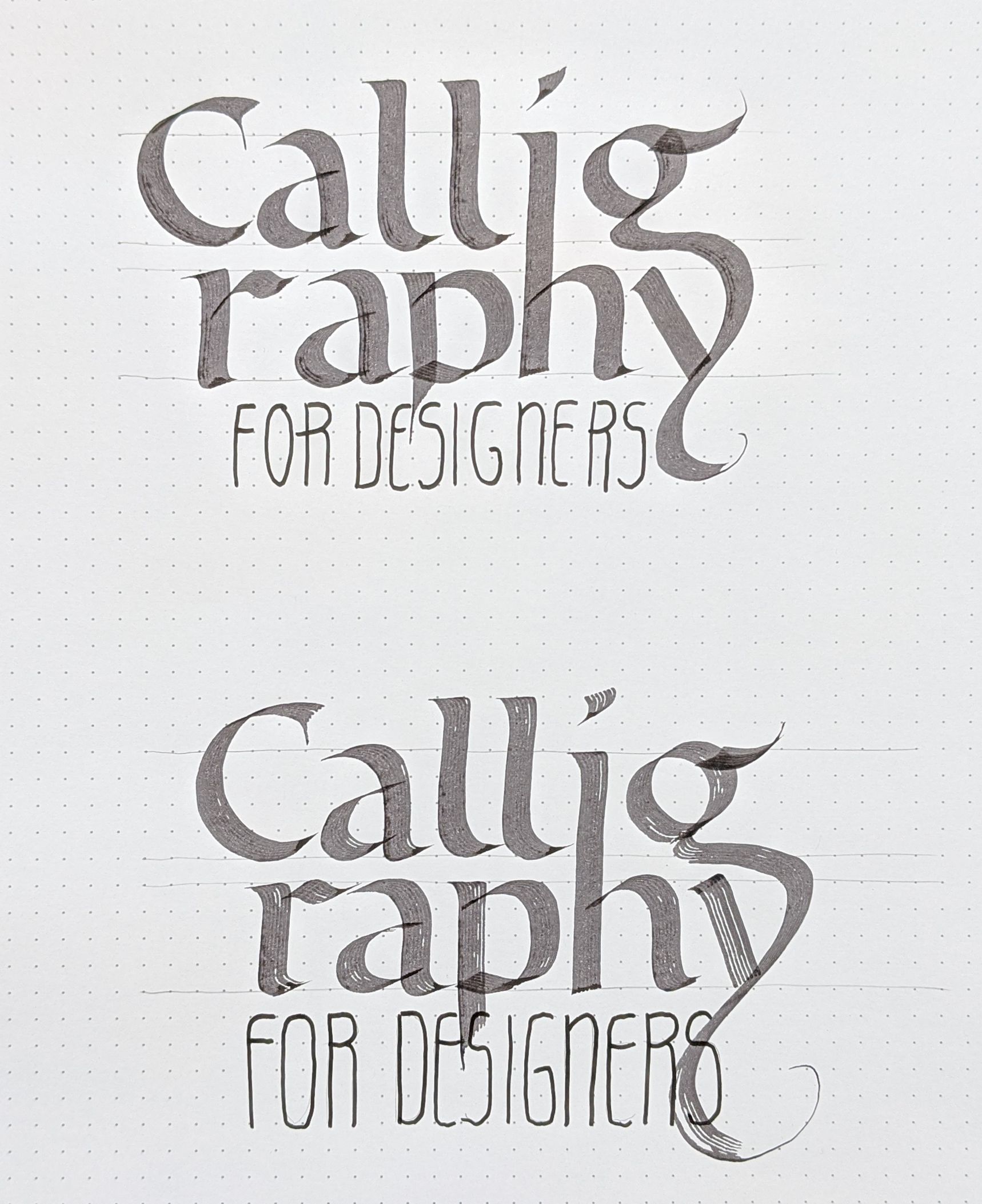
I made a total of three attempts. If I were trying to use this as a physical piece, I would probably do one more.
The first attempt was just a practice run, and I didn't have any expectations for it. It was mostly okay, except for the bottom of the g's bowl that has a think-to-thick line connection.
The second one came out pretty well, but I was bothered by the slant of the h's ascender, so I decided to try one more time, and draw some vertical guidelines to help me keep the letters straight. You can see those lines in the image below.
The third version did not come out as perfectly as I had hoped for. The verticals were parallel, but the arch of the h just didn't work out.
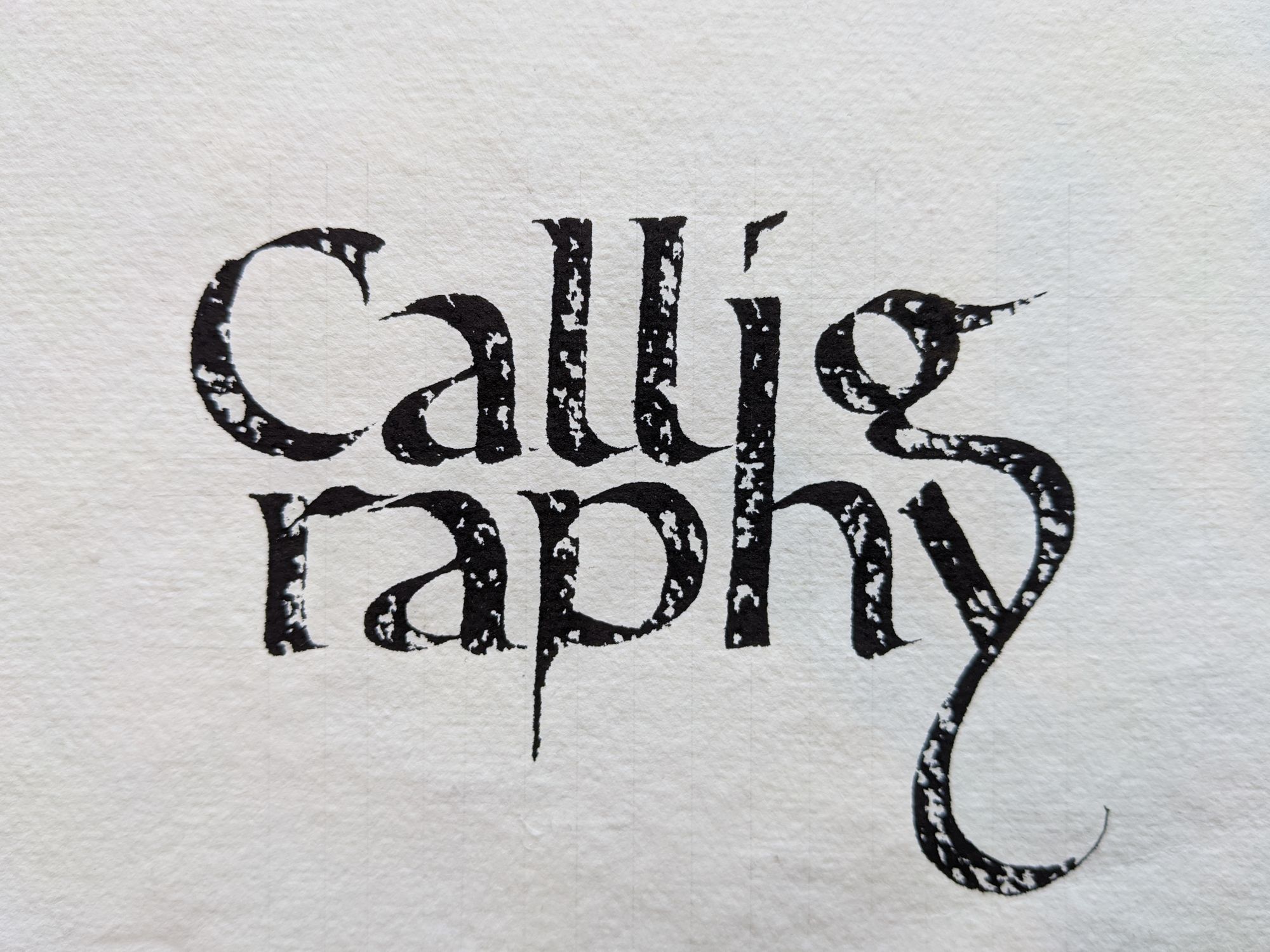
Since this project was only intended for digital use, I just combined the better parts of the two attempts into one.
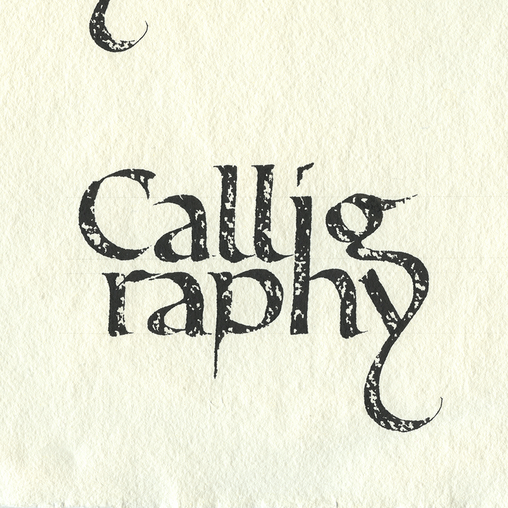
If you were a real purist, you might call me a "cheater". But let's be realistic: why waste a whole other sheet of paper when I can fix it up digitally, and you would never notice if I didn't tell you?
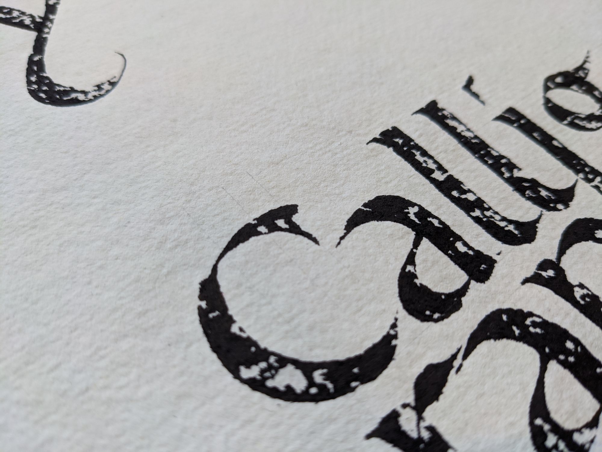
The versions that I combined were both scanned in high resolution. Below is a small piece of the scan at 100% size.
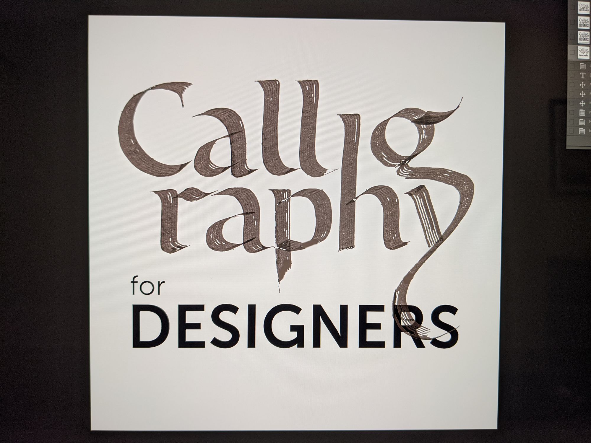
From there, I did some more "cheating", and erased the lines in Photoshop. I have to admit that the Spot Healing Brush tool has gotten much better since I first tried it in Photoshop 7.
I already knew what type I wanted to use from my earlier experiments (Univers), so I picked my colors (complementary to highlight the contrast between digital and hand-made), slightly adjusted the color balance on the scanned piece, and it was done.
Since I wanted to use the same piece for advertising on Instagram, I also made a taller version that has the workshop information in the image itself.
I hope to see you on March 14, 2020! You can register at inkme.blue/workshop.
Comments