Is my Starbucks cup angry at me?

The first assignment in my first design class was to use simple black shapes on white background to express different words, such as "small", "crowded", "angry", and so on.
The key takeaway from that assignment was that pretty much anything could be expressed with the simplest shapes, and if done well, the meaning would be universally understandable (within the same country and/or culture).
Jagged and angular shapes usually correspond to the "angry" concepts, and so does the color red. Again, this may not apply to all cultures, but assuming the design is made for North America, those would be the most likely associations.
Check out this Starbucks cup holiday design:
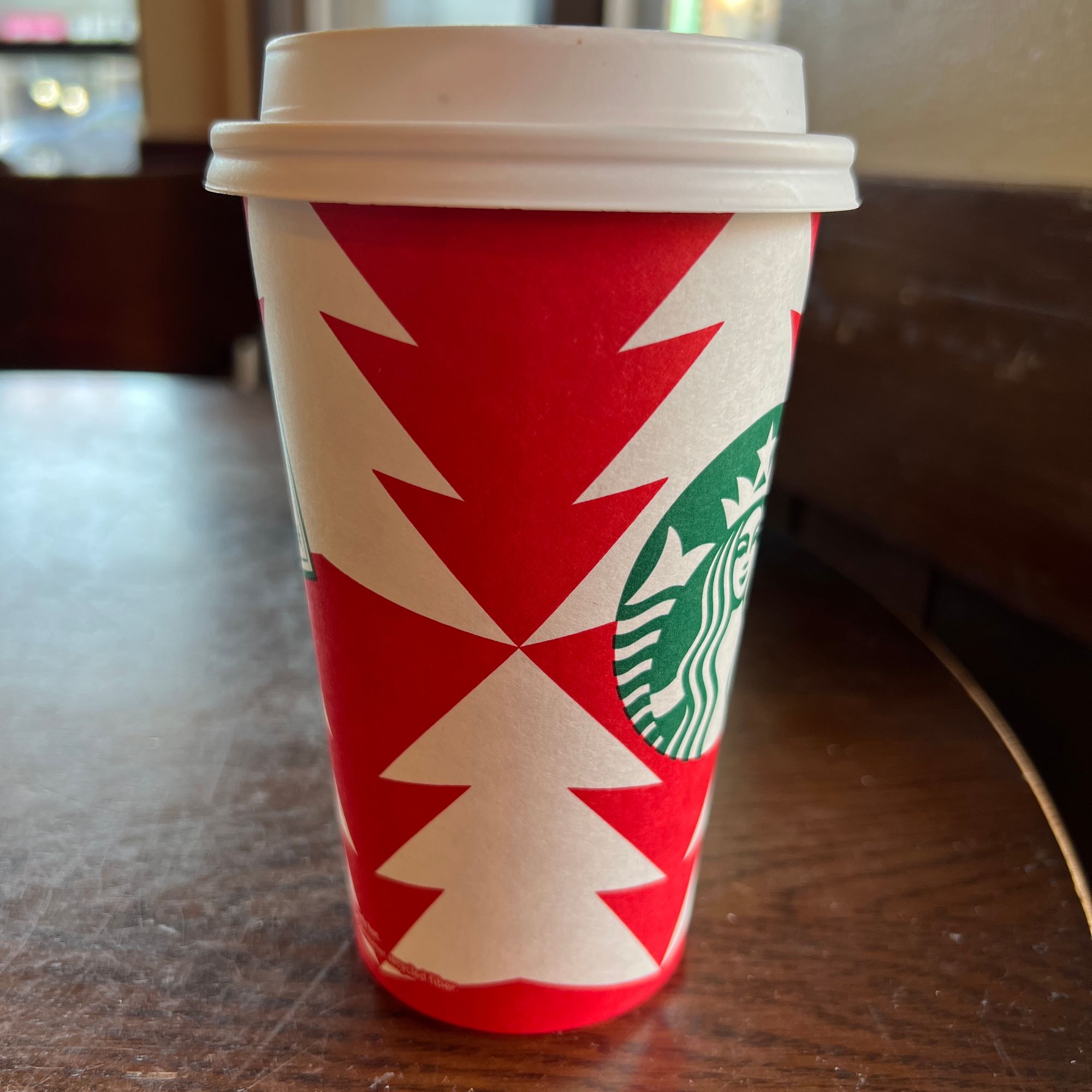
When I first saw it, I thought "Whoa! What's going on here?"
I can see a little fir tree at the bottom that is being struck by 2 lightnings at the same time, ouch!
Of course, that's not what the design is. It's just white fir trees and upside down red fir trees arranged in a pattern around the cup.
However, that point in the middle where 6 triangles meet reminds me strongly of the "anger" images from my design class. These kinds of shapes are what most people would come up with to express the concept. And while it clearly is not the intention of the design, it is what people will notice subconsciously.
I wonder how nobody at Starbucks noticed this during the design reviews. Perhaps the trees did not look so much like lightnings on the template as they do on the cup.
Or perhaps they didn't spend much time on this design, considering the alignment of the Starbucks logo:
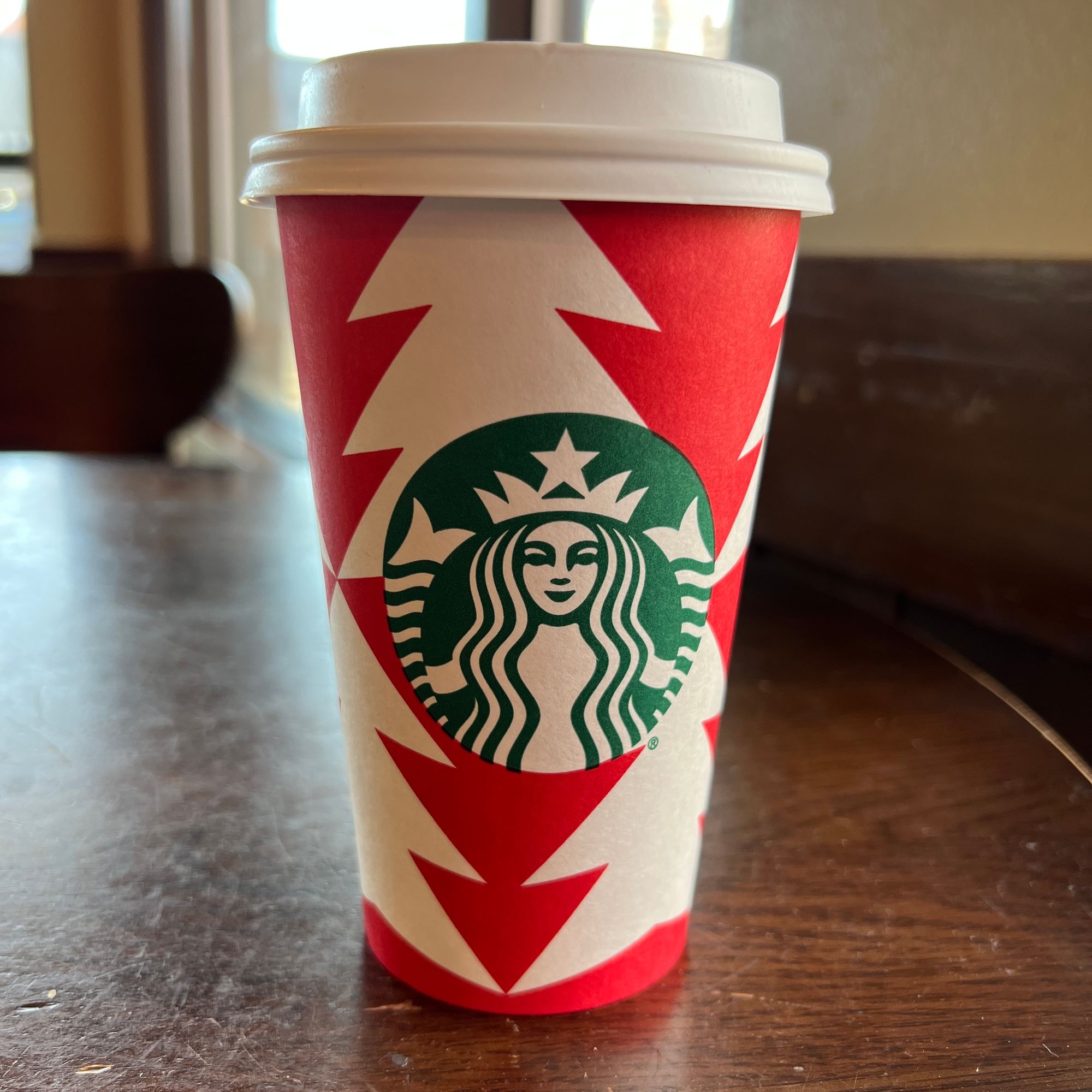
When I look at this side of the cup, it really bothers me that the logo is not centered with that red upside-down tree at the bottom. The placement looks accidental, I cannot think of any design principle or reason why anyone would put it in that precise location.
I've generally had a high opinion of the Starbucks designs, but this cup is just not good. Hopefully next year's holiday collection will be more visually pleasing!
Comments