Chaika: Cyrillic typeface

One day I was browsing Lebedev's "business lynch" web-site, and came across somebody's question about the font used in the Chaika sewing machine logo. The verdict of the person who had looked at it ran along the lines of "that letter Ч has a very interesting shape, I wonder what the rest of the alphabet would look like".
I decided that I would very much like to know that too. There was just a teeny-tiny problem: I had never written with pointed pen before, so when I tried to come up with an alphabet, I didn't even know which strokes would be thin and which ones would be thick.
So I put the idea aside for a while and worked on my calligraphy instead. At some point this year I decided I was ready to give it another try, and here is the story from that point on.
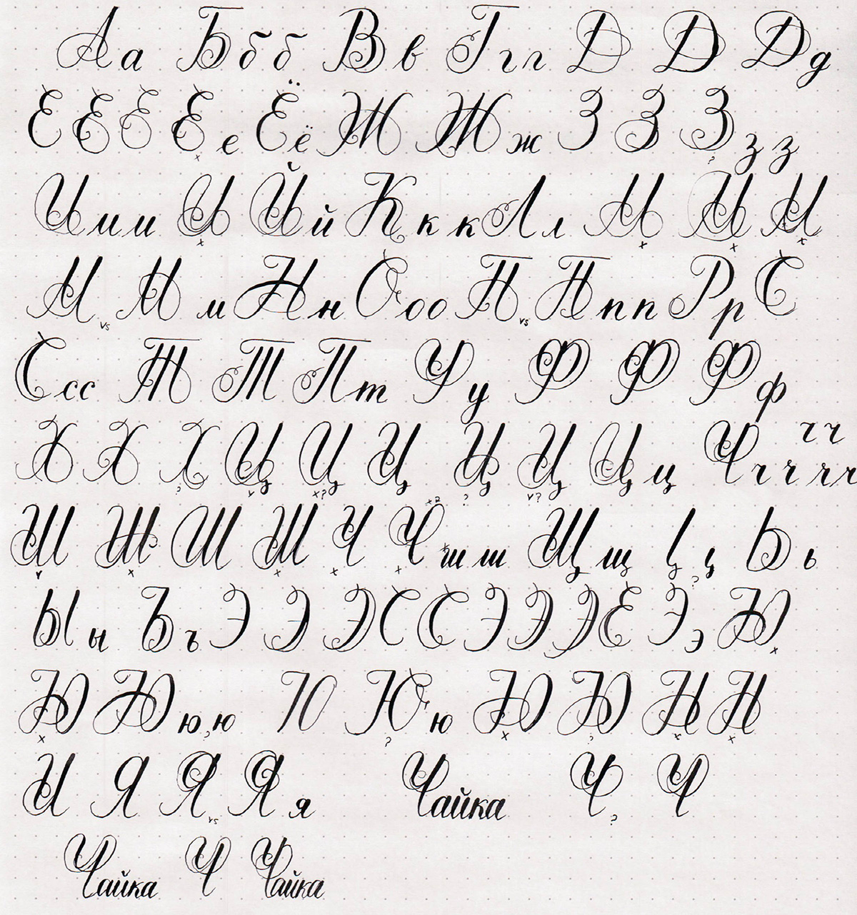
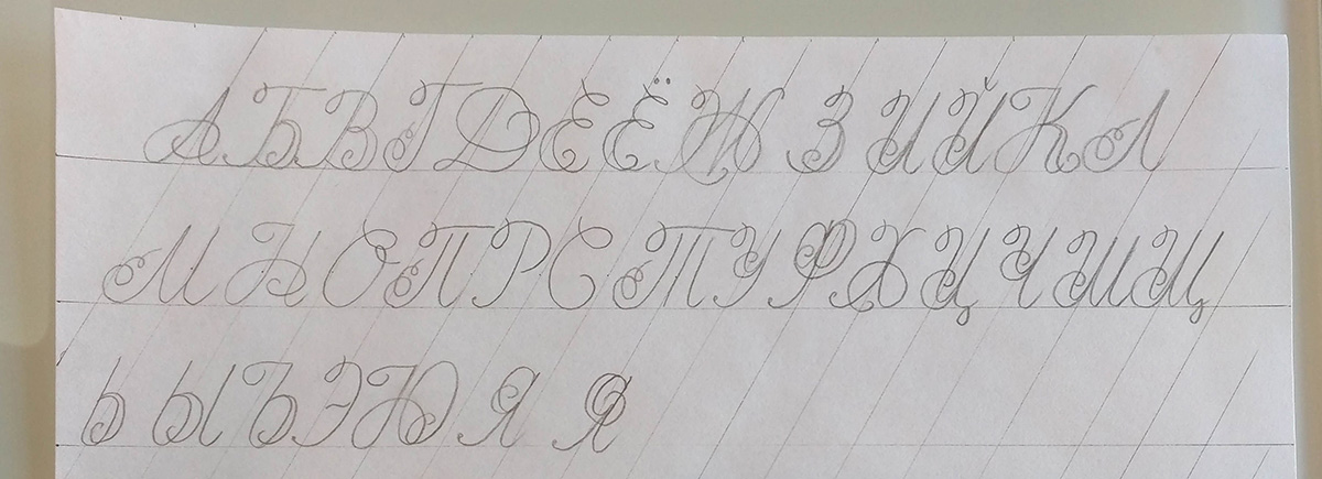
The first thing that I did was write the capital letters in pencil in their simplest cursive form. Even before that, I practiced quite a bit to be able to reproduce the Ч from the logo. I realized right away that the shape of that letter was not something you could naturally write in one stroke, and it took several attempts to make it look like the logo.
After getting the most basic shapes down, I started coming up with different variations that would look similar to my starting letter.
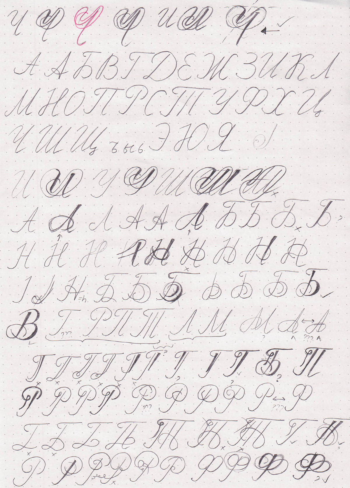
Trying those in pencil was enough to give me a rough idea of what I wanted to try, but I had to switch to using a pointed pen soon enough to make sure I don't get carried away with crazy shape ideas.
Some letters seemed obvious enough, while others gave me a lot of trouble. I would try them over and over again. I mentally broke the letters up into several groups that had similar elements, and tried to make all the letters within a group consistent.
I then showed my experiments to a designer friend and got a nice critique along with several suggestions. I played around with those during another round of pencil drawings.
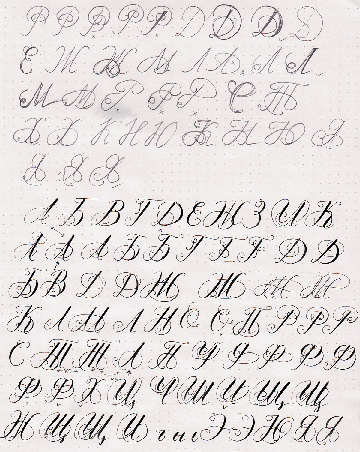
The more I worked on the letters, the more disappointed I became with that letter Ч. While it may have inspired me to take on this project, it was nothing but a troublemaker. Most of the letters didn't have the right place for that "double bottom" effect, and also didn't need to be so wide. I ended up modifying the Ч quite a bit compared to the initial version.
I had also completely forgotten about the lowercase letters. Fortunately, those don't have to be ornate, so I decided to go with basic pointed pen versions.
After that, I wrote out the entire alphabet on a separate page to see how the letters matched up, and got some more critique from another friend. Some of the things were quite obvious, such as the "leaning Л", which is more defective than intentional. Others were a bit more vague.
In general, I noticed that the more I asked people, the more vague their answers became. I am guessing that is because at some point, unless you are a type designer, you just know if it feels right or wrong, but can't really put your finger on it.
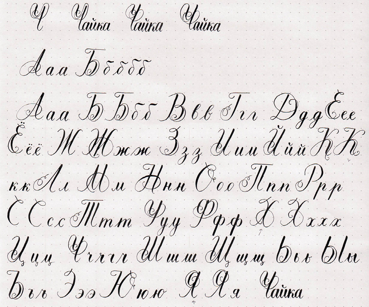
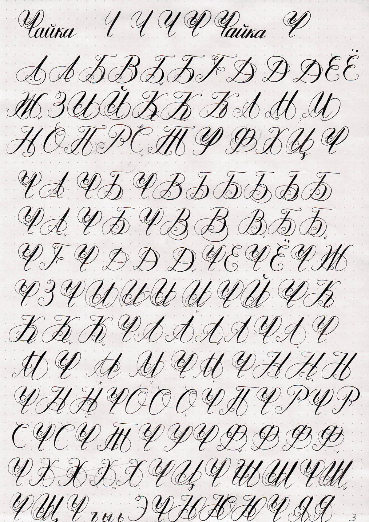
One of my friends asked me to write some text to show how that would look, which of course was a great idea. I also looked back at my Copperplate alphabet and decided to change the entrance strokes on the letters. Additionally, I simplified the Ч even further, since it now barely matched the rest of the letters.
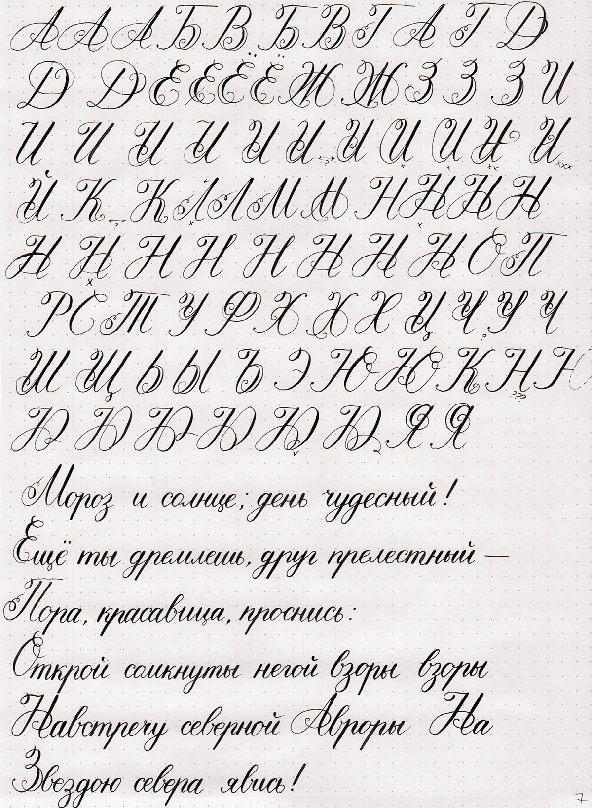
While I was mostly happy with the shapes of the letters, there was still plenty of work, since they were clearly not at the same angle, and that was one of the things that made some letters feel wrong.
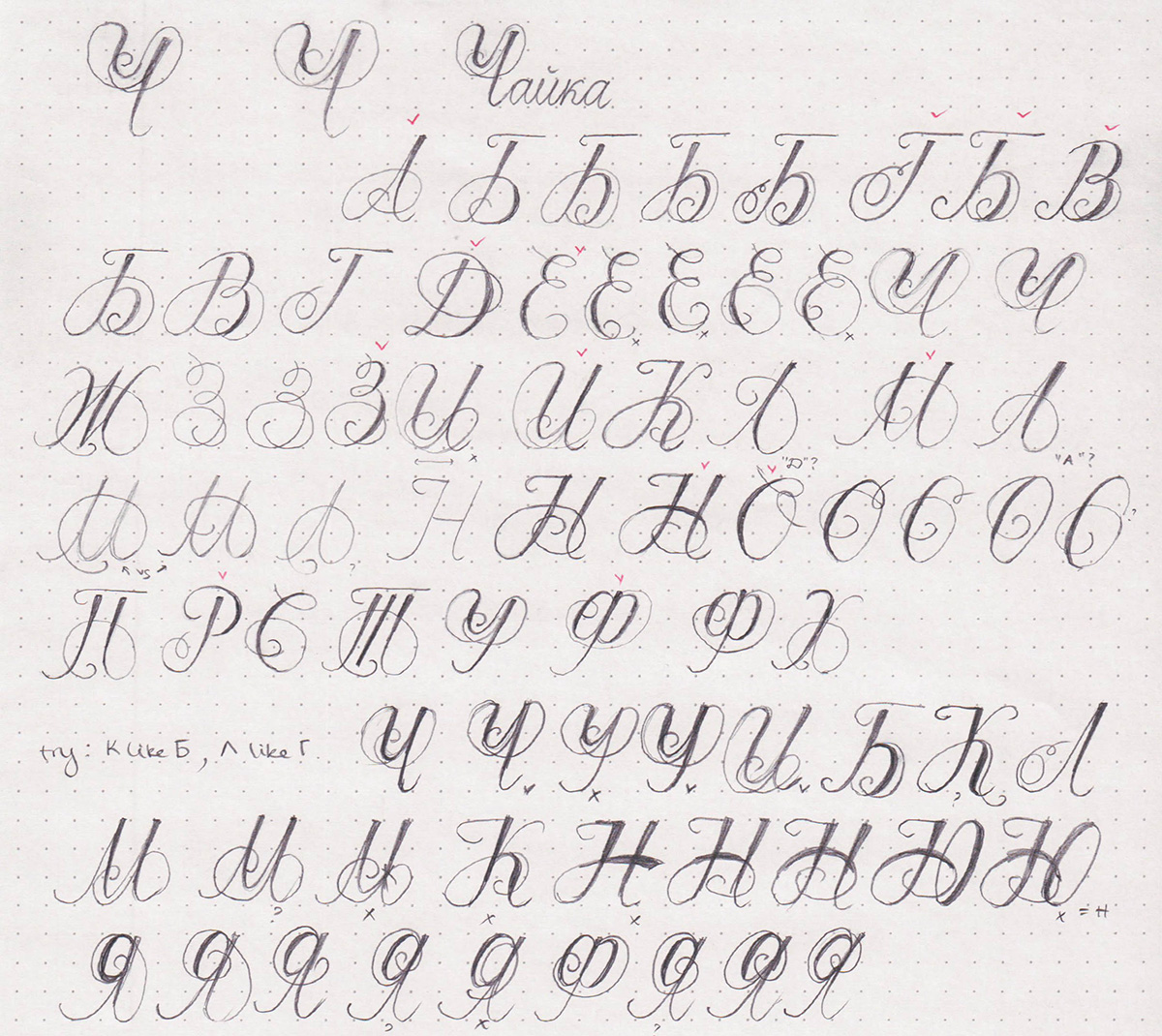
I wrote out the capitals and measured the approximate angle of each letter. Originally, I was shooting for 55°, but it turned out that 60° was more natural for my writing, so I decided to go with that.
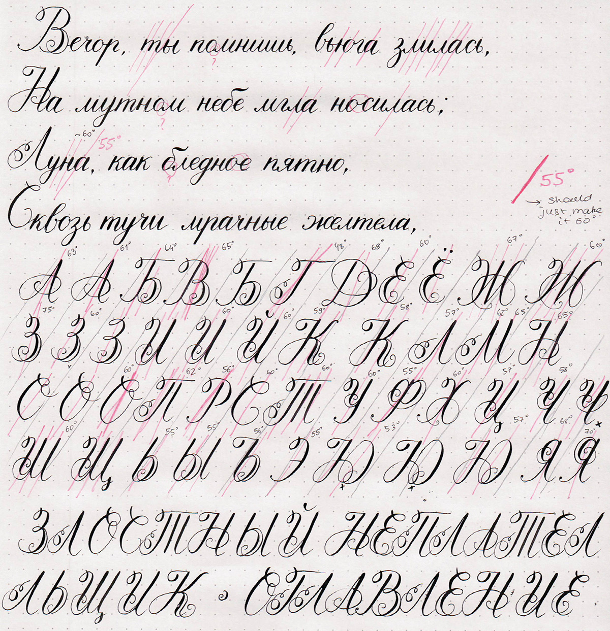
I lined some tracing paper and copied the letters over to it, rotating them to match the angle where necessary.
Then, I used the traced letters as a reference to write the final version.
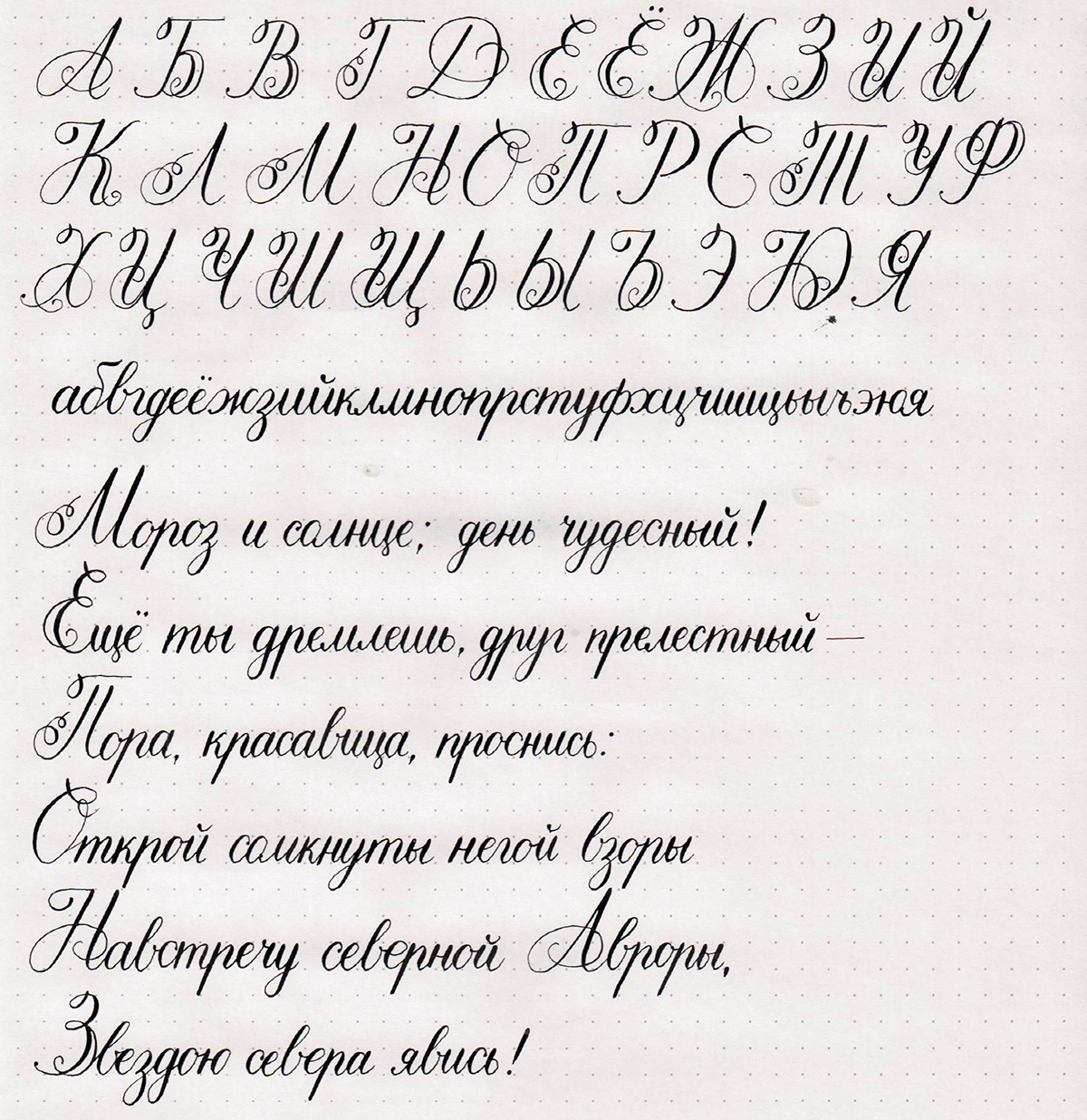
Of course, not all of the letters are perfect (would you ever expect a hopeless perfectionist like myself to state otherwise?), but most of them are pretty close to where I want them to be.
I will make a couple more iterations of each letter until I am happy with all the tiny detail, and then I will turn this into my first typeface. I've never done that before, so it will be an interesting challenge for me. And, of course, I will have to add in the matching latin characters.
After all, I still don't really have the answer to that question that inspired me to design this alphabet. My personal answer is that there would not be a matching alphabet because the Ч is too elaborate and impractical. Someone else may have a different answer, but I am happy with mine.
Comments