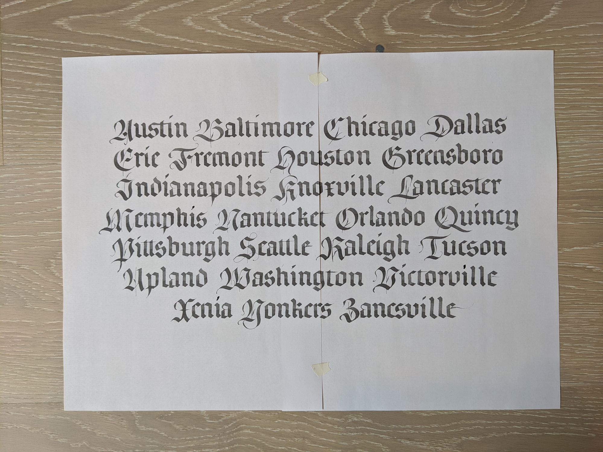
Blackletter cities

This week, I was studying fraktur capitals, and my homework assignment was to write out a word beginning with each letter of the alphabet. I chose to write a list of US cities.
There are many different styles of writing that can be classified as "blackletter". For this particular piece, the lowercase letters are textura, and the capitals are fraktur.
I personally find these capitals hard to read, and I have certainly taken a few liberties to modify them to improve readability. As my starting point, I used a handout from a class I took a few years ago with Julian Waters.
Even though capitals and lowercase letters are traditionally written on the same baseline, I decided to drop the capitals a bit to give more emphasis to them.
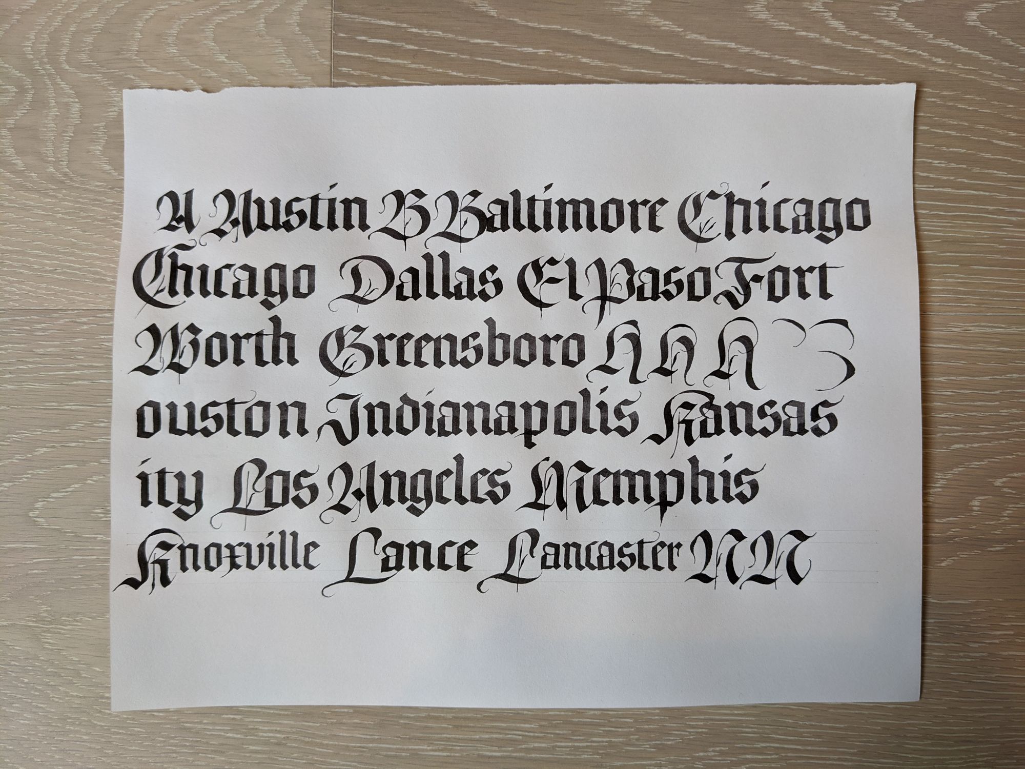
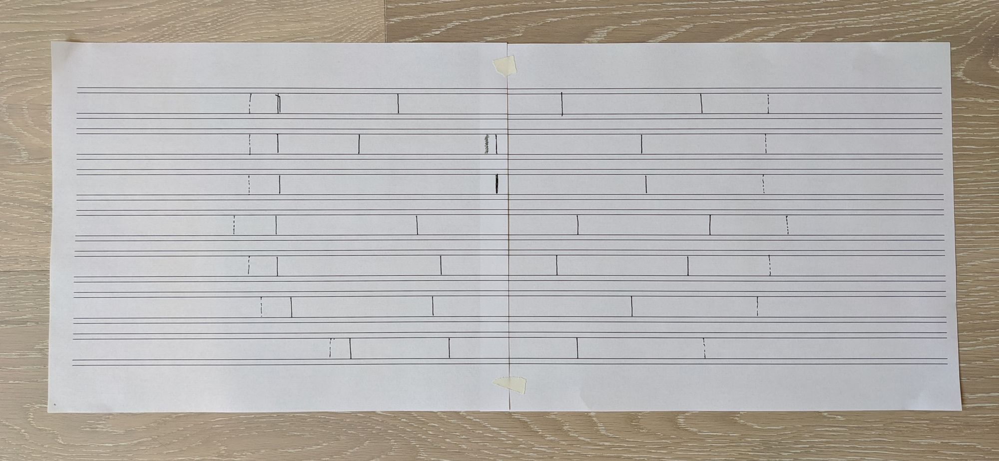
In my original trial, I had considered using a smaller nib size for the lowercase letters to increase the contrast (see the last line in the picture above). I don't think it looks good, so I went back to using the same size pen (3mm) for both.
I also realized that I did not want to use city names that consist of multiple words, so I updated my list to replace those.
To keep the layout simple, I decided to write 2–3 cities per line, and center them.
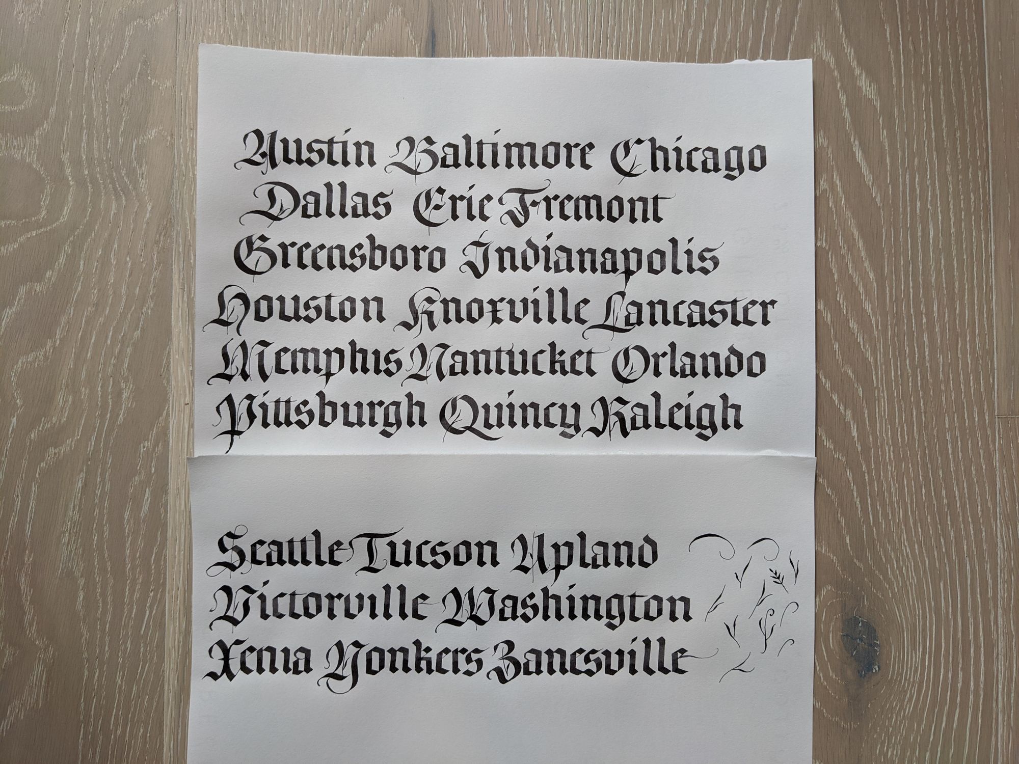
I realized pretty quickly that the paper size I chose (11x8.5 in) was not going to be large enough to fit all of the cities. After I finished the draft pages, I scanned them both, and rearranged the words in Photoshop to fit on a 15x10 in page.
Then I printed them out so I could see what the letters look like at their actual size, since viewing them on my computer could be a little misleading.
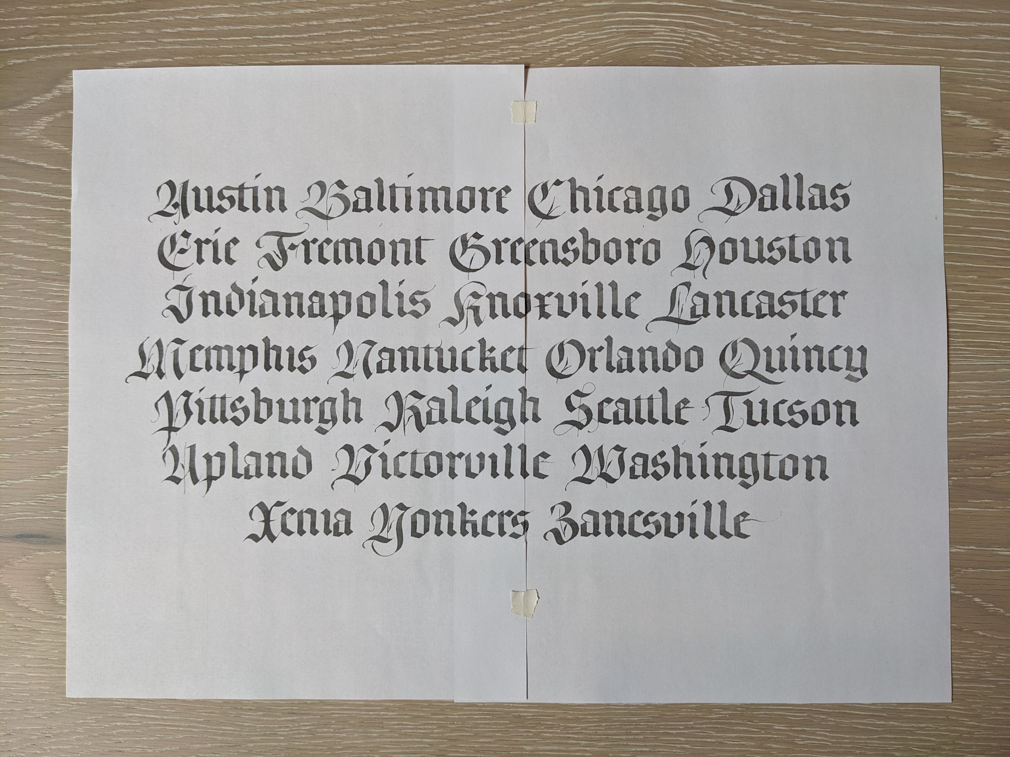
Once I did that, I realized there was a problem with my layout. The spaces between the words created "rivers" (or contiguous stretches of whitespace that span multiple lines), which are undesirable.
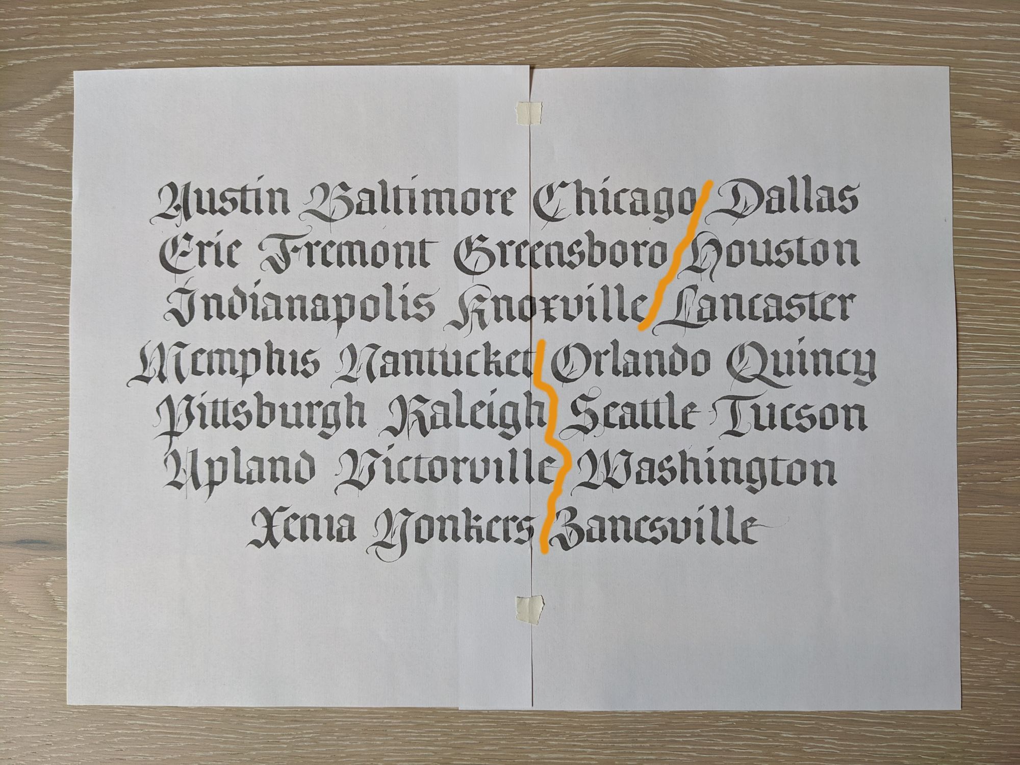
Since for this particular piece, the order of words is not particularly important, I switched a few of them around.
I also realized that 15x10 would not be large enough to have enough margin around the text, so I decided to use a 20x15 sheet of paper instead.
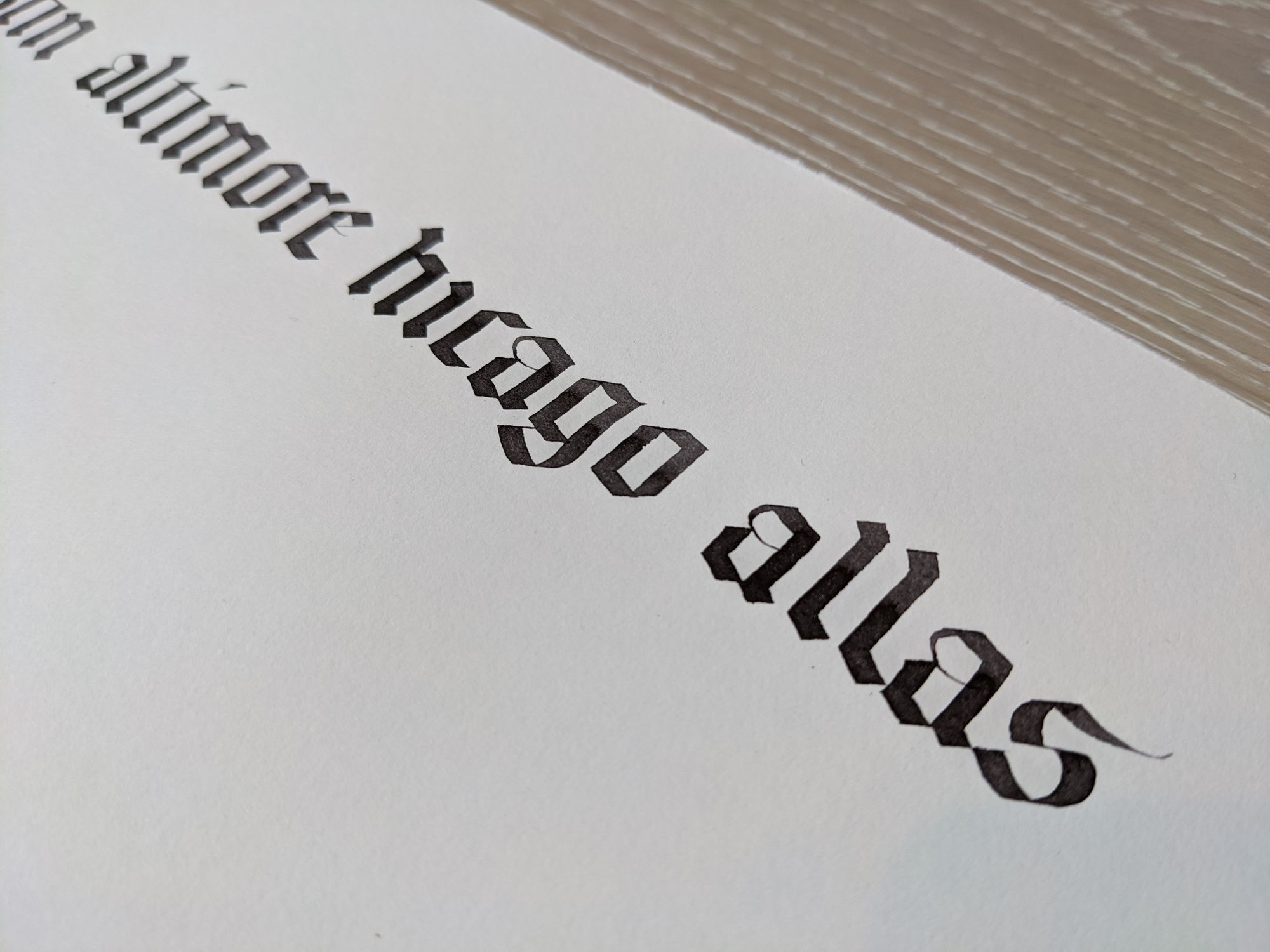
To make the piece more interesting, I decided to use orange for the capitals, and black for the lowercase letters. Since the orange is transparent (I used Dr. Martin's Hydrus), I could not rule the lines in pencil, or else they would show through, and I would not be able to erase them.
I chose to go for the lazy approach, and printed out some guidelines to tape to the underside of the sheet. I marked the starting point of the lowercase part of each city as well, so I would know where to start writing.
I wrote a few lowercase letters on the same kind of paper to get warmed up, and also to make sure they aren't too different in size or width from the initial practice piece. Depending on what paper you use, you may sometimes end up with large enough difference that you have to do all the measurements over on the "correct" paper.
Then, I wrote out the lowercase part of each city.
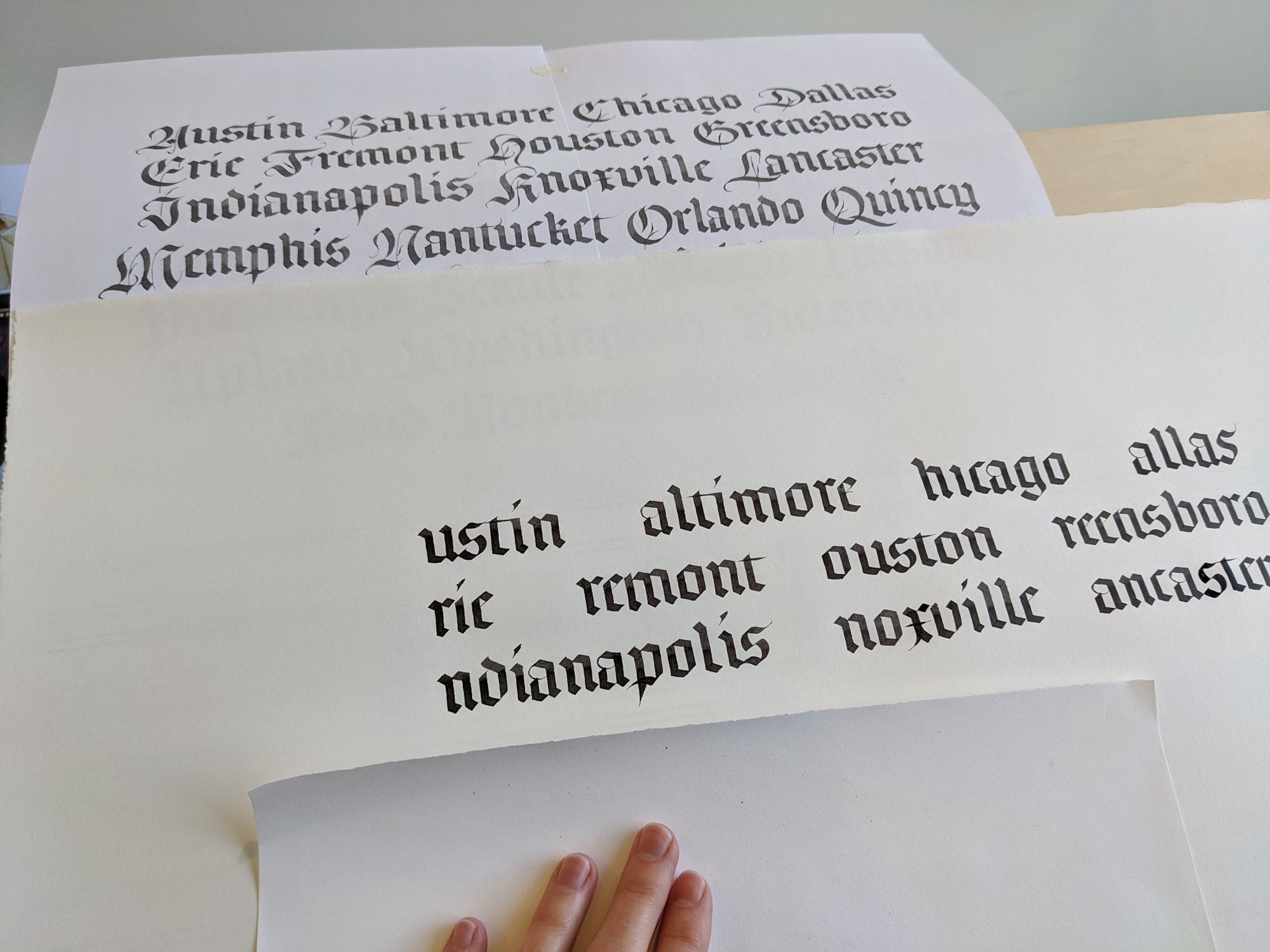
After the letters dried completely (I took a lunch break to allow for that), I went on to practice some capitals. I was initially planning to write each capital on a practice sheet, and then immediately write the same one on the final sheet, but it turned out to be impractical. I didn't want to accidentally smear ink while juggling 2 fairly large pieces of paper. Thus, I had to settle for a few warm-up letters.
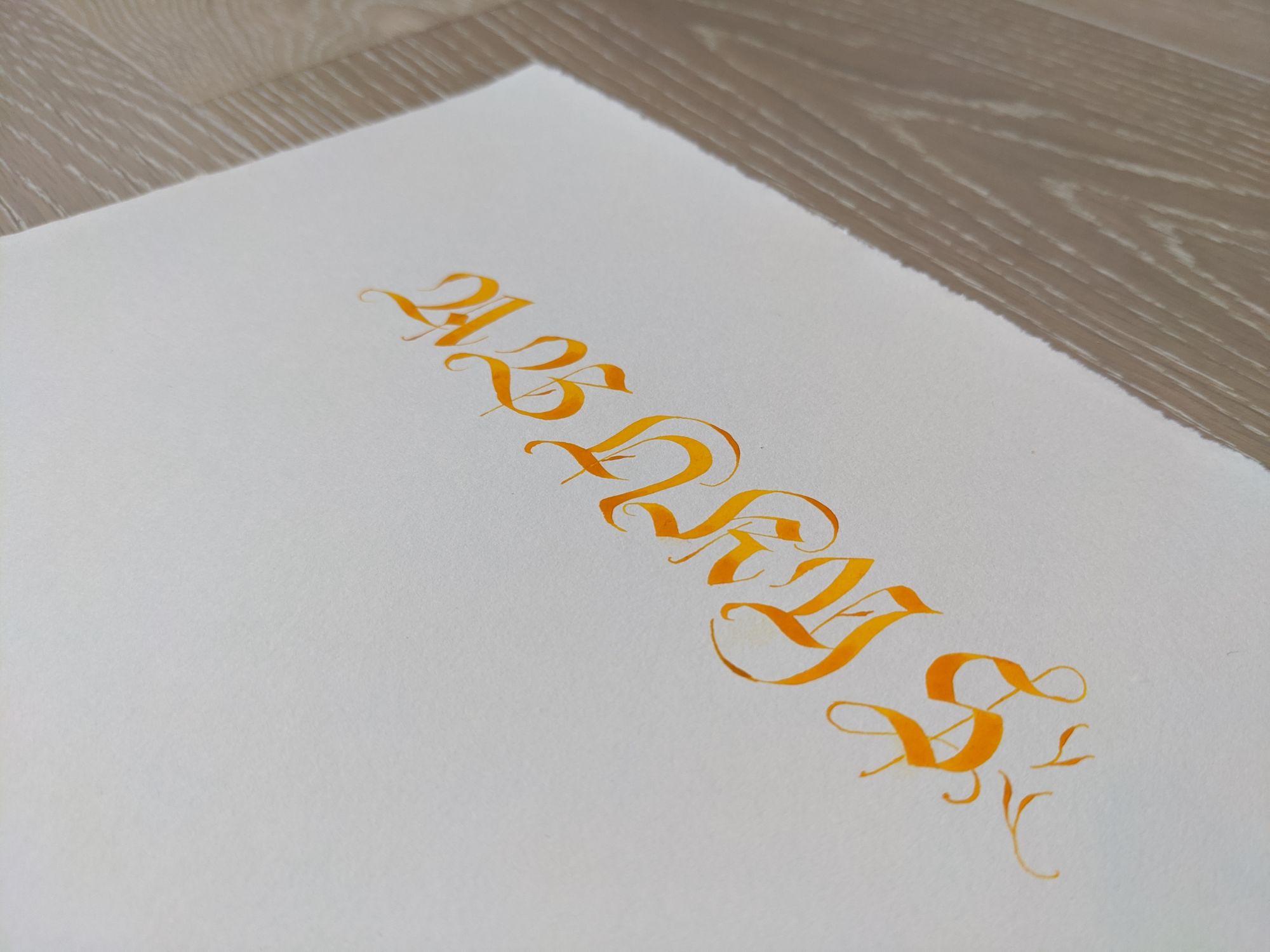
What this picture does not show is that not all of the parts of these letters were written with a broad nib. All of the hairlines and vaguely leafy ornaments were added later with a pointed pen, and I had to wait for another hour or so before I could do that, since the ink was quite wet.
Anyway, I was too busy with the actual work to take any more in-progress pictures, so all I have is the final result :)
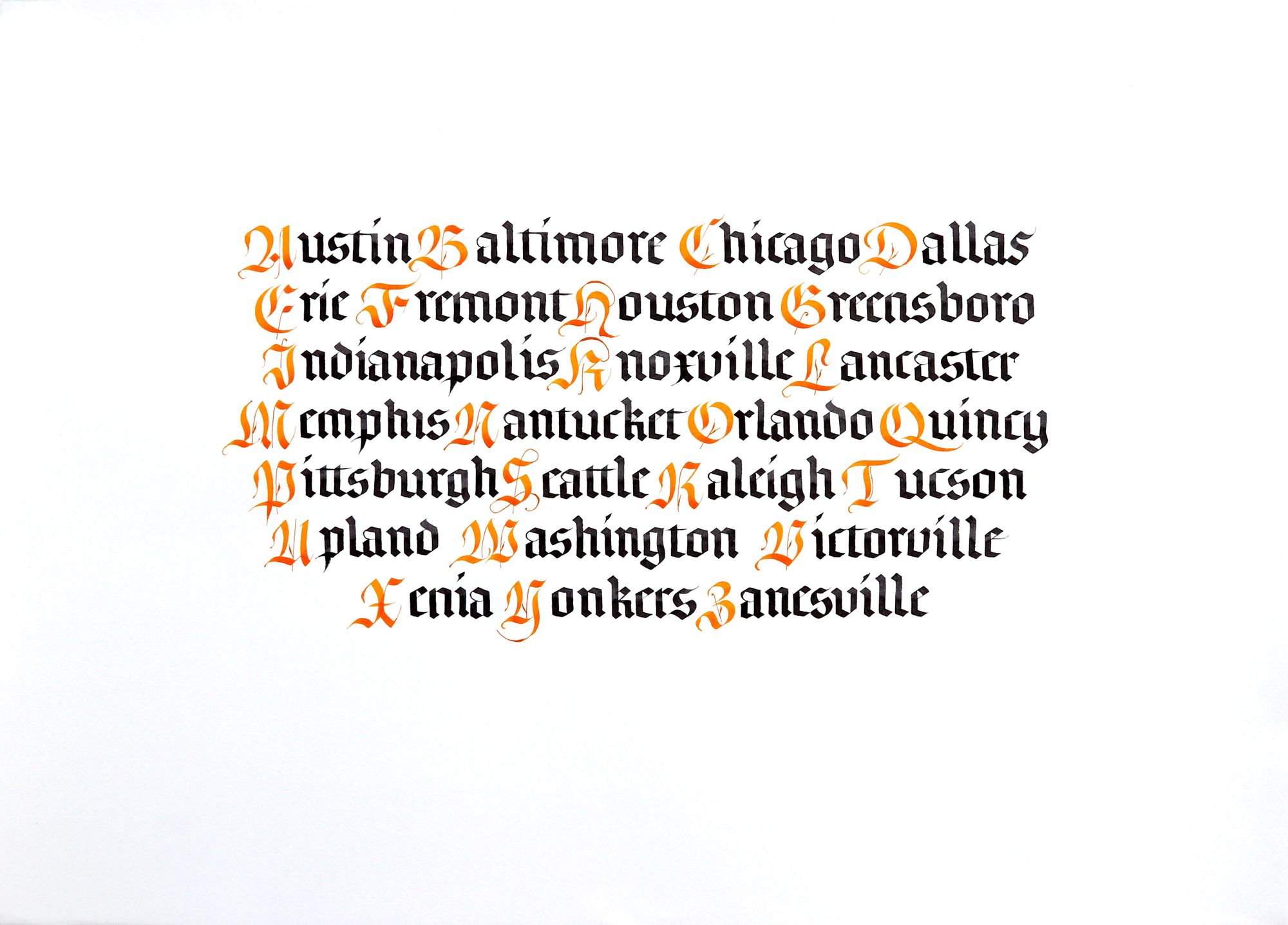
I am pretty happy with how this turned out, although some of the capitals looked better on my practice runs. I think I'll have to repeat these many more times before they become second nature. There is also a slight issue with the spacing: in some places, the capitals ended up closer to the end of the previous word than the beginning of the word they belong to. I think this happened because I was afraid of starting too close, and having to write over the black letters (I didn't use a waterproof ink, so they would bleed). If I were to do this piece over again, I would make sure they are all in proper places.
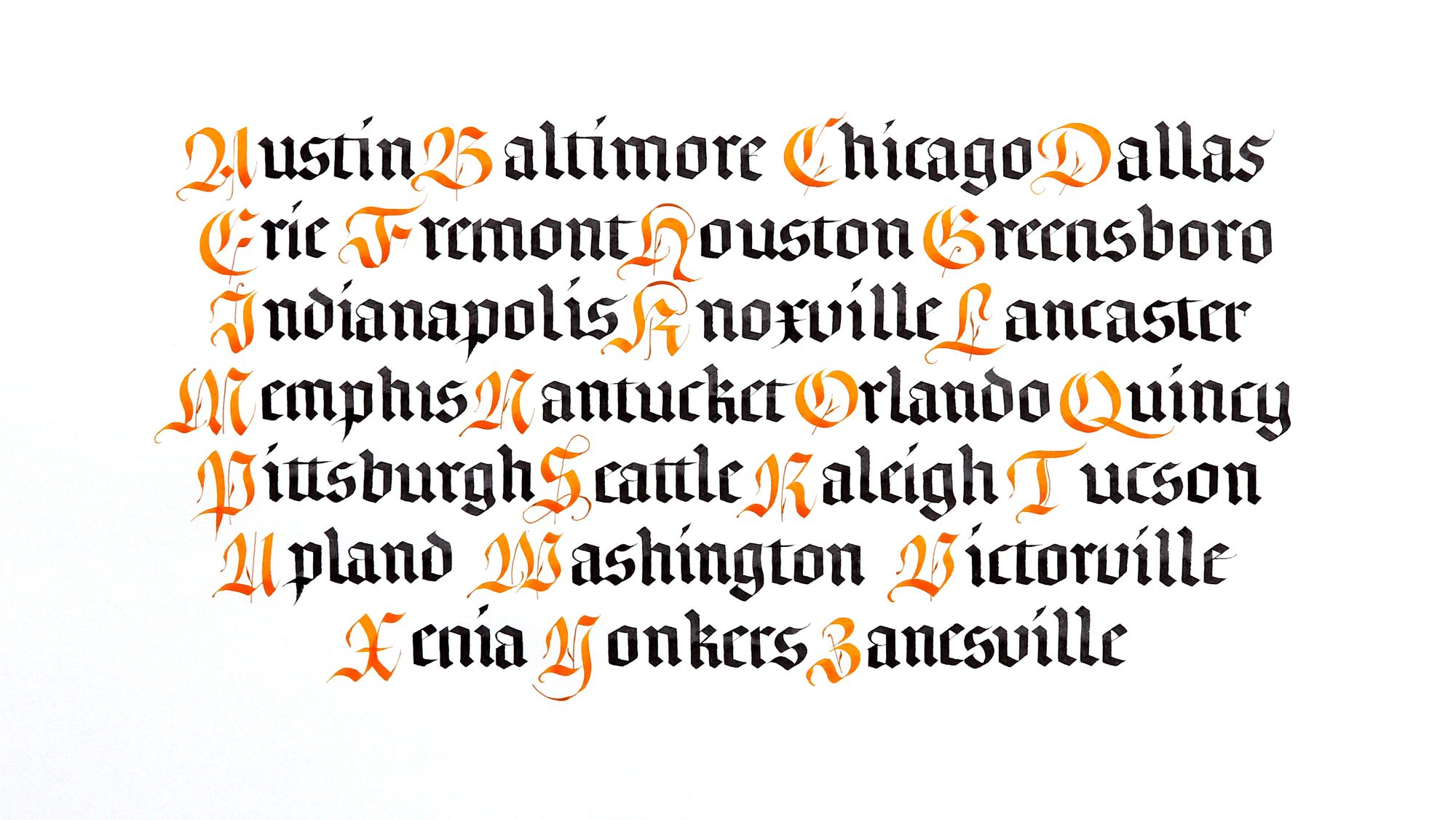
Here is the same piece, but cropped differently. I find that the margins on physical pieces and margins on digital copies of them look very different. If this were on paper, I would say it didn't have enough margin, but the full margin version above looks like it has too much margin in the picture (but not in real life). My best guess is that this has to do with the physical size of the object, which causes the proportions to be perceived a bit differently.
Comments