Assignment #4: Book (Part 3)

The night before the third class, I finally nailed my creative driver. I was crying in the shower when it suddenly came to me: "Freedom to experiment". It was something that the Wikipedia article had mentioned. The Beatles pretended to be a different band so that they could experiment with their songs. Maybe I could do some experimentation too?
The next part of the assignment was to put together the book based on the plan from previous week (it could have some placeholders for now), and to continue working on the key spreads.
To present this in class, I had to print out a thumbnail view that would have small versions of all the pages, as well as the key spreads in full size.
I didn't yet have a clear idea where I was going since I only just figured out the creative driver. This is what the thumbnails looked like:
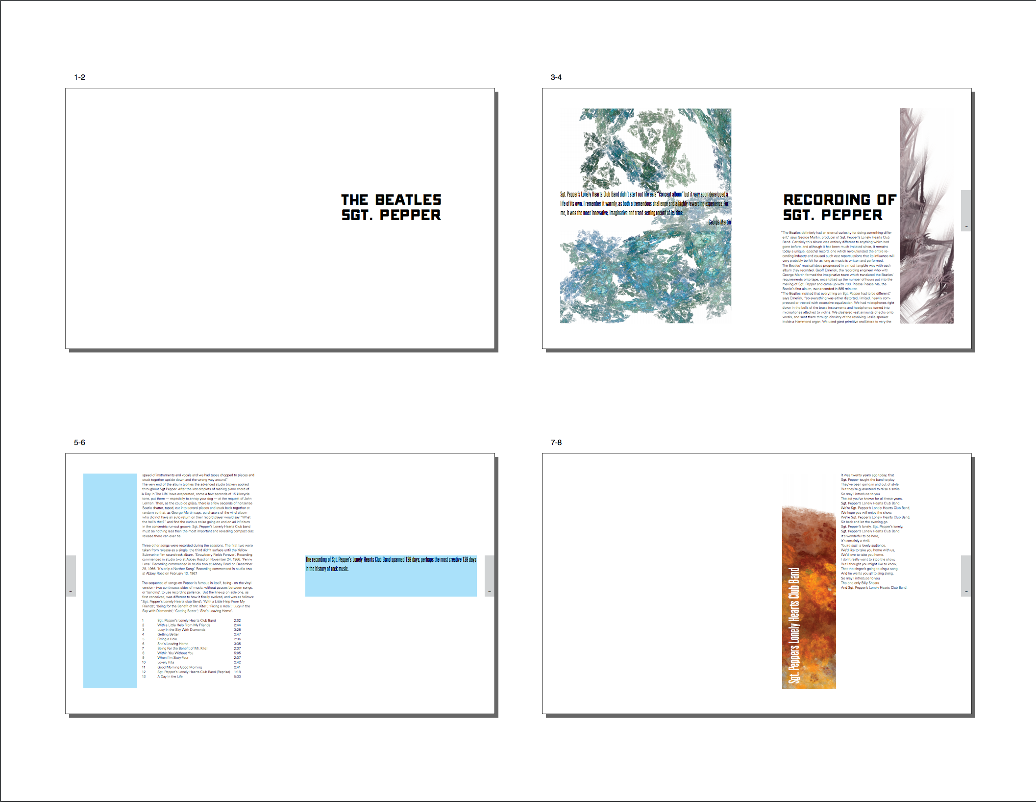
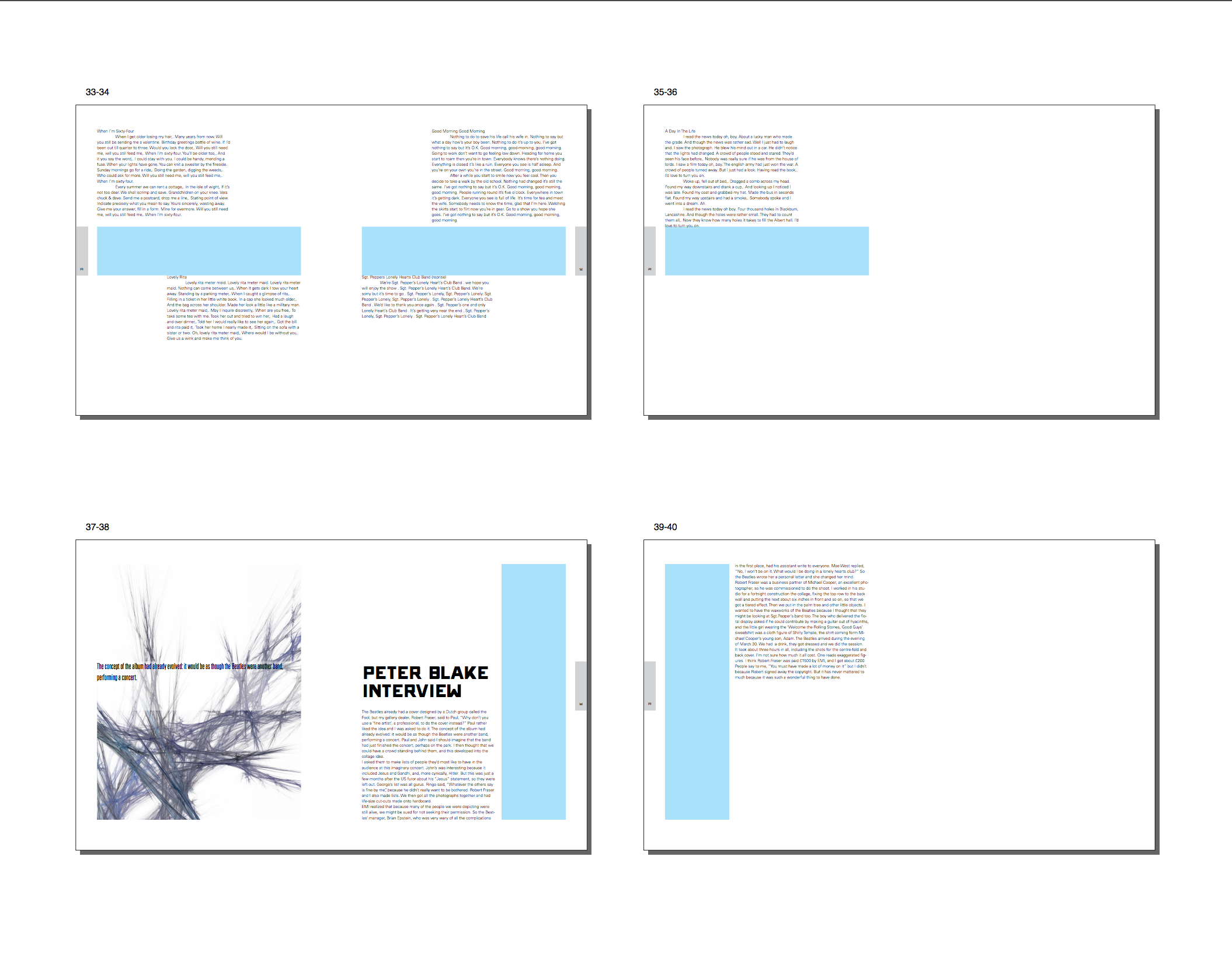
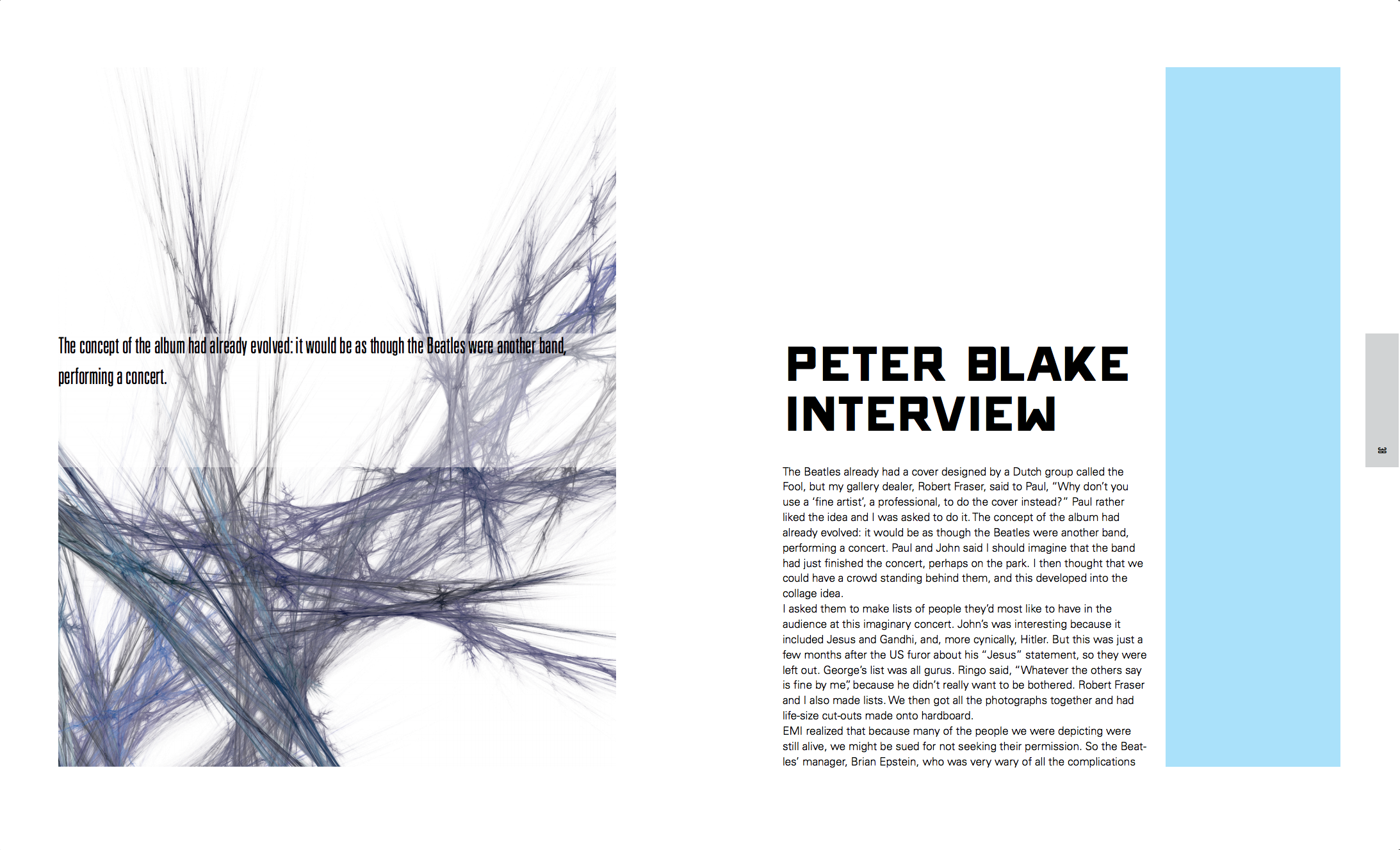
The blue boxes represent the places where images would go in the final version of the book.
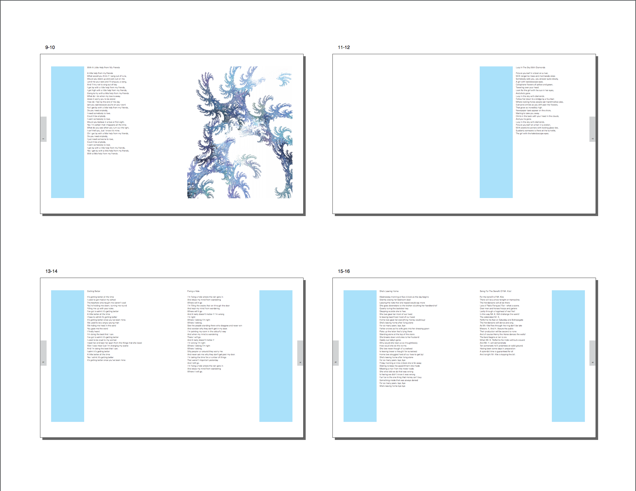
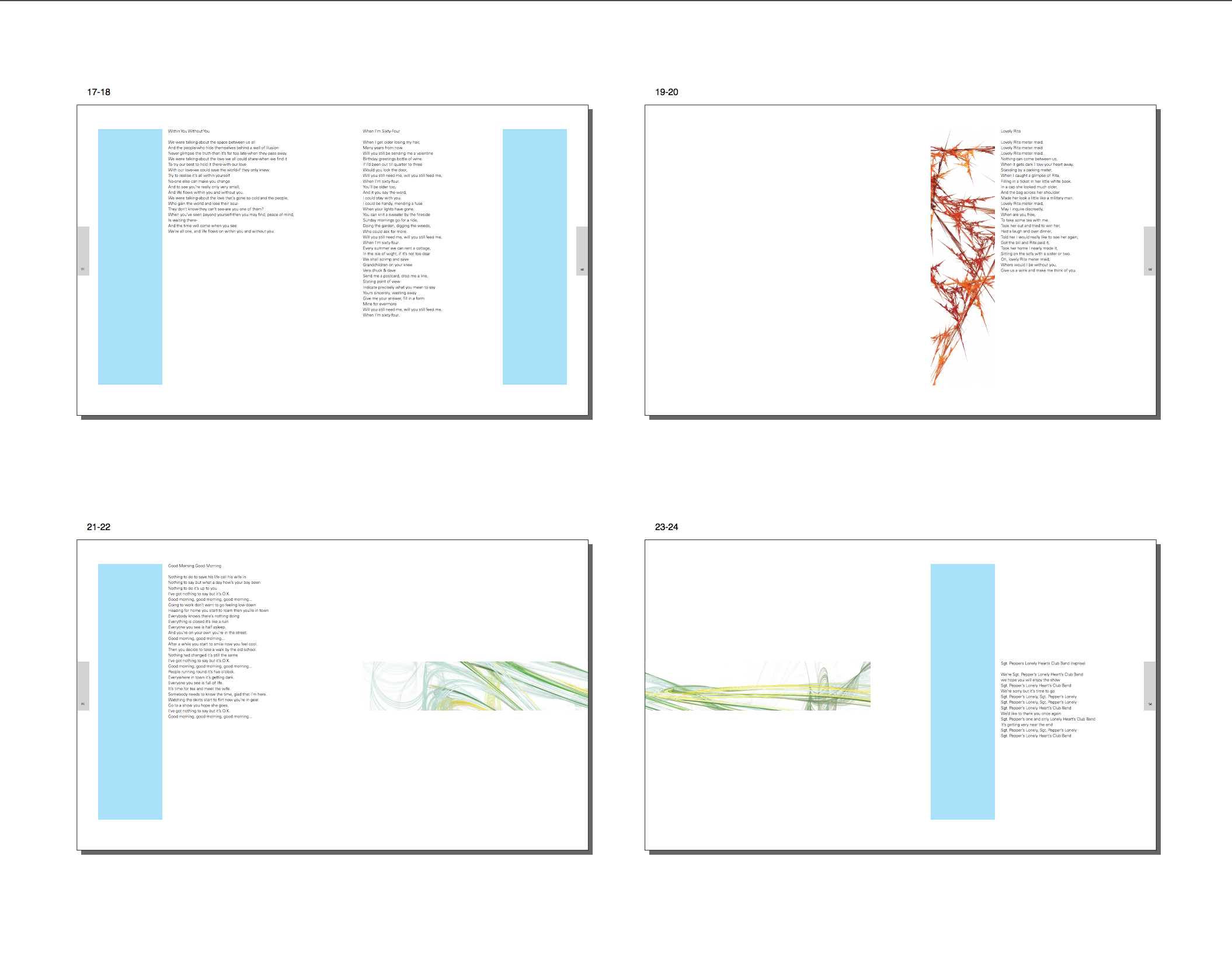
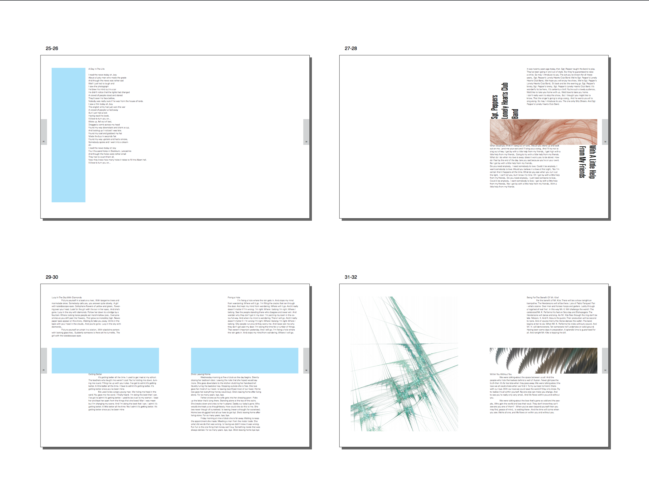
Below are the larger versions of the spreads that I considered key for this book. Those are the ones that define the key characteristics of the entire piece, such as type choices, image placement, the number of columns, the height of the hang line, and so forth.
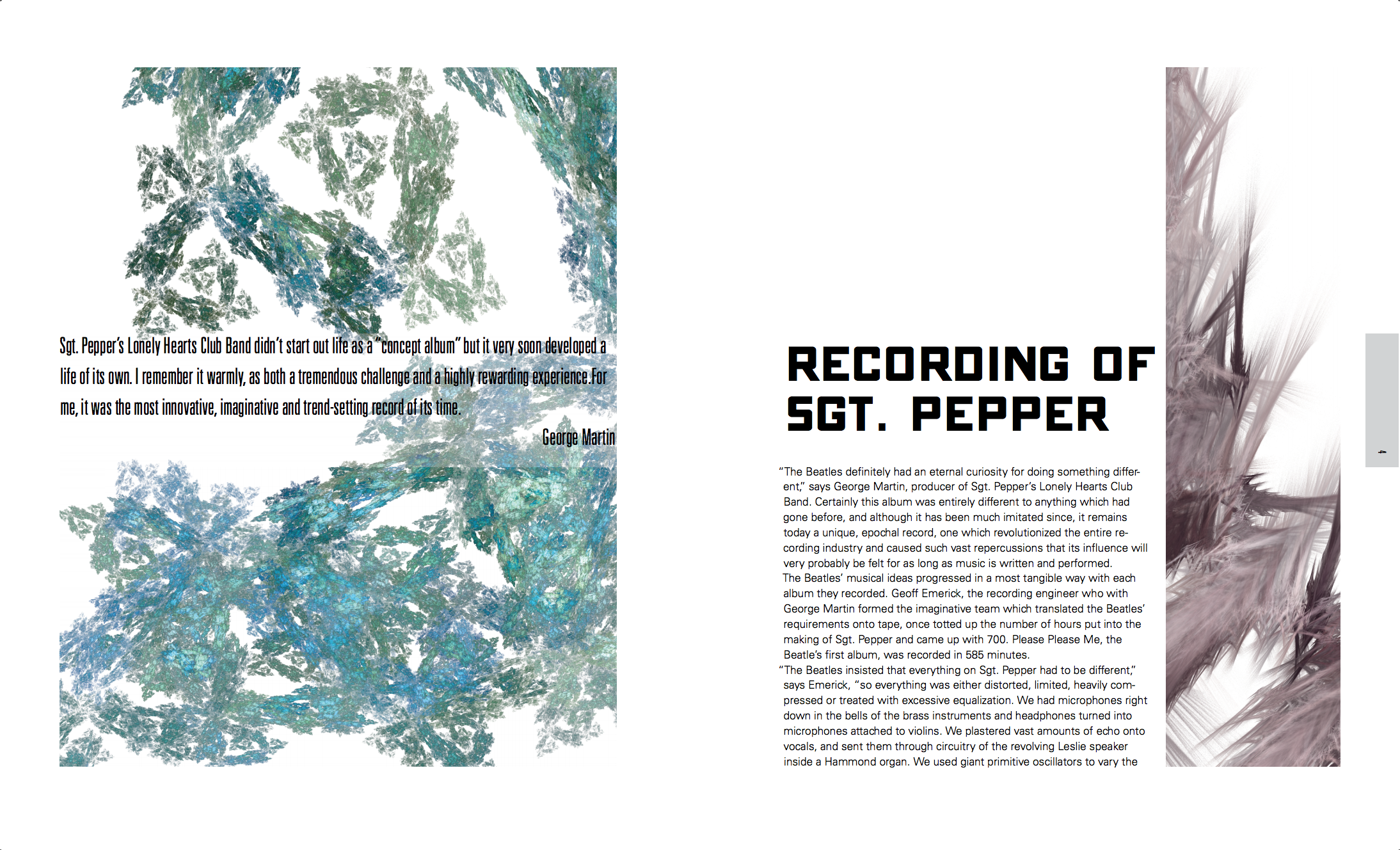
The first one is the first page that the reader sees when they open the book. It sets the tone for what they can expect from the future pages.
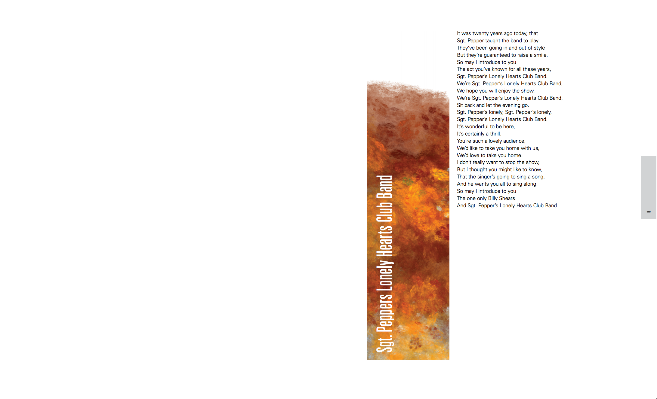
The second one is for the song in its poetic form.
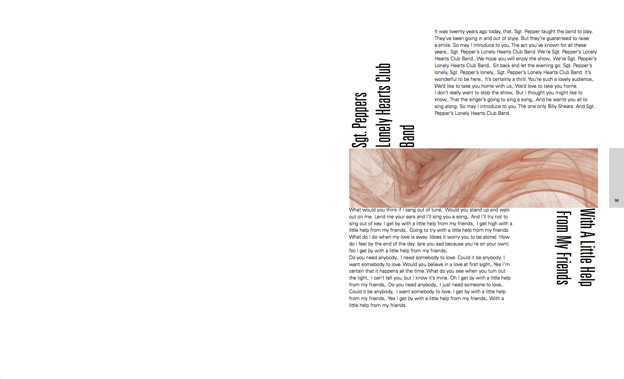
The next one is for paragraph-style lyrics (this is a requirement for this book, even though in all other cases I would consider it too weird to put in the lyrics twice).
Finally, the last one is for the second article that is at the end of the book. It is very similar to the first one in order to create a sense of unity.
I got some very interesting feedback in class. The first thing that was pointed out to me is that I need to have more variation in volume. Some pages need to be "loud" and others need to be "quiet". As it is, everything is at "medium", so it blends in.
The same was true about the images: their sizes are not significantly different, and there needs to be more variation.
An interesting suggestion to achieve the above points was to invert some pages to black, and to try to have a big image on one side, and no image on the other.
The display type that I chose for the article headings was generally well accepted, with the caveat that I should use the same type for headings and quotes. It was also pointed out that it's fine to make the quotes bigger than the headings, which is something I had not considered.
Finally, for the paragraph section, the instructor told me not to "bounce" the songs on the page, since it doesn't add anything. I guess that is fair :)
With all these things in mind, I went to create the next iteration, about which I will write next week.
Comments