Assignment #3: Expression poster (Part 1)

The next assignment for my class is a two-week project. The goal is to create a poster that promotes a song by "capturing the essence of that song typographically".
The constraints are as follows:
- Only text should be used on the poster (no images).
- There should be at most 3 colors (including background).
- The poster should have 3 different levels for viewer (50ft, 5ft, 5in).
- Minimum size is 13x20in, but can be larger.
- The poster should include the title of the song, full lyrics, author/composer, and playing time.
For the first week, I need to present two different layouts as possible directions for this project. The week after that, I have to create the final poster and print it out in full size.
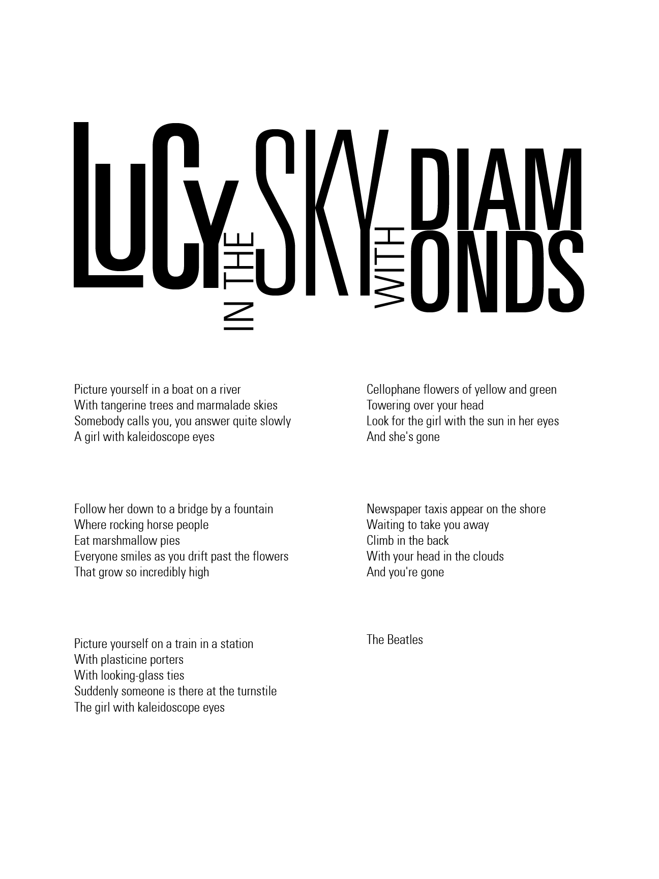
The song of my choice for this project is "Lucy in the sky with diamonds".
As always, I started out by making some sketches of what the final poster might look like.
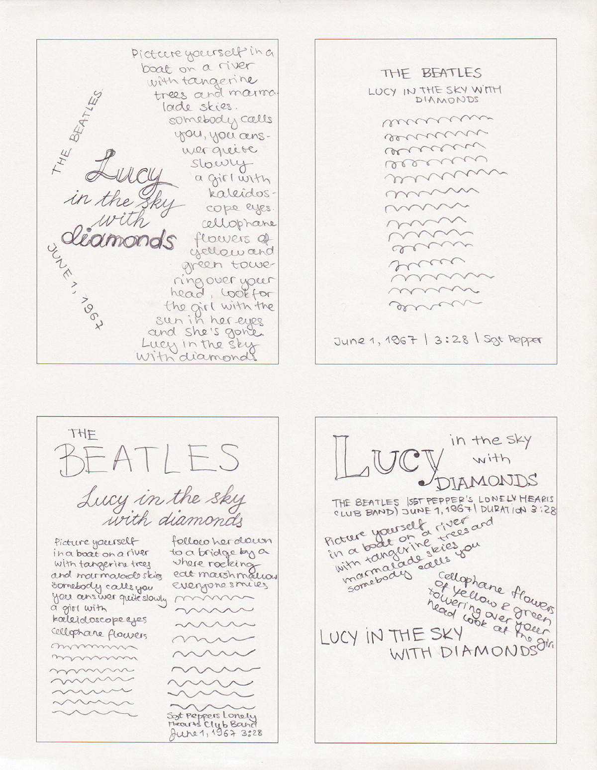
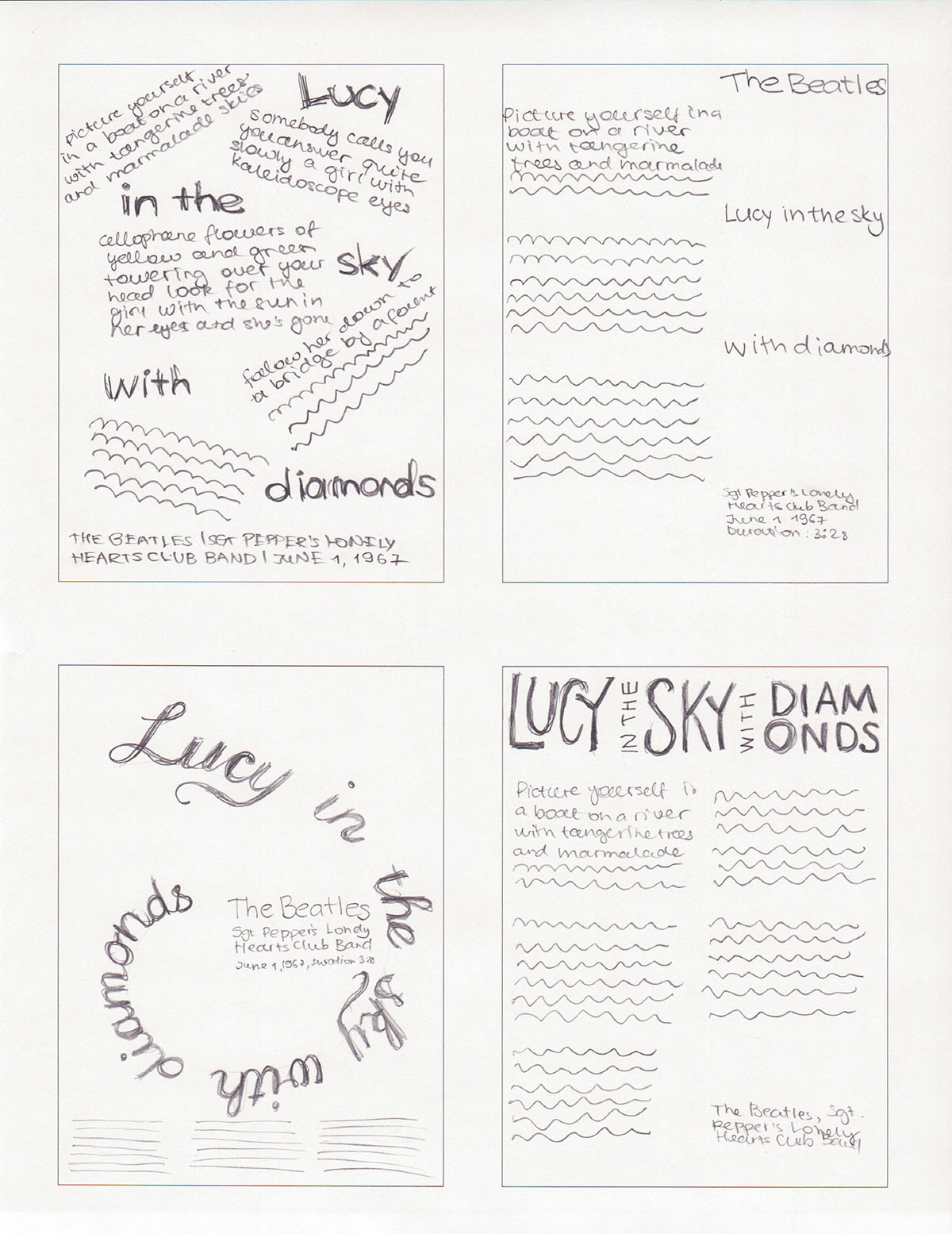
Some of these ideas are more interesting than others, and I really had to get that "diamond" out of my system, so I used three of the sketches to create the layouts below.
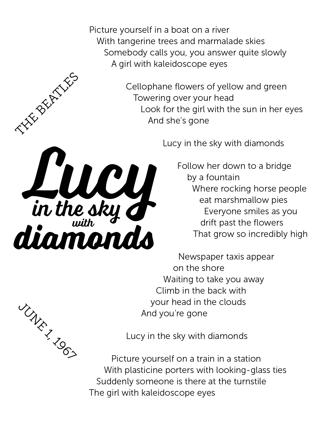
I didn't present this one in class, but I just had to do it :)
When I showed this one, the general consensus was that it was "not psychedelic enough", since the typeface I picked for the title was too neat and orderly. The other suggestions were to use crazy colors, add more dimension to the poster, and to only use either Futura or Futura Condensed, but not both. Another important point was that even though the lyrics looked fine when printed out on a regular sheet of paper, they would be way too huge on a full-size poster, so I need to decrease the font size.
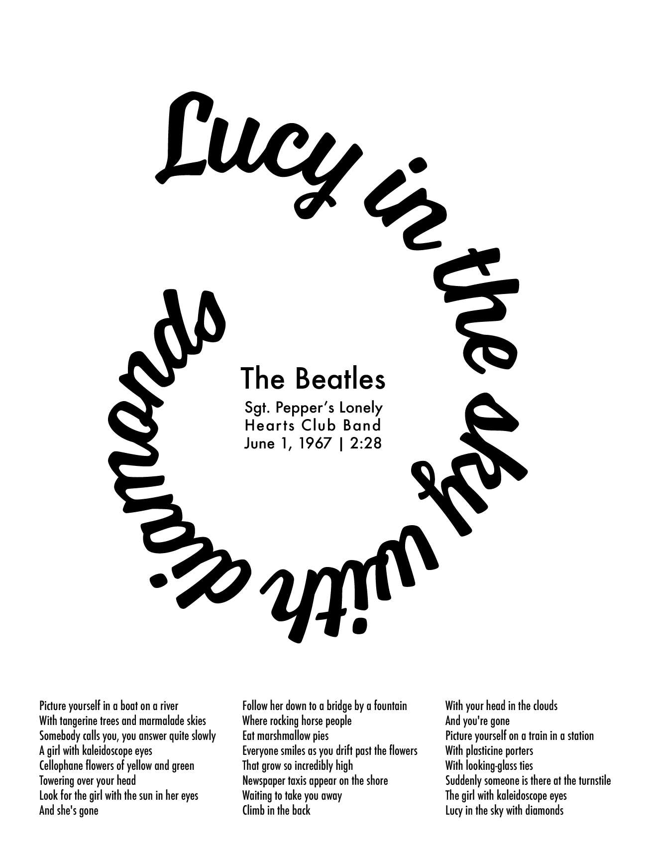
I didn't quite finish this version, so I didn't present it for critique in class, but showed it to my instructor. He suggested that I apply all the comments that I got for the spiral version to this one instead, since it would look more interesting.
Off I go on an adventure to make this poster more crazy!
Comments