Assignment #2: Create three layouts almost breaking the traditional grid

For the second assignment, we were asked to use the same text as before, but instead of copying somebody else's traditional grid layout to make our own. An additional (but very important) constraint was to make some changes that would almost break the traditional grid, and yet it would still be recognizable.
Now that this assignment has been reviewed in class, I have to note that nobody understood what it meant exactly. The instructor meant we should have made small changes that pushed the limits of the grid, but we all made things that went much further than that.
I made several sketches to explore the different directions in which I could take this:
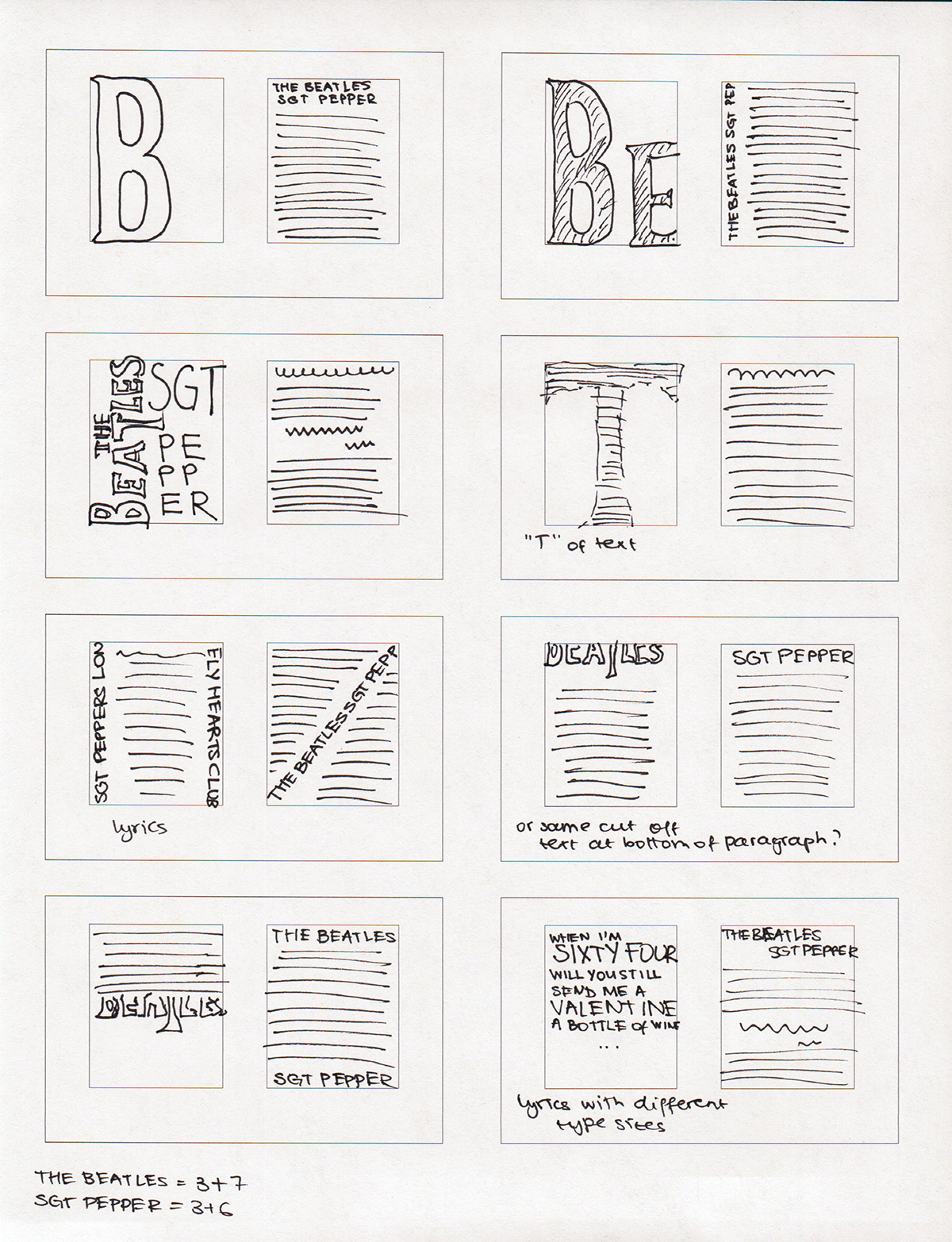
One thing to note is that these thumbnails are pretty small. What ended up happening for a lot of them was that I tried to re-create them in InDesign, and failed. Things didn't line up the same way as I had thought they would when I made the sketches.
This is the next page of my sketch explorations:
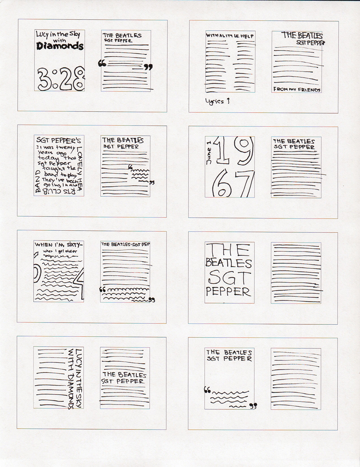
I only needed to pick three, but I tried to make at least seven of these just to see what they look like once created digitally with all the correct proportions.
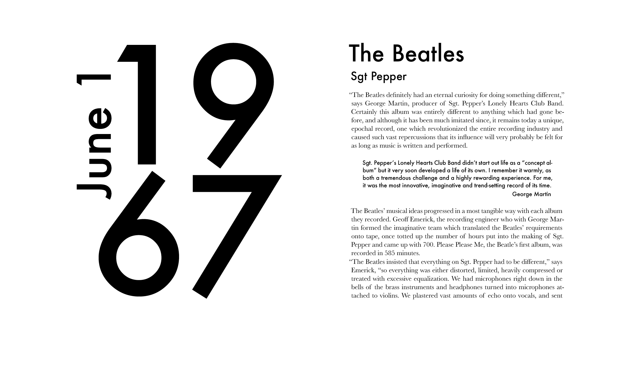
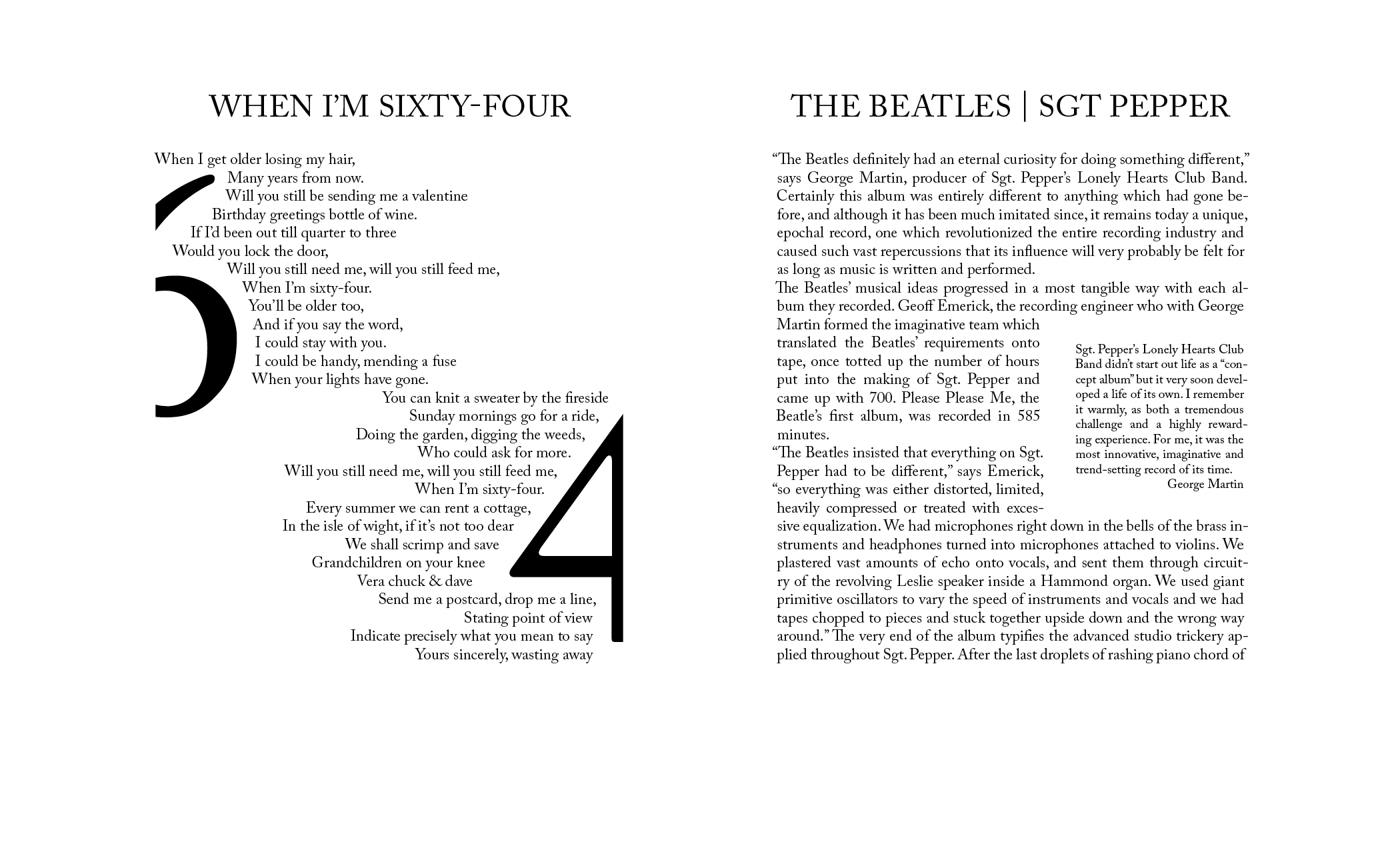
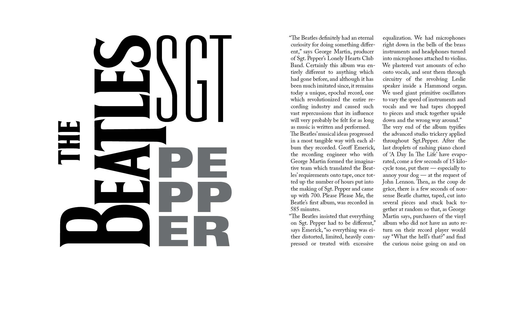
Below are the three layouts that I made for this assignment.
In general, the feedback has been that the right page of these spreads is pretty close to the traditional grid, while the left one is not traditional. I had indeed intended to make one page more traditional, and one a little less so, but it is a coincidence that it's the right page that is more traditional in every design.
For this layout, the usage of Futura makes it decidedly modern, and not traditional. Even though the left side takes up the same amount of space as the right side, it still cannot be considered a traditional grid.
This one uses both left- and right-align for text, which is again not at all traditional. Also, the idea with the cut-off numbers didn't work out quite as well as I was hoping it would.
The right-hand side of this layout is very traditional. It has one problem, though: too much hyphenation. Since these were pretty quick sketches, I didn't spend much time adjusting every line, and ended up with too many hyphens. If this were a real magazine article, I would have to spend much more time on the text.
This was a fun little assignment, even though I didn't do it quite right. I feel like it was harder than just copying somebody else's grid, since there are countless possibilities of what could be done, and I had to settle on something.
Comments