Assignment #1: Copy three layouts as closely as possible

It's that time of the year again, and I'm taking another design class. This time it's called "Typography-based design", and it's taught by Jeff Barlow, Starbucks Creative Manager.
For the first assignment, we were given copies of three book spreads and several choices of text. The objective of the assignment is to create three spreads using one of the texts, and each of these spreads should imitate one of the given one as closely as possible while using the traditional grid proportions.
The samples were given on 8.5 x 11 inch paper, but the layouts had to be created on 8.5 x 14 inch paper.
Spread #1
This is a page from a book on typography. It has a lot of different elements, such as numbered lists, usage of italic, bold and small caps, and so on.
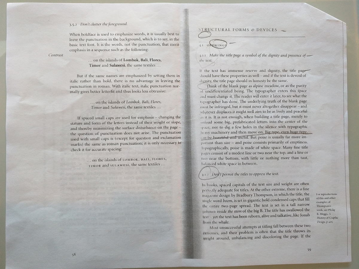
This is my version of the same layout. I got most of the features of the original one, except the end of the left page. I should have used just two lines from the lyrics and applied the same style as in the sample to them.
Spread #2
This is a page from an early 20th century book that was done in the spirit of preserving the fine art of book-making.
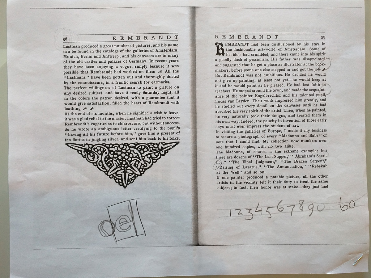
In my version, there isn't enough leading between the lines, which makes the text look darker. The pattern on the left page is just a scanned copy of the original.
Otherwise, I feel like this one was easier than the previous spread since it didn't have so many things to keep track of.
Spread #3
This is the fun one. I'm not sure which book this came from, but it's probably early 18th century.
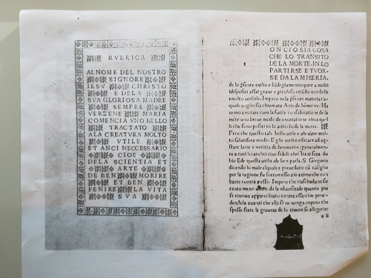
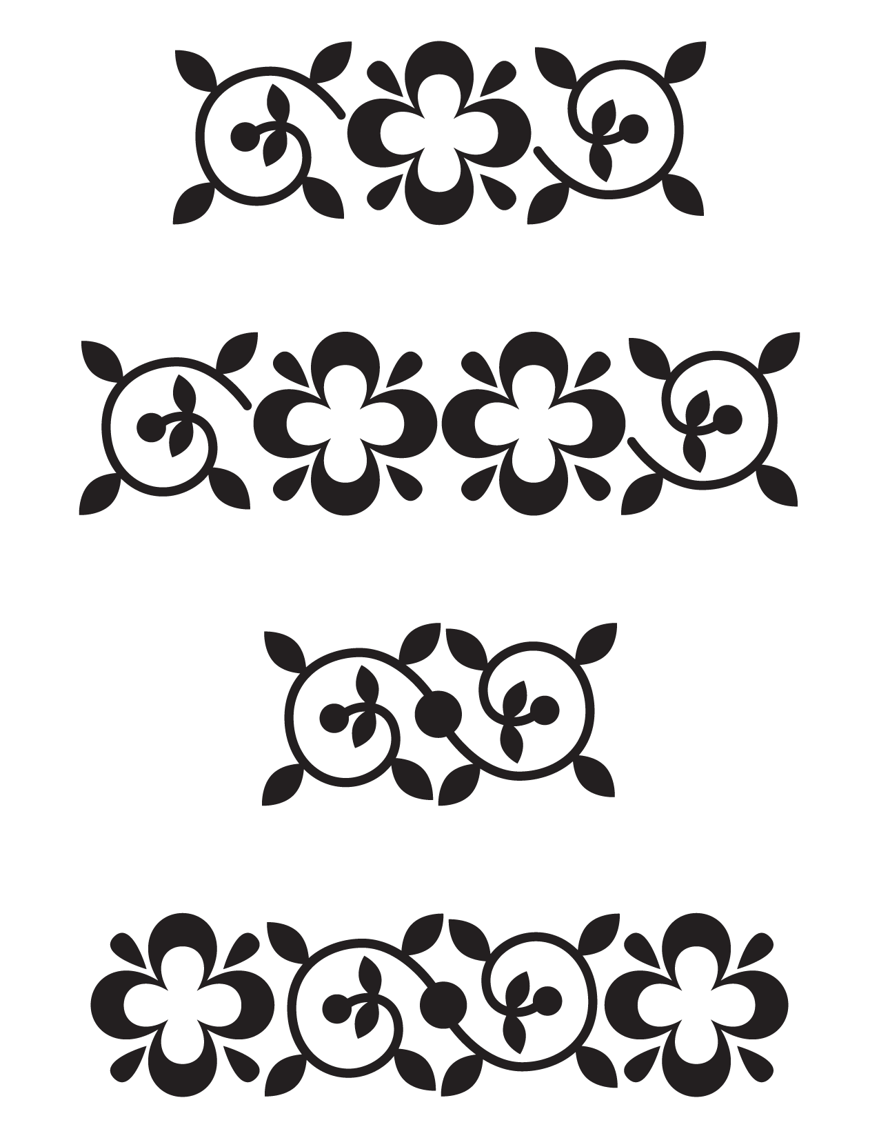
One of the things that is unique about this spread is that it has a pattern. However, unlike the pattern on the previous one, this one could not be easily scanned and copied, since it is blurry.
So, as step one I made my own version of the floral pattern to use for the layout.
Then, I had some fun making a frame out of them and arranging the song so that it would look like the text in the original (I am pretty sure it is a prayer, but don't quote me on that).
As you can tell, my layout is a bit wider than the sample. That is because of the traditional grid requirement: I set mine so that the rectangle fits exactly with the traditional grid.
The right side is set way too tight, and the lines are too long.
There are some common mistakes across all three of these.
Since the samples were given in a different size, I should just have resized them to match the target size. That would have helped me maintain the correct proportions, since my type is just a bit too small.
I didn't pay enough attention to the number of characters in each line. If I had counted them, I would have matched the type size more closely.
Finally, I used Adobe Garamond Pro for every single one of the layouts instead of trying to find a more closely matching typeface for each of them.
Overall, this was a fun, although really time-consuming, assignment. I thought I had spent so much time fiddling with it, and still I didn't get all those small details!
Comments