Assignment #1: 5 logo versions

I am currently taking Design 2 at SVC (svcseattle.com). This post is about the first assignment.
Objective
Make 5 high quality sketches for different logo treatments for a company.
Additional information
The name of the company is Mana Fine Furniture. It is a small high end furniture manufacturer based in Oahu, Hawaii.
They use exotic hardwoods, such as koa, and focus on using sustainable practices and renewable resources. The design of their furniture is simple and modern, and it is meant to last.
Their mission statement is "Invest the best of Hawaii in the finest furniture possible".
The logo should have the following qualities: beautiful, sophisticated, timeless. They particularly want to avoid common Hawaii stereotypes.
Process
I started out by doing some research about Oahu, koa, and what comes up in Google Search for "Hawaiian furniture".
Then I started sketching different logo ideas. I knew I wanted to avoid the stereotypes, so I just put them on the side so that I could get them out of my system. I could not resist putting a mana crystal in!
Below is a page from my sketchbook where I tried some ideas.
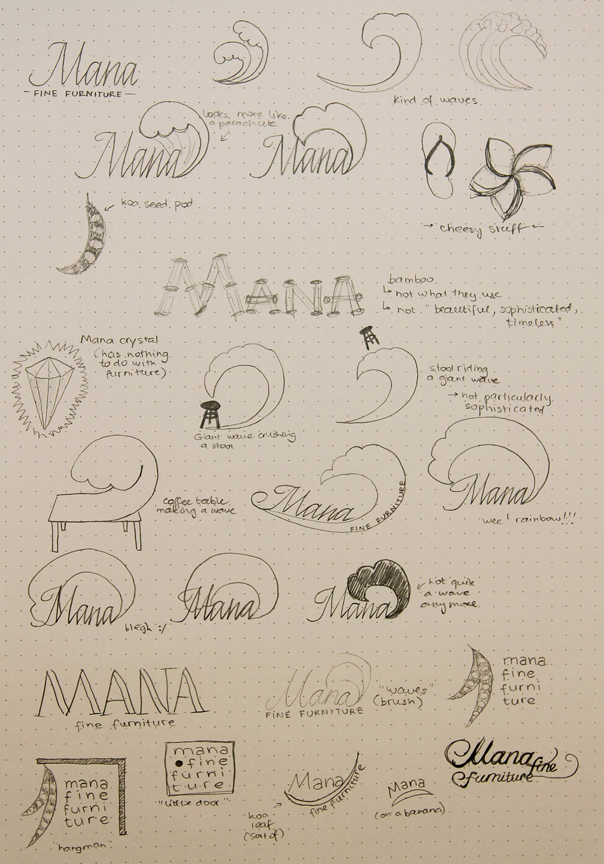
Some of them are obviously bad and/or ridiculous, but I find it easier to concentrate on the good stuff once I let go of the bad stuff, and the best way to do that is to put it on paper.
When I think of Hawaii, I always think of the giant waves, so a lot of these ideas were based around that.
After doing these preliminary sketches, I started developing some of the more interesting ideas:
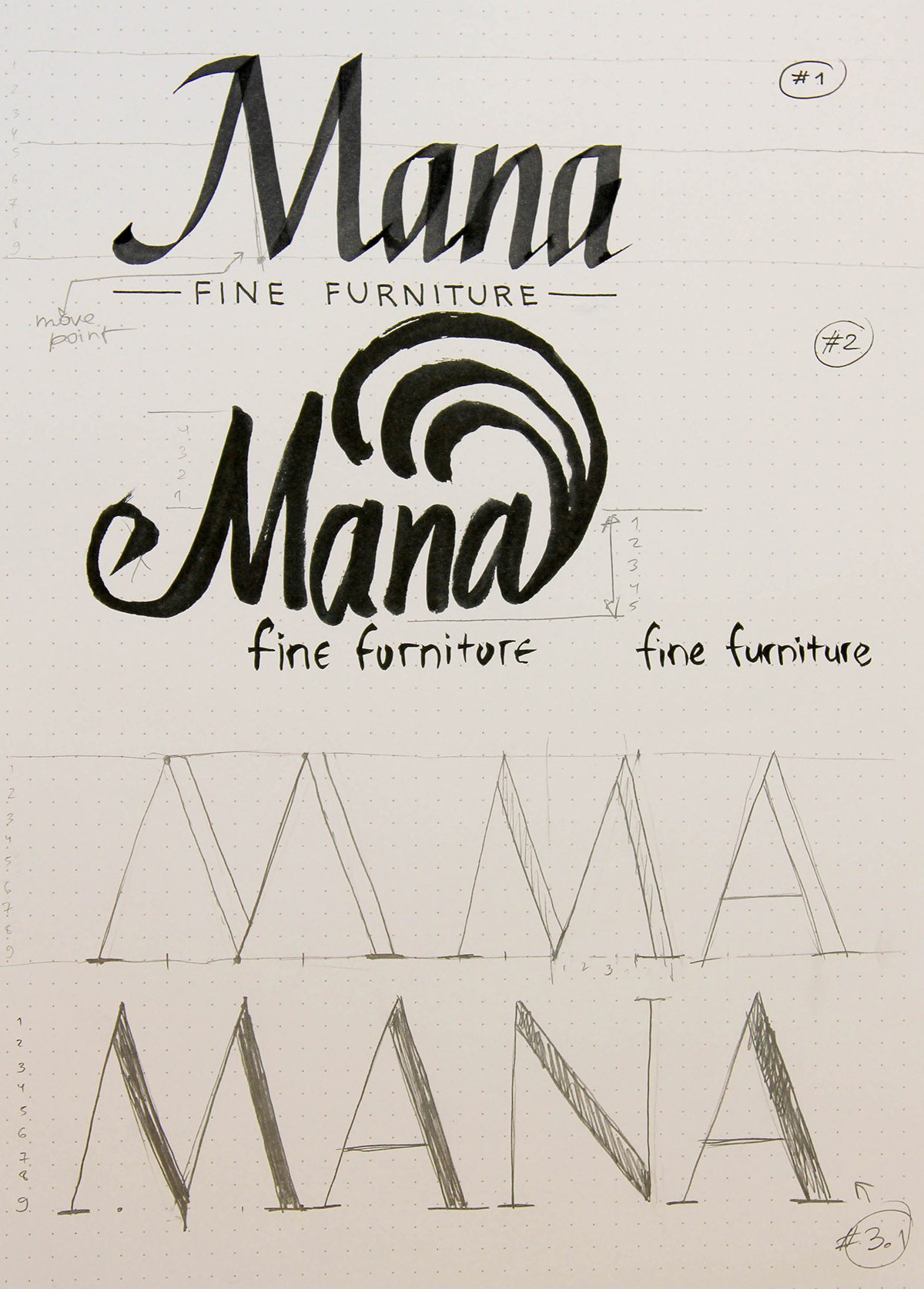
I used broad edged pen, brush pen, pencil and fine liner as my tools.
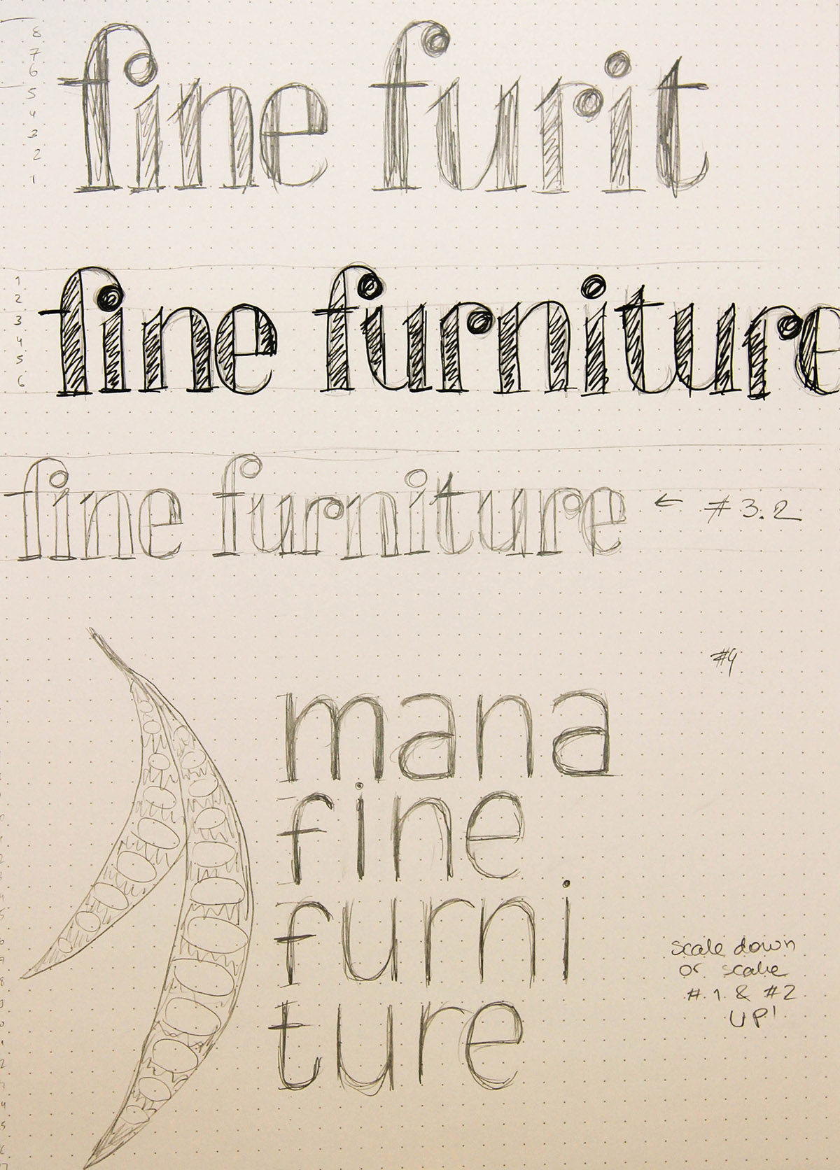
For this one, I really wanted to make the "fine furniture" look fun, but it took several attempts to get the size right, since I traced these sketches onto separate sheets of paper so that they could be nicely centered.
Results and discussion
Below are the 5 final sketches that I picked, followed by my rationale for picking them, execution details, and then the comments that I got in class during critique.
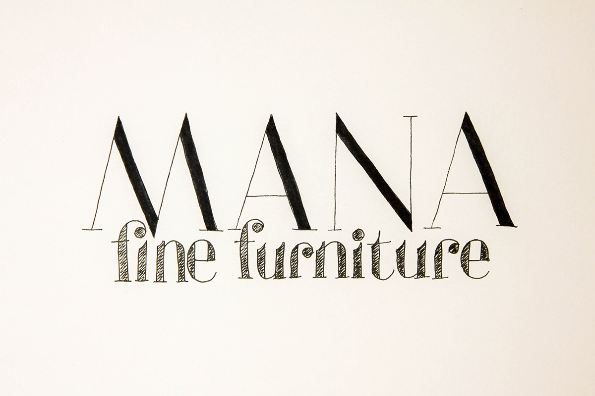
1
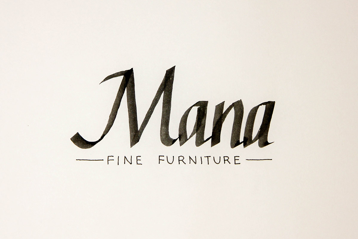
This was one of the first ideas that I had based on they "sophisticated" and "timeless" keywords, and also on what I feel a fancy furniture store logo would look like. I do realize this logo does not evoke Hawaii in any way.
The top word is written in a broad edged pen using italic hand. On the bottom, I used a fine liner, and pretty much just my handwriting. Since this is a sketch, there is no point to look for a particular typeface and then practice writing it out just for this.
Critique: As I noted above, my classmates agreed that a connection to Hawaii was lacking. They also pointed out that this logo would not scale well, since the text on the bottom is too fine. If I were to move forward with this logo, I would have to address that.
2
Here, I decided to go for an even more sophisticated look by using a modern typeface with high stroke contrast for the word "Mana". For the lowercase letters, I decided to use what could have been almost the same typeface, except for the slanted tops of the vertical strokes. I added those because otherwise the logo would look too somber.
The outlines of the letters are done using a fine liner, and then the top letters are filled in using the brush end of a marker.
Critique: This logo also does have any connection to Hawaii. To be honest, the execution of the lowercase part was better in the original sketch, which makes it look less attractive than it could be. Again, there is a problem of thin lines, and in this case they would be harder to "fix", since that would require a complete overhaul.
3
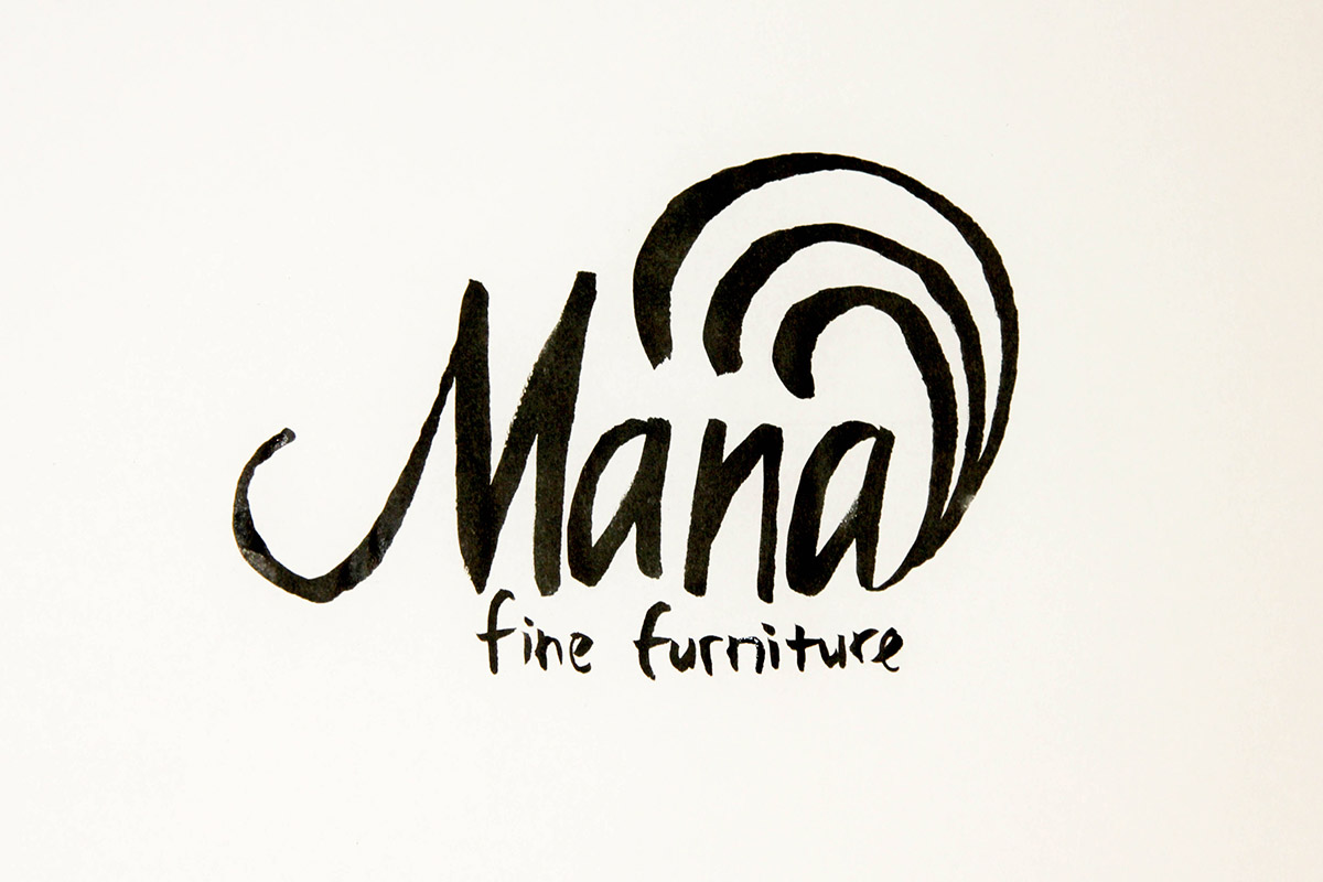
This is the version with the waves in it, which help create a connection to Hawaii. The writing is a bit rough and uneven, so that evokes the feelings of something that is handmade.
I used a brush pen for this entire piece, applying more pressure to the word "Mana", and less to "fine furniture".
Critique: This was one of the two pieces that my classmates said I should refine further. They agreed that the rugged handmade feel was appropriate. I will definitely play more with the "fine furniture" part, since I didn't give it much attention in this sketch.
4
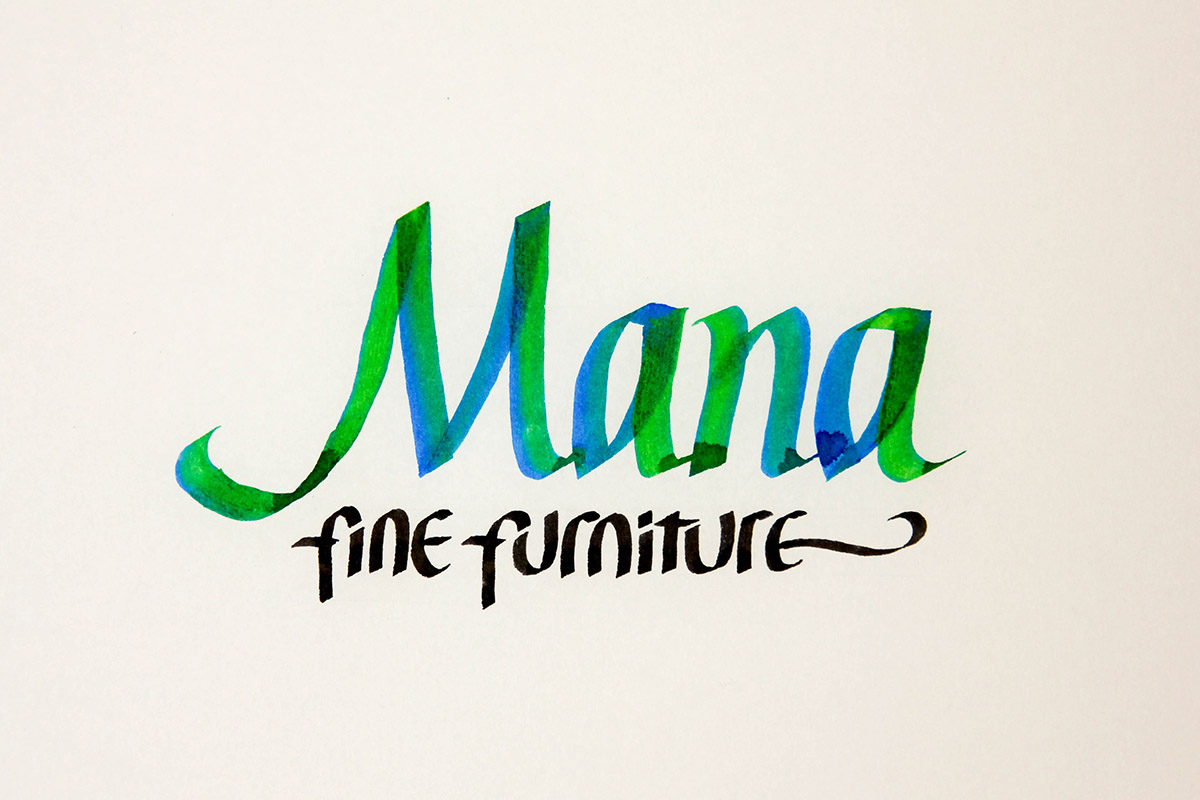
I am going to be honest about this one. I sort of ran out of ideas, and I needed to produce 5 different logos. I tried doing a color treatment that would be evocative of the waves, and using a different hand for the "fine furniture" part.
For the color part, I used a parallel pen with turquoise ink that I touched to a second pen filled with grass green ink for a couple seconds to create the blending effect. The bottom part is done using a smaller size parallel pen.
Critique: I got an interesting question about this one. Somebody asked how I had picked the colors. I just admitted that those were the only two colors that I had, and they seemed to match the ocean theme. Otherwise, it didn't get much feedback.
5
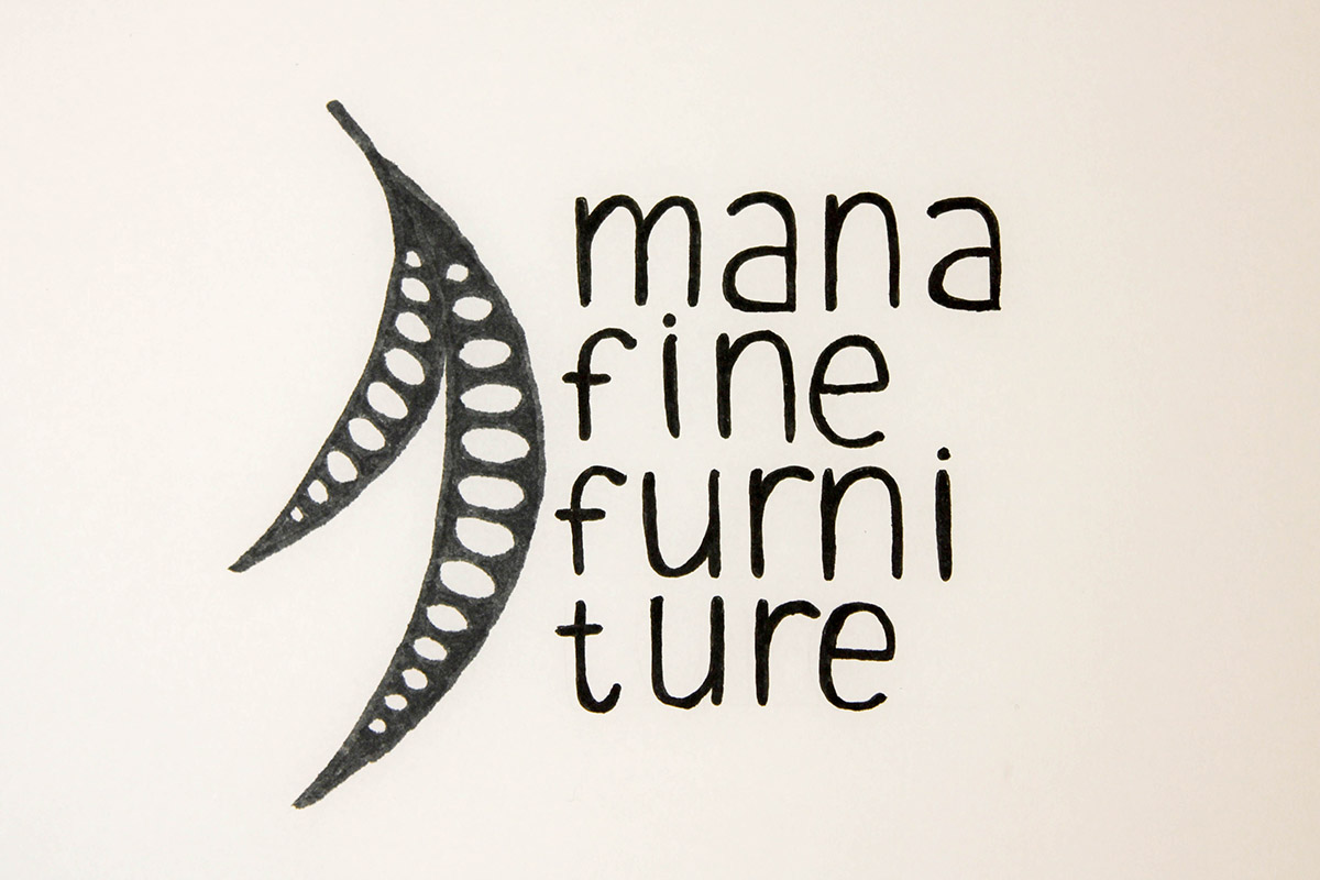
After despairing over my fourth piece, I remembered that I forgot to use the seed pods that I thought were really cool. This logo is very different from the others for several reasons:
- It has an icon in addition to text.
- There is no hierarchy going on between "mana" and "fine furniture".
- I broke up the word "furniture" into two pieces, which is a rather risky move.
This whole piece is done using the brush ends of a dark grey and a black marker.
Critique: This is the second piece that was suggested for further refinement. The seed pods seem to be a good connection to Hawaii / koa, and the hand lettered text has the handmade feel to it, just like in the other version.
Conclusion
For the next part of the assignment, I will be refining #3 and #5, and choosing the one that works better.
Comments